Oh man! Has he done it now! Neither rain, nor snow, nor death of the night, can keep him from his duty. Hogwash! Welcome to the horribly late review of the Type Directors Clubs’ Typography 8, 1987.
Obviously any talk of how relevant and cutting edge this modern design is can be thrown out the window because of my delivery custodian, so don’t get on my case about it—actually, please do. It’ll be 20 years before my mailman gets your letters to me anyway, so do your worst, world! Do. Your. Worst.
Alright, now that I’ve had my iced-tea and a light snack, I feel a little better. A little calmer. So it was a little late, what’s the big deal? Not as if it was a kidney, and I can still do a nice little write up on this gem, can’t I?
When flipping through the pages of any publication from this time, especially an annual, I get an odd feeling of nostalgia. The work that fills the pages reminds of me of the television shows I watched as a kid. When you compare the work found in this book to, say, Typography 27, it’s easy to see whats changed, what’s the same and what was obviously done in a fit of the-kids-will-love-it.The most comforting thing I found was, what was well crafted design then has held up amazingly well now. Which gives one the hope that if you put the right amount of effort, thought and enough of your soul into a piece of work you do now, you and others will still look at it and smile in two-decades time.
Oohhh the colour!
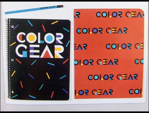
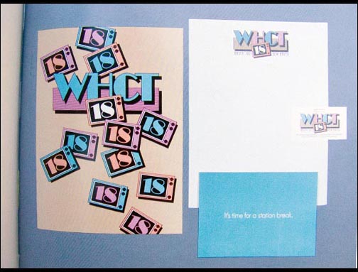
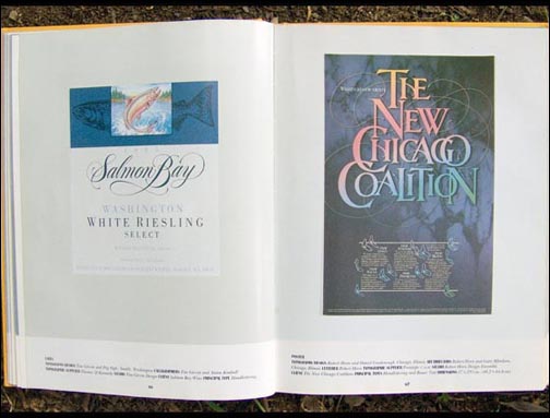
Let us start with the colour. Oohhh the colour! Such calming colour! Looking at some of the work in this book, you’ll be easily forgiven for thinking there was a colour prohibition recently lifted on pastels. Soft blues, soft pinks, soft yellows and soft purples all come out to play, and what a night they have! They drunkenly dance upon the skin of type and shapes across the dance floor that is the page, in an uncommon display of divergence among brothers of letters and shapes. A single world may contain three to four colours, one per letter. Or a sentence may have each of its words a different colour, which I’m sure was all in an attempt (marketing? finance? client?) to make the job really pop.


Look as if they were laid out by a drunk pinata
Circles, rings, semi-circles, squares, wavey lines and a plethora of other options are found in abundance. In most instance, these shapes look as if they were laid out by a drunk-on-tequila pinata. A pinata that loves solid drop shadows. That isn’t to say that it’s ugly per se, more, it seems as if they were positioned at random by a paper beast full of candy. A friend once told me that her design teacher (while studying at the time of this book being published) loved to encourage his students to make their work leap off the page, using drop shadows and layering as the propulsion device, something which seems to have been true of many designers of this time. One of the most interesting thing when looking at these works is wondering what I’ll be thinking when looking at my collection of design annuals in another 20 years. More importantly, what will I be thinking when looking at my own portfolio in another 20 years? Will I think some of the elements (type? colour? shapes? texture? image?) will look randomly placed, even though right now I always feel as if they’re going in the right place, for the right reason? What will my solid drop shadows be?


Now for the typography. It goes without saying that the simpler of the works is what has stood the test of time. Perhaps it’s because more effort has to be put in to acheive the level of elegance required for a minimalist piece to be ‘good’ rather than ‘bad’ and also, with a simpler piece, there is less to go wrong.
The work gives the feeling of being more experimental
That being said, in general, the work gives the feeling of being more experimental in the late eighties. Perhaps the lack of a giant, instant delivery, communication network (I believe the ‘internet’ is the correct term), helped to widen then gap between the styles and voices used of the day. What was being produced in Australia was probably less influenced by that being produced in America, Europe or Asia and vice-versa. Not non-existent, just subdued a little.
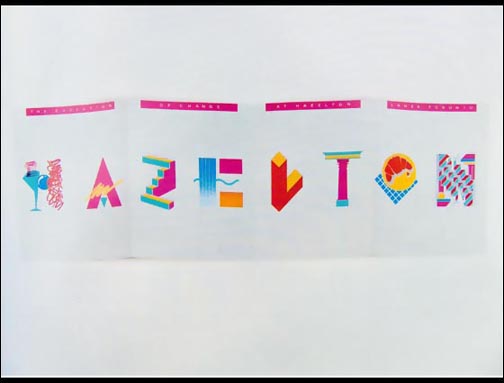


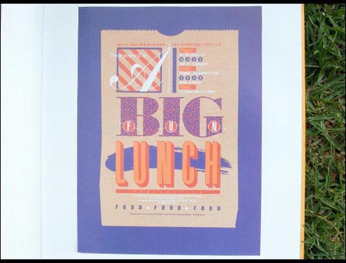


In a lot of instances, body type was big (12pt anyone?), to the point of absurdity by the norm of today. Serif fonts were used much more as well as no space after/first line indents and quite a few canyons for leading. Exploring further, you start to get the feeling that a lot of creatives enjoyed calligraphic solutions for headers and display type as there is quite a display of ink, swirls and curls. This seems like it was quite the time of transition, as the traditionalists were using calligraphy abundantly, but the super-slick ‘digital’ look was starting to come in a little and push the calligraphers off centre stage. Of course I say this, yet the list of calligraphers in the index is far bigger than that of the copywriters, art directors and illustrators combined.
The list of calligraphers in the index is far bigger


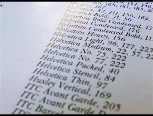
What’s in a name? In our industry, quite a bit. There are some font families that come up as often today as they did then; Bodoni (15 times), Futura (22 times), Garamond (15 times), Helvetica (25 times), Times Roman (10 times) and Univers (16 times) aren’t foreign names to anyone whose spent more than 15 seconds thinking about type. With 118 (give or take) pieces through out the book, that handful of families gets quite the workout. There is definitely something to be said about a well designed, beautiful, dependable font.


As for creatives, there is also quite a number of familiar names. Ken Cato, Colin Forbes, Paula Scher, Kit Hinrichs, Art Chantry, Charles Spencer Anderson (with a whopping 14 pieces), Saul Bass, the Duffy Design Group, Pentagram and Saatchi & Saatchi are all names found through the pages.
I’d say it’s essential in becoming a good designer
It’s always nice to look at the past – I’d say it’s essential in becoming a good designer or illustrator or typographer. While this, and books like it, aren’t on the top of my Amazon wish list or something I troll through second-hand book stores for, it is definitely the kind of thing worth picking up when finding. Is it worth spending the money? Well, that’s up to you, but I know I would.

Master Your Craft.
Weekly.
Become the designer you want to be.
Join a group of talented, creative, and hungry designers,
all gaining the insight that is helping them make
the best work of their lives.