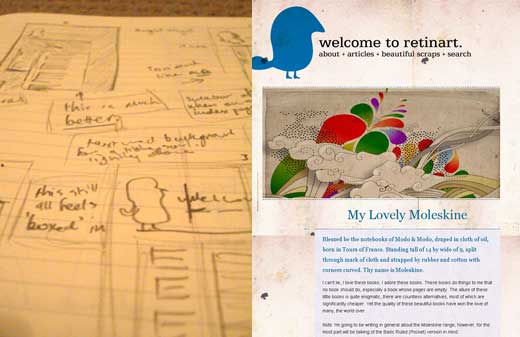
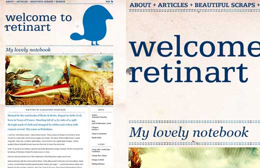
Retinart has existed in one form or another for a few years now. Most of the changes made, existing solely in my own mind, didn’t actually turn into much. It is now that I feel that I have taken the right first step.
This domain has been the address for a slew of folios, a self-centered blog or two and mostly empty, in promise and content, ‘coming soon…’ place-holders. Then I designed the previous version of Retinart and started to write. While I was, and still am, comfortable with my writing looking like that of one who is new in the arena, the amateurish design I employed was sub-par. And what do we do with sub-par work? We kill it. Build it better, bigger and stronger. So welcome to version two of Retinart—I do hope that it pleases.
I mostly find my self wondering why it’s so necessary
to try and force so much content into my field of vision
Blog design is an interesting branch of the tree. Being a primarily print-based designer, web design is often a little odd to me. I mostly find my self wondering why the designers of most sites find it so necessary to try and force so much content into my field of vision. When it comes to blogs, it seems like the people behind them want to push a whole lot of content as well as their most popular articles, their latest articles, their featured articles, their Flickr steam, Twitter stream, favorite YouTube links, links to their friends blogs, feeds of their friends’ blogs, the blogs that have linked them and the blogs they hope will link to them once a referral list is looked at, and don’t forget links to add each article to Digg, Delicious and who-knows-what-other-social-network. You would be forgiven for thinking that these sites consider hits to be the main focus, with the ends justifying the means, rather than good content, that is actually worth linking too. All of this superficiality is what I want to avoid like a plague.

For me, the beautiful thing about web design is that it can grow. A design for printed matter can’t be changed once it is completed, but a website can. I find I am comforted by the knowledge that I can make improvements, and more importantly, implement new feature and sections easily. This is one major reason why I felt that a redesign was in order. The previous design of Retinart didn’t have any room in which to grow. I simply didn’t design the site with any kind of significant expansions in mind—optimistically (read that ‘stupidly’), I thought that I would get everything perfect, right from the word go. Of course I was wrong. The majority of sites like the one I’m trying to develop have expansions every few months. Often these are small improvements, ones that most won’t notice, but they all add up to a better use experience. And isn’t that the reason why we do these sites? To benefit our visitors?
Finding places to lay the blame other than
on my own head doesn’t benefit anyone
The second major reason for the redesign is very user-centric (as opposed to the first being primarily site-centric). In it’s previous form, this site was not inviting. Looking at it, you didn’t want to read more than the header. My layout didn’t flow well, nor was it all that aesthetically pleasing. In fact, the only part of the old design that I was happy with was the background, which isn’t going to make a viewer read what is in front of it, is it? I was practically embarrassed to show the site to anyone, which doesn’t help when you’re want to grow an audience as well as ask for people to be interviewed. Why should I expect other people to be happy looking at my site if I wasn’t? There are numerous reasons why the last design was a failure, ranging from time restraints, technical hiccups and an array of other excuses I could conjure up, however, finding places to lay the blame other than on my own head doesn’t benefit anyone.

Technically, the site is now far smoother. As well as a new design, I’m using a newer version of the CMS than before. When the last version of the site was being put together, it was recommended to me by many to give the CMS Joomla a go, which at the time was more or less at version 1. Now we’re up to version 1.5 and a lot of changes were made to how it worked and what can be done, resulting in a lot of actions being automatically performed, which makes producing content a lot easier. The biggest lesson I learnt was that a couple hours spent now, in learning how to use your CMS better, will save many hours down the road. It is definitely worth learning what your CMS can do straight out of the box, rather than adding a pile of add-ons to get the same result, only slightly easier, which may only lead to more headaches when one of those add-ons has an update that breaks your site. That being said, I’m not exactly happy with Joomla. I’m not happy with it to the point that I wouldn’t recommend it to anyone, not just yet anyway. I can’t help but feel I would have saved many hours if I had used WordPress or ExpressionEngine – Joomla just doesn’t feel like it’s accessible to those who don’t know PHP syntax. A simple list of “this is how you insert X” would have been a lifesafer. You know, like the one WordPress has.
I am not going to treat you like a
slow-witted child to whom I’m selling snake-oil
I also have a few self-imposed rules. Firstly, I’m going to always publish quality articles. Yeah, I know this should be a given, but a lot of sites post for the sake of posting, in an effort to get more hits, which for many, means more cash. Basically, you won’t be seeing any of those ’50 great fonts that you need to have, otherwise you can’t call your self a designer, which you probably aren’t anyway, because if you were, you probably wouldn’t be interested in these shitty free fonts’ articles. You know the ones I mean. Unless these kind of articles are on high quality sites which use them as after-dinner mints, then they are just feel like efforts to get popular on Digg, more often than not. While I am going to try to get an article up a week (which will grow to two or three down the track), I’m not going to put something up unless it is worth reading. Now for what most bloggers get wrong – I am not going to treat you like a slow-witted child to whom I’m selling snake-oil. I know you’re smart and I know you hate ads. There are three kinds of blogs when it comes to ads. Those that have no ads, those that have a small ad (ie. the Deck) and those that have so many ads that they appear at the start, middle or end of an article, as well as taking up 1/5 of your screen in the sidebars. If you have a sidebar dedicated to advertisements, then maybe look at what your priorities are. If something is on this site, then it means I want you to see it because I think it might be something you want to see. As simple as that.

This isn’t a vanity project for me. I’m not using to further my career directly (although I do hope to learn through the writing I do here, which will benefit me professionally, but you get my drift) or to get a few freelance gigs. This is simply a place in which I would like to learn and broaden my understanding of graphic design and creativity, as well as yours. One thing I don’t want to be is a content-provider (as opposed to a content-producer) as I want to give you original articles, not ‘best of the web’ articles. I’m going to consider this a place that I am sharing with you, the audience. Somewhere fun, interesting and hopefully a little thought provoking.
REFERENCES & LINKS
Header GIF
A quick look at the building up of the top header image.
The Mars Volta
The award for best soundtrack while developing this design would have to go to The Mars Volta’s The Bedlam in Goliath.
Joomla!
With it’s young age in mind, 1.5 should prove to be quite the powerful CMS.
Master Your Craft.
Weekly.
Become the designer you want to be.
Join a group of talented, creative, and hungry designers,
all gaining the insight that is helping them make
the best work of their lives.