I just got to the point where I was always embarrassed.
I loved my previous design, but I was embarrassed by it. And one shouldn’t hold such rotten feelings when asked to show their blog. Or worse yet, when other sites actually link to it. It should be a moment of excitement, of satisfaction of ‘everything is just right’.
That’s what I was missing. I didn’t have that at all. I was bothered by a lot and found my self in a horrible position, burdened by cures to fun and excitement.
I felt as if I could do better. I felt as if I needed to provide a better experience for those of you who were kind enough to come visit. A blog should feel like a home — a place of comfort, entertainment, knowledge, an inviting place of warmth, full of little nooks and crannies in which fun can be found.
So I set my self the task of building a better home.
A year is a horribly long time
In this online world, a year is a very long time. I’ve seen some amazing sites launch and grow in community and content in the time it has taken me to just get to this point. I’ve seen great sites become poor ones and poor ones become great ones. All while I twiddled my thumbs.
I apologise to those of you who were kind enough to visit and subscribe in the hope of new content. My audience means a great deal to me, and I failed to show it due respect. I went quiet, and as a content producer, going quiet isn’t acceptable. So I do hope you accept my apology.
I was in equal measures horribly lazy (hello burn out, my old friend!) and wildly energetic (nothing like 18 hour days playing with WordPress).
Enough of such talk, its time for the fun stuff!
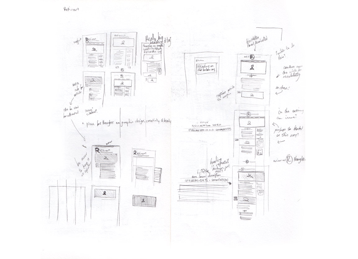
Sketches
I did start this process about 13-14 months ago, so much of the details have been lost in the fog of memory, but let’s see what we can stumble around and feel out, shall we?
Initially I wanted to understand what made a good website tick, so I sketched out a few sites that I found to be beautifully designed.

Then from this my mind was racing towards a design for Retinart as I could see a pattern emerging in what felt right and how to handle the kind of information that’s to be found here.
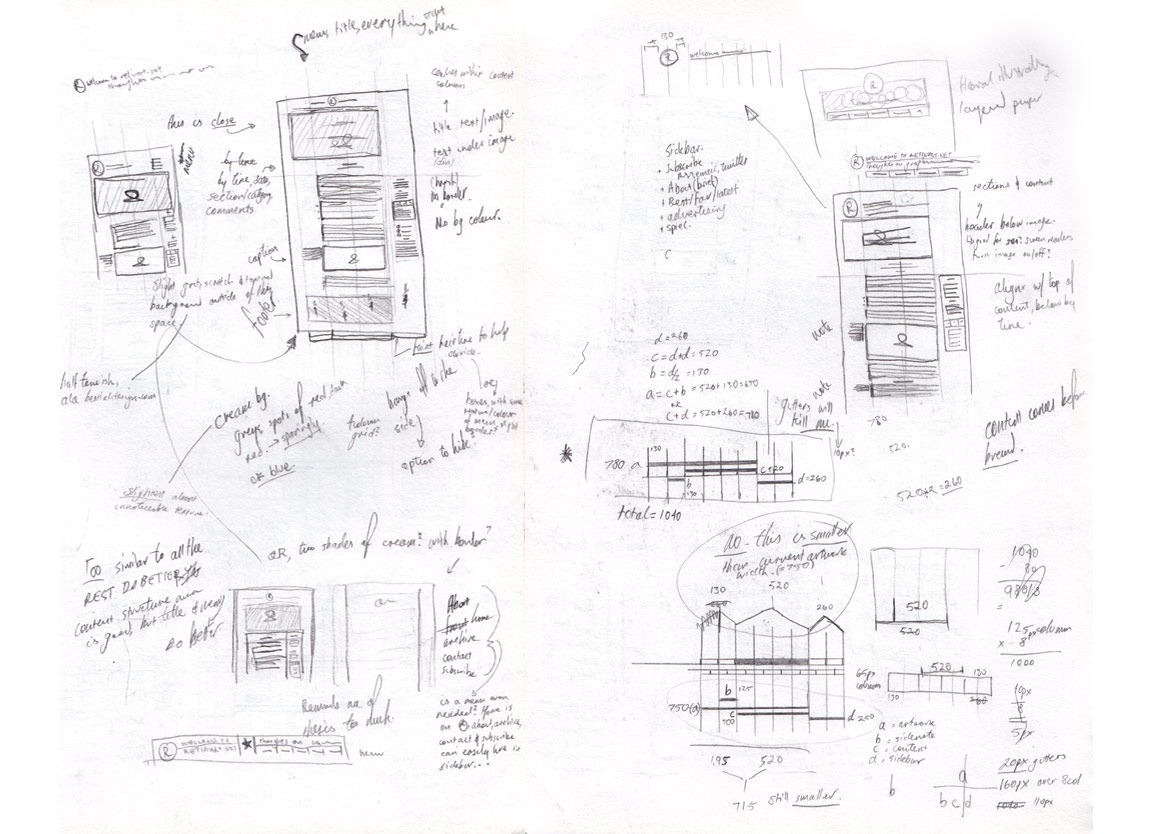
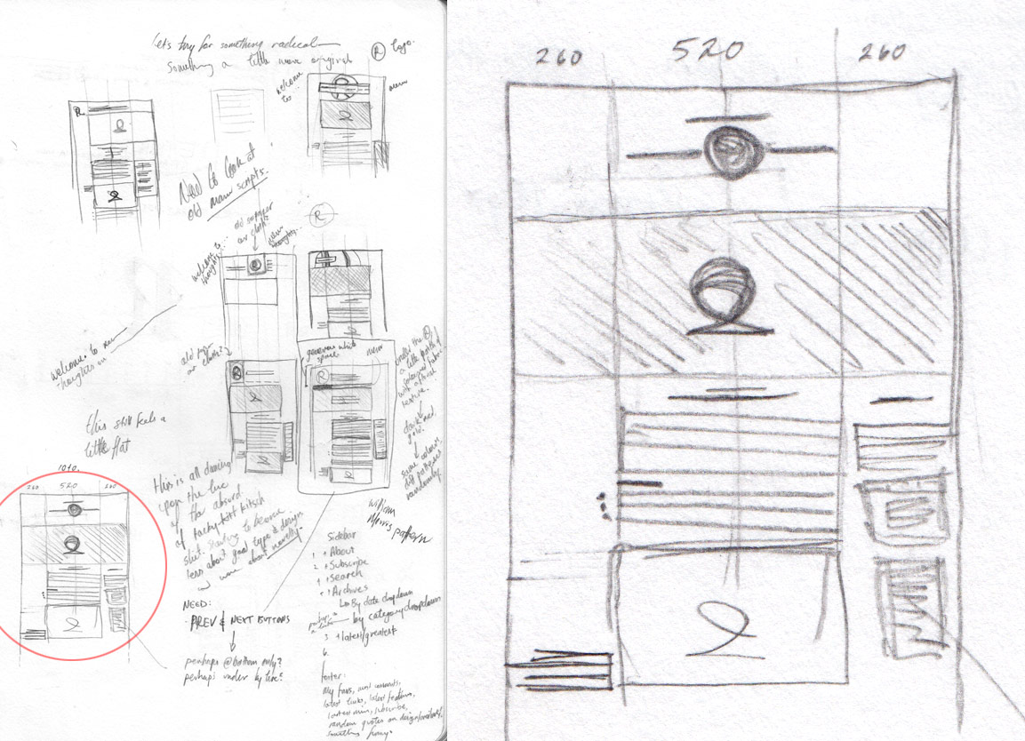
Photoshop Comps
I spent quite a bit of time in Photoshop, just hoping to get the design as perfectly figured out as possible, before I ventured into WordPress. If I had to do this again, I might not have spent quite so much time here, but it did provide a great help when it came to the CSS.
CSS not being my strongest suit, I felt that if I could have a perfect layout in Photoshop, then all I’d have to do is attempt to match what I’d done, just with real content.

Before I even did some sketches, I thought about using the Thesis theme as it has some great features. In the end I realised I’d spend so much effort getting it to work how I wanted that I would just end up killing all those great features.

From Joomla to WordPress
Before this redesign I had never touched WordPress and my only experience with a CMS was Joomla, which I found infuriating and painful to work with.
Still feeling the burns from my previous CMS, I decided that I would do what I know and build the template to completion before venturing towards WordPress. So I went ahead and with help from a good friend, Esben Thomson, was able to have a validated, cross-browser safe HTML template to put into WordPress.
Unfortunately, though, the latest 45 comments submitted to the old design didn’t make it over.With the help of a few plugins and a lot of MySQL headaches I was able to port all my content over and, most painfully, was able to get my comments to jump into WordPress too.
With the content now in WordPress, I had to tediously update all the title imagery.
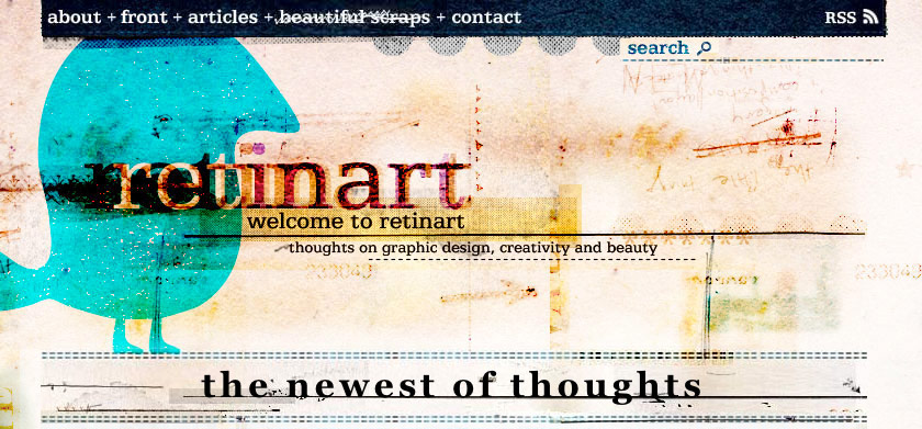
This is the third version of Retinart, and with each version the title artwork has grown in size. When I went to the second version of Retinart, I didn’t update the old artwork and instead had this ugly mess;

I wasn’t going to repeat this mistake and instead went through and updated every single title artwork I had previous done. Luckily a lot of the PSD files had extra content off the canvas edges, so the process took about a week and involved minimal tweaking.
Site Features
Obviously you can just wander around and see what I’ve done to the site, but there are a couple things I’m especially happy with that I wanted to show off.
Citations in the Margins

I love seeing margin notes in printed material, so this is something I had in mind while designing the site.
Images in the Margins

Again, I do love those margins! In this case you can see an image sitting to the side for those cases where an image should be included, but not too strongly in the content
Pull Quotes
References & Links, Article Navigation

Most articles will have a References & Links section at the bottom of the content.
Comments Form

I love to play with words for the simplest things, making them a little silly and a little fun — the comment form was a great opportunity to have such silly fun.
Footer (of the Footer)

I get that my footer is crazy-large, so I needed to counter all the weight that the content of it drops on the bottom of the page. These three little buttons and the light italic text is probably my favorite feature of the entire design.
Contact Form

You’re taking the time to write to me? Why wouldn’t I do my best to make it a little more interesting than a standard ol’ contact form?
Content, or
How I Learned to Stop Worrying and Love The Hard Work
So anyway, I now have 30 articles finished, scratching at the walls for freedom.
In an effort to offer you great, new content, I often have to spend more than a day or two researching — a few of my articles might take a week or two instead. From this I might only get one or two articles, but it means that I haven’t limited the content to what I already know and, hopefully, will be delivering something that isn’t often found online.
I love diving that much deeper so that what I offer might be of stronger interest. While it sucks at the blood of my time, it is absolutely worth it. Having this reserve means that while I’m spending a week researching and not writing, you’ll still get your two articles a week, or in some cases it gives me the chance to just take a break — a pretty good deal I think.
I’ve tried to write two kind of articles — major and minor. The difference is mostly depth and length. Major articles fall in the 1200-1400 word range and the minors are about half that. I might want to spend 1400 words talking about geometry, then a few days later post a review article about the book that inspired me to do so in only 600 words.
It’s mostly about pace. Two posts a week is a nice number for me, but I wouldn’t be able to write two major articles a week, it’d just be too hard and the quality would drop very quickly (a big no-no). I’m also not sure how well two 1400 word articles a week will go down with you guys. Might be a little much, no? I’d think so.
Topics that I’ll cover will vary, but will mostly lean towards theory and history, with a lot of beautiful images. The beauty of writing so far in advance is that if I become obsessed with a certain topic, I can focus on it for a month, but then distribute the content out over three or four.
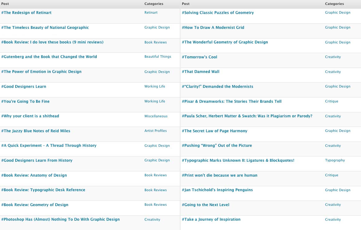
Here are a few samples from upcoming articles, just to whet your appetite;

Thanks for the help
I just can’t help but feel that there aren’t enough sites that cover the kind of content that designers deserve. Too many assume that all we are after are pretty pictures, which, although great, aren’t enough to help us be better at what we do.
I don’t want to give you articles on the mundane or on the baby steps of design — I want to give you something with substance, something that’ll entertain and inform you. I want you to be better designers so it’s harder for me to talk to you. So you expect more, so I have to up my game.
I’m very lucky that there are a small number of people who seem to connect with what I write enough to first offer friendships and, because of that, then offer a great deal of advice and discussion. I’m sure of this more than ever because of those who helped me with this redesign.
Oh how I will torture my self if I forgot someone, but please let me know if I did! It’s been so long they probably don’t remember helping me out, but to the following people and their critiques, comments, encouraging and wonderful comments, I have to say thank you a hundred times over:
LaurenMarie (@creativecurio), Vivien (@inspirationbit), Tracey Grady (@traceygr), Steve Mehallo (@mehallo), Jacob Cass (@justcreative), Andrew Kelsall (@AndrewKelsall), David Airey (@DavidAirey), Mitternacht (@Mitternacht), Niki Brown (@nikibrown), Matt O’Leary (@olearymo) and Tom Bryan (@demotecontrol)
And I absolutely must give a special thank-you to Esben Thompson who was not only a sounding board for my worries but a good friend. Whenever I hit a stumbling block with the design (or HTML, or CSS, or WordPress, or the content) I always knew I could rely on Esben for some sound advice, or in some cases, rewriting my broken or messy HTML & CSS or telling me something is just a ridiculous idea — thank you greatly!
It’s because of intelligent, talented and driven people like those above and people like my audience that I enjoy writing and discussing design so much.
So what’s next?
Oh, this is the fun part! Starting next Tuesday I will be posting twice a week, a major article on Tuesdays, then a minor on Thursdays.
Like most blogs, this is a site for the audience, not the writer, so let me know of any topics you’d like to see covered or if you have any preference as to what articles I post sooner rather than later from my list above?
I’m looking forward to playing with different ways of delivering content including some videos (I have a lovely letterpress I want to play with, and it’s best shown in video), a newsletter, a tumblr site, twitter and whatever else will allow us to talk about those principles and elements of design that we all so love. So stay tuned!
I’d love to hear what you think of the design so please feel free to leave a comment.
Master Your Craft.
Weekly.
Become the designer you want to be.
Join a group of talented, creative, and hungry designers,
all gaining the insight that is helping them make
the best work of their lives.