Milton Glaser is a name virtually anyone who has studied graphic design history to any extent knows. The Bob Dylan poster and the I Love NY logo are two works that many people even outside of the field know and have seen time and time again. For several years, between his time as co-founder and president of Push Pin studios, yet before the I Love NY logo, he was art director of New York magazine.
I love magazines. Editorial design is second-to-none for me. It’s a world where things can be tried and if successful, pushed, evolved, grown. If an idea looks good at first but not so good 20,000 copies later then damned be the embarrassments! There’ll be another issue soon enough. Typography is played with, photography and illustration can carry all the weight of a layout and the rules and expectations can be pushed to within an inch of their lives, only to be brought back to something graceful and elegant the next story. Because of this love I have, when I read about Google’s new digitizing of publications from the last century or so, I wet my self.
Well, not really, but you get an idea of the level of excitement I was experiencing.
In the small pile of publications that this new digital archive was building, only a few names aroused a modicum of interest. Except one, one caught my eye for one reason or another: New York. A name I was at best vaguely familiar with. A level of awareness I was more than happy to boost as best as I could for a couple of hours a night for the better part of a week.
The magazine, which began its life as a supplement to the New York Herald Tribune in 1936, is still going today. But it would be absured for me to look at every issue from a span of over seven decades to find some pretty pictures. So I narrowed it down a little, using the Art Director as a guide.
I’m lookin at a span of time of less than a decade – from it’s inception as a standalone magazine in 1968, through to it being bought out by Rupert Murdoch in 1976. Why these years? Because it is the years that legendary graphic designer Milton Glaser was holding the creative reins.
1968—1972: Art Director – Milton Glaser
Originally a sumplement of the New York Herald Tribune, New York started its life in 1963. In 1967, the Tribune went bust, but unlike its parent-in-paper, New York went on to live as a glossy magazine in its own right.
During the life it had at the Tribune, it was in the hands of Editor Clay Felkin and Graphic Designer, Milton Glaser. Purchasing the rights to the magazine after the collapse, the duo assembled a few regular writers and illustrators, whom they used to help develop a magazine that, as an outsider to the city, feels very much like New York must have during this time.
The stories told a range of topics from political to sexual, from the artistic to the absurd. Of course, it is more than the stories that makes this magazine something interesting to flick through, as an interesting and smirk-worthy as they are.
New York acted as a discovery for me. I loaded up the link and, forgetting or not knowing that Glaser was involved, smiled from time to time. Then smiled a little more. Then uttered the phrase “oh wow, that’s nice” at a layout or two. Then I saw the name Seymour Chwast, one of the PushPin creatives, and I smiled even more. A little more flicking, a few more phrases, each escalating in the pleasures of discovery, then there it was. In black and white. Art Director – Milton Glaser
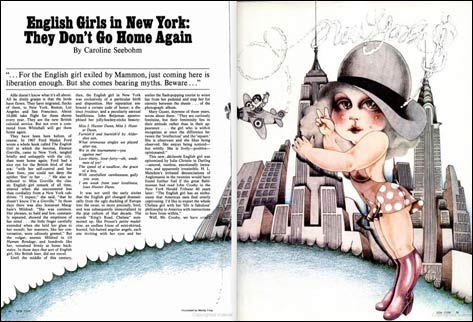
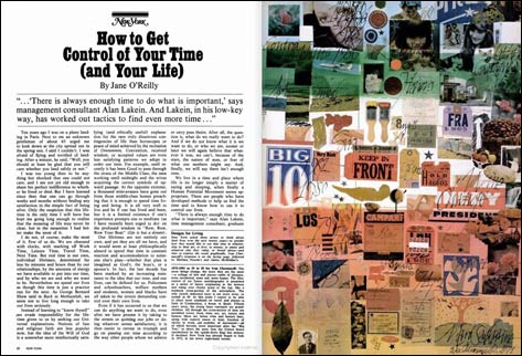
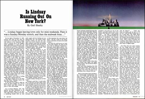
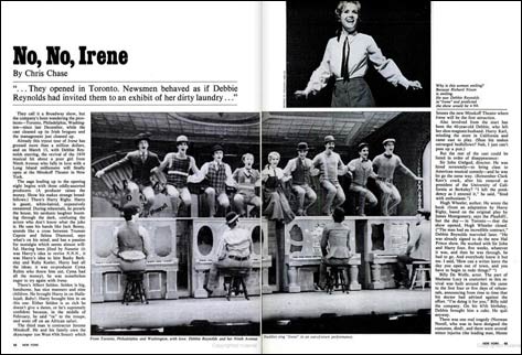
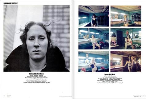
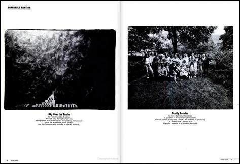
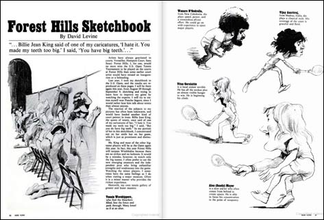
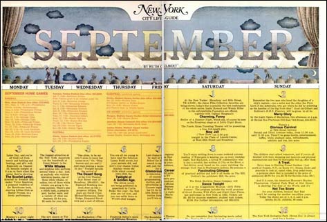
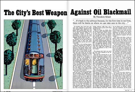
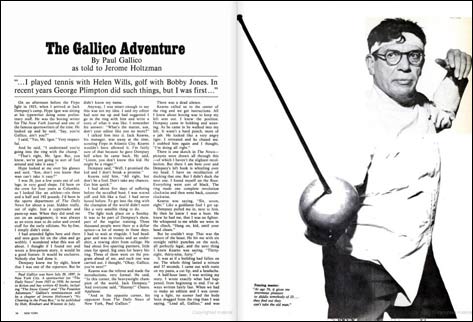
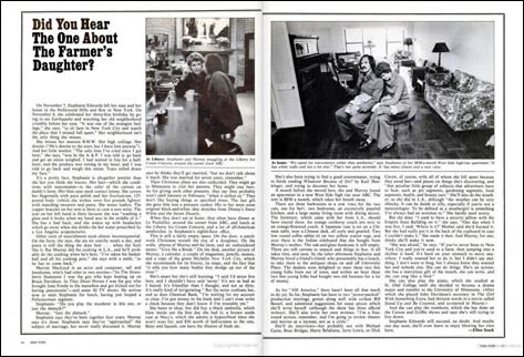
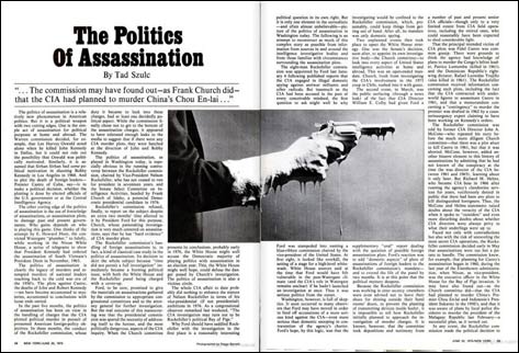
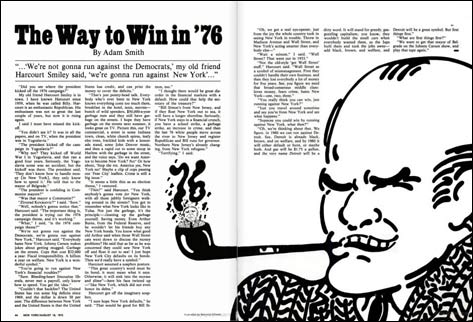
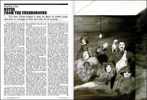
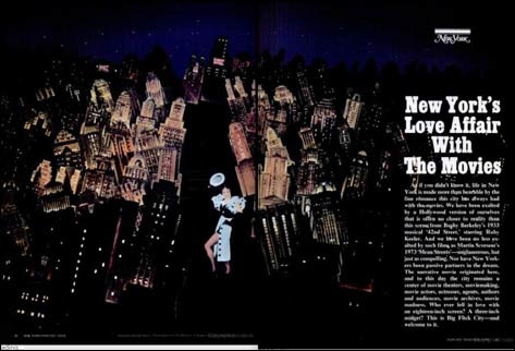
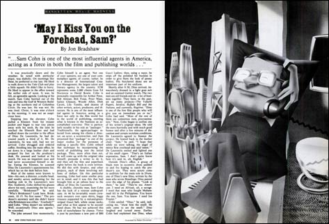
I won’t go on and on about the playfulness of the grid used—the strong three-column layout that is adhered through-out its lifetime—or the strong imagery, evolution of title styles or how a circle fitted into a square plug in a delightfully surprisingly way. No, I think instead, I’ll just let you discover all the fun stuff for yourself.
Each image links to the respected spread at Google, which will allow you to zoom in a little more and go to the pages before and after. See note below images.
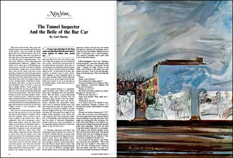
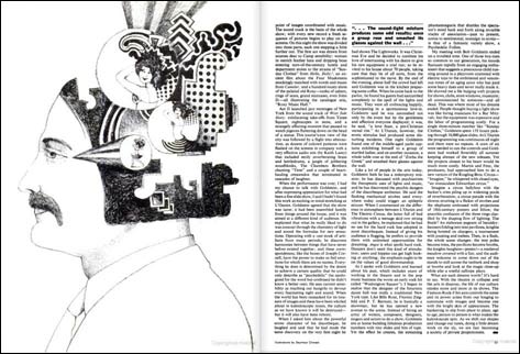

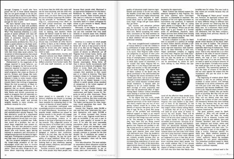
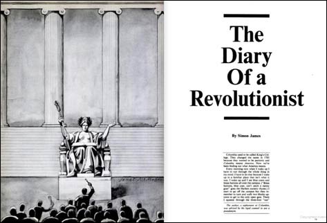


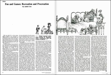
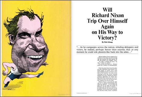
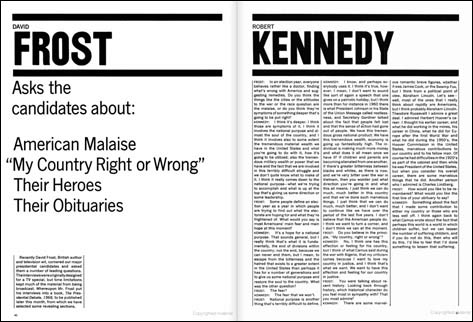


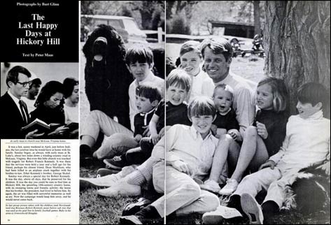


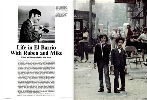

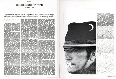
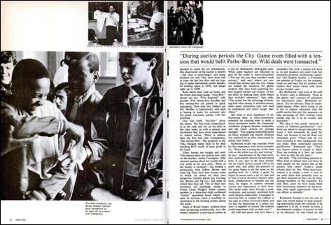

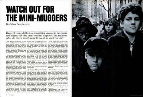







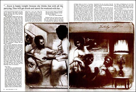
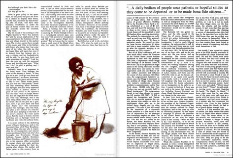

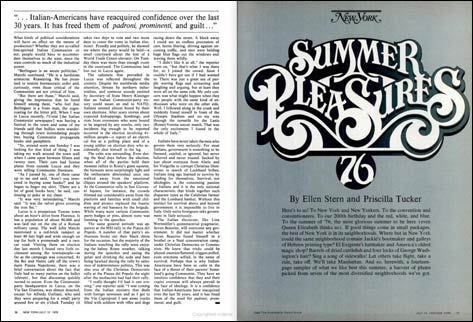

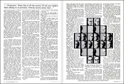
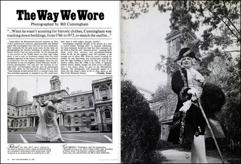
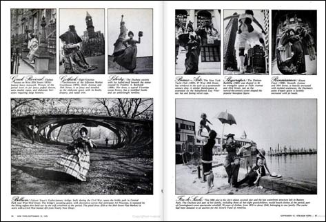
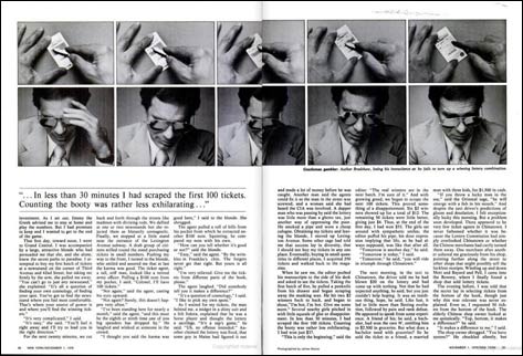
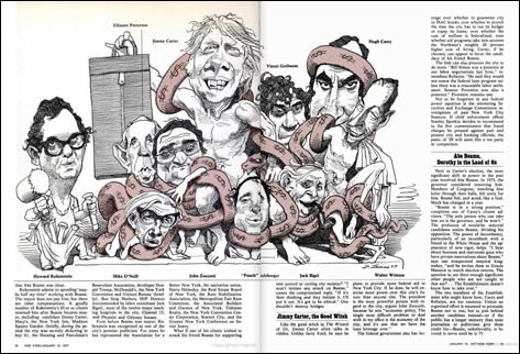

A quick note
When this article was originally written, I was able to provide links to every spread as it appears on Google. Unfortunately, either between the migration of Retinart to a new CMS or perhaps because of a change at how Google handles the URLs for their hosted publications, they stopped working. For now, the best I can offer is a URL to New York Magazine main page on Google Books.
Character
Character seems like a good way to sum this one up. The magazine is playful. Nothing is taken too seriously with the layout and look, yet nothing is held too sacred. Nothing feels out of place. This is what Glaser added as he served as Art Director, while working closely with the Editor so they could make sure text balanced with imagery and layout.
The boundaries in style were set by the Tribune art director Pete Palazzo, and Glaser looks to have respected them. They are bounced upon and to great effect. Any change in layout or style is subtle enough that it doesn’t insult any of the previous layouts, but work hard enough that nothing feels stale. It all surely serves as a lesson to any of us who may consider editorial design their passion.
It goes without saying that all the images are copyright of New York Media, LLC, Google and whomever else would like to get in on it.
Master Your Craft.
Weekly.
Become the designer you want to be.
Join a group of talented, creative, and hungry designers,
all gaining the insight that is helping them make
the best work of their lives.