Most poorly designed pieces have something in common; they’re too complicated and too busy. Too many fonts, too many photos, too many logos, too many colours. Just too much. Have a look at the majority of the award winning work that’s floating around—there are few fonts, few photos, few logo, few colours. Even the busy looking designs can be broken down into simple elements.
Design is about being able to convey a message, which is more often than not bundled with an emotion, in an effort to evoke a reaction in an audience. One of the truest maxims I’ve ever known is; if the message is interesting, if it has power and strength, then wrap it in a simple design—let the message do the heavy lifting, not your design. Let the audience discover the emotion or thoughts or connections themselves, let them fill in the gaps, rather than forcing something onto them.
Before we get too far into this, I’ll offer you a brief explanation as to how I came to the genesis of this article. While working on a piece about realism in illustration, I found something much more interesting. Recently, the team behind Family Guy put together a 40 minute retelling of the first Star Wars epic – A New Hope. While comparing the shots of the original film with their illustrated counterparts I realised there was a different kind of article burried in the 240+ stills from the movies I had put together – Blue Harvest, the Family Guy homage, was a well designed take on the original that with or without intention, demonstrated minimalism in an awfully fun way.
Why simple is good
More often than not, the reaction we are trying to provide, be it an emotion, thought or action, is complex and powerful. To make someone laugh, you wouldn’t have a routine that rivals Who’s on First? in length in your layout, would you? Instead, you’d use a single image, with a single tag line, that when combined will generate the reaction you are after – a smirk, giggle or hopefully, a fit of hysterical laughter. The audience will see the image and the line of text and relate it to an idea or experience they hold locked away in their memory, waiting to rise to the surface when triggered. The less there is on the page, the fewer of these memories there are trying to be remembered. A simple combination can deliver powerful results. A simple combination, a simple solution, means there is less to absorb and understand, that is, the easier it is to ‘get it’ now and the easier it is to remember down the track.
Recreating a mood
Take a look at the following shots. The opening to A New Hope is something that everyone vividly remembers experiencing for the first time. An enormous, technological marvel passes over the audience, belittling a moon and surface of a planet as it menacingly chases it’s victim. This mammoth ship is light-years ahead of anything that we can fathom—it’s awe inspiring. It is this that the illustrators of Blue Harvest wanted to recapture. This feeling of awe and of shock. When it was first seen back in the day, it’s complexity was phenomenal, it was like nothing seen before. However as time has gone on, it has became less phenomenal in the world of Science Fiction. So the artists of Blue Harvest had to do what they could, to recreate that initial feeling of awe. So they added detail, more detail than the original. More lights, more compartments, more gidgets, more gadgets. Each one simple in its self, adding up to a more complicated whole.


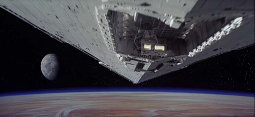


At the point, my argument might seem contradictory – here I am saying that less is more, then rave on about the beautiful extra detail added. But remember two things; firstly, the extra bits added are all simple in themselves, adding to a perceivably more complicated whole. Secondly, it is an emotion that they wanted to recreate, an emotion that requires a lot to be conjured. Shock and awe can’t be achieved easily, so in this case it takes a lot of simple parts to build something strong enough to get the job done.
Filling in the gaps
We’ve all seen, or worked for people who ask for, designs that are filled to the brim with photos, words or illustrations in an effort to stress a point. It isn’t enough to show one photo which has people of different backgrounds in it, you need several! Show as many ethnic groups as possible! Otherwise somebody might feel left out, or you might seem racist! Gasp! Oh no! That brochure has to have at least nine photos of people smiling and laughing, otherwise people might think you’re workplace is drab and boring! Dollar signs need to be used as a border, otherwise the audience might not get that you give financial advice, even though it says so in the heading, subheads and the body! Unfortunately, all of the above happens often. Some people are under the impression the the audience aren’t intelligent and don’t realise how polarising it can be to have so, so much, blatantly thrown around.
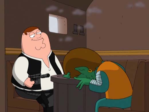
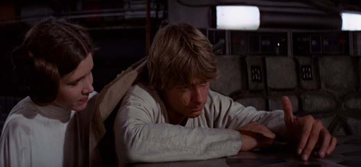
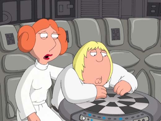
You don’t need to make everything blindingly obvious. Your audience is smart and appreciates not being looked down upon. They will happily fill in the blanks, rather than being force-fed the obvious. Look at the following shots. Our brains find faces in everything—it’s how we can tell the difference between our parents and a pot-plant when we are young. The illustrators didn’t have to put huge amounts of detail into showing and mimicking expressions. The shape of the eyes and mouth change ever so slightly, but we are wired to pick up on this without the slightest thought. We don’t see the up-curling of a lip, changing shape of the eyes and brow or the tightening of muscles in the face to see what the illustrated characters are feeling. Simply changing the angle of a curve let us in on what they’re feeling and thinking. We make connections and fill in the blanks. This will work in your design too – don’t think you need to put in every connection there is between two elements or two pieces of information. Do it lovingly and logically and people will get it, they’ll see the faces.


If it’s boring, if it’s interesting
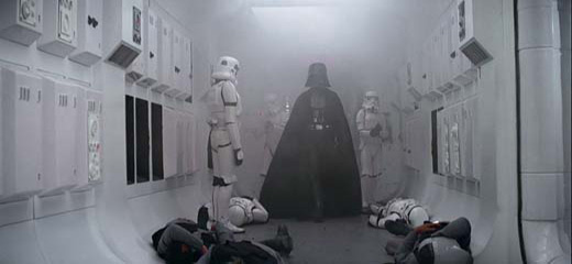
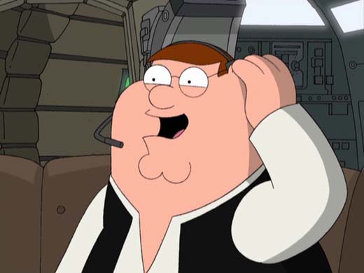
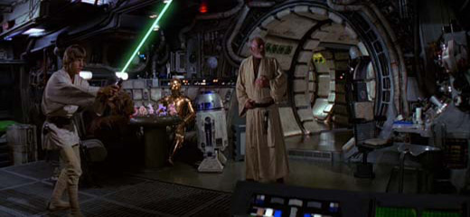
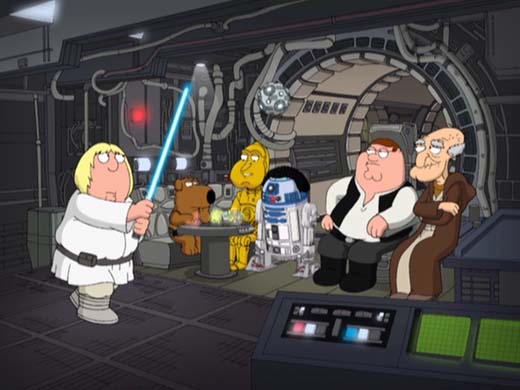
I said earlier that if the content we are designing for is interesting in its self, then keep things simple. Most of the technology we see in the two films is boring. It’s in the background, with no personality (C-3PO and R2-D2 excluded of course). It’s a box that protrudes from the wall, with a flashing light or two and not much else. It isn’t the focus and so it can be as loud as it wants, because no one is listening. It is the visual soundtrack. The characters, the focus, are simple. Their illustrated selves are dripping personality, delivered to us through the voice actors. What they are selling is powerful. The humour is in their voices, in their dialogue, so they are wrapped in a simple design – their clothes aren’t crumpled and layered in shadows and shades of colour. Below you’ll find great juxtapositions between the detail & complexity in the boring (the backgrounds and technology) and the subtlety & simplicity in the interesting (the characters). The point? if you’re content is interesting and powerful enough, don’t over-design it, just give it a nice sweater and a fresh haircut.


Colour
Colour is another one of those elements of graphic design that is overused by the amateur. For something to get noticed, it should be bright and colourful, no? Well no, of course not. If you watch A New Hope or Blue Harvest with the colour scheme in mind, you’ll quickly notice only three paints are on the board – black, white and brown, with mixes and shades of all of the above in employment. This is true for most (90%?) of the colours on screen at any given time. These neutral, soft, forgettable colours really just work as white noise for the brilliant flashes of colour that appear from time to time – a backdrop for an eye-catching splash of red, or green, or blue. The lack of colour with a hint of something strong and bright can be much more powerful than a rainbow of colours.


In a minimalist galaxy far, far away….
Using shots of these two pieces of pop-culture to explain why less is more, is a little odd I know. Though it helps illustrate my point, is a little bit of fun and let’s face it; Star Wars is awesome. It also serves as a reminder that what we are often trying to recreate in our work is an emotion, be it of wanting, safety, happiness, anticipation, excitement or reassurance. With so much of what we take in visually throughout our day being ever so busy, having something simple to look at, even fleetingly, is refreshing. It quietens the noise and is therefore, more noticeable. Most of all, it’s easy to digest. We are trying to evoke the complicated through the simple. And as always, why not have a bit of fun during the process?
REFERENCES & LINKS
Star Wars font
I found the font I used in the header at this Star Wars fan site.
Wikipedia: Star Wars
You will absolutely get lost in the epic amount of information that is on Star Wars at Wikipedia. Even if you aren’t interested in the film franchise, it’s interesting to read about the production.
Robot Chicken
Seth Green, the voice of Chris Griffin, has his own show – Robot Chicken, which did their own take on Star Wars around the same time Blue Harvest was finishing up production.
Star Wars in 30 seconds
Go check out the little flash piece I was thikning of using instead of Blue Harvest, but bunnies scare me.
Copyright
Around half of the images in this article are owned by Lucasfilm Ltd, while the other half are owned by Twentieth Century Fox and are being used here for educational reasons only.
Master Your Craft.
Weekly.
Become the designer you want to be.
Join a group of talented, creative, and hungry designers,
all gaining the insight that is helping them make
the best work of their lives.