Here we are, the last stretch, the last eleven, the last show-downs. In this final part of the series on movie poster remakes, we get a look at Harrison Ford being creepy, Al Pacino acting the bad-ass, Chrispin Glover looking freakish and as always, Audrey Hepburn looking glamorous. What else could you ask for?
This is a good batch for balance. The split between which works better, the original or the remake, is almost divided straight down the middle. As what seems to be the norm, horror movies were remade over and over and so we have a few good comparisons, with the newer ones winning through simplicity and light splashes of colour. We also have a great example of a remake that is so laughable compared to the original you could weep—I’ll let you figure out which one that is, but I’ll warn you, it’s damn easy.
The other parts
Part I (A-G) • Part II (H-L) • Part III (M-R) • Part IV (S-Z)
Sabrina (1954 & 1995)

The epitome of grace and elegance within the film world, Audrey Hepburn, stands playfully and is clearly the attraction to this movie. Yes, there is too much type, bizarre floating heads and someone either being punched or stretching out their back while a friend rubs their shoulder, but it all works so well.. even though it’s hard to tell what the movie is called. Then we have Harrison Ford looking as creepy as possible with a “… dance for me and call me daddy” expression on his face. You pick which is better.
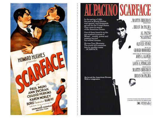
Scarface (1932 & 1983)

“Why you! I’ll show you boy-o, put your dukes up, it’s time to rumble! Time for a farce!” vs “Say hello to my little friend!” You can decide this one, too.
Anyway, now that obligatory Scarface line is out of the way, let’s get to the meat. The 1983 version is so iconic I don’t even know what to say. Tony lies between the light and dark, between being a peasant and a drug-lord, between life and death. A look of distaste for what he sees before him and gun in hand, the black/white/rad imagery is so fantastic that you look past the reams of type.
Shaft (1971 & 2000)

Why is Samuel L. Jackson silver? Minus the two cringe worthy tag lines (Still the man? Really? Most of the audience you aimed for wouldn’t have been alive the first time Shaft was the man. And Any Questions? Come on, how bad-ass-pompous can you get?), the 2000 version is visually better to look at. Jackson comes off strong and fearless while the out-of-focus shot (from the waist down it isn’t very crisp), the shots of the city in the background are great, with the red smog working fantastically to give a little colour.
My Fair Lady / She’s All That (1964 & 1999)

Haha. I.. haha.
??????? / Solaris (1972 & 2002)

What defines these two posters differently as good and bad is that which they have in common—a strong focus on strong artwork. The original has an interesting illustration that feels like HAL is watching. Probably just what you want considering the movie is set in space. The colours and expression on the face help give a feeling of unease and uncertainty, while the type feels very 70s-future, so to speak, which helps it work. I can’t say that it doesn’t draw me in and doesn’t pluck the chords of curiosity. The remake works because it skips past the sci-fi. It gets into the veins of the story and shows that it is a love story, not a film set in space, which doesn’t matter, what matters is the connection between the two characters.
The design of the remake is effective. While it might have been nice to have seen this without the reversed out text, the black bars almost emulate the feeling of space – pitch black with specs of white, perhaps a subtle reminder that this love story is wrapped in bleakness of the infinite? The moment we’re seeing doesn’t feel contrived, is intimate and a strong photo which, if anything, reminds us that when you have a strong photo, let it do all the work.
Plein Soleil / The Talented Mr. Rippley (1960 & 1999)

This comparison can almost go without comment. Neither have super strong points, but do nothing to offend. That being said, the colours of the remake are quite gentle and help give the feeling of the beauty of where the film is set, and the partley perplexed yet menacing expression of Matt Damon helps establish his relationship with the characters of Jude Law and Gwynyth Paltro. Again, while most covers are over saturated with bright colours, this one is noticeable because of it’s limited range of hues.
Taxi (1998 & 2004)

HAHA! Get it?! He’s armed, but she’s dangerous! Because she’s got a crazy taxi and goes REALLY REALLY fast. HAHA!
The poster is as about as good as the Shakespearean tagline. I probably shouldn’t be so harsh. You shouldn’t assume that a movie is going to be as bad as the poster (… or more accurately, the tagline). In this case it is, but you shouldn’t always feel that way. I do feel sorry for the graphic designer who had to put this together. The strong focus on the imagery and restraint of the heading shows they know what they’re doing. The tagline shows notes from the client.
The original is just great. You get a rush from the car flying through the air at break-neck speeds and, as with it’s younger brother, the title is part of the artwork rather than slapped over the top of it.
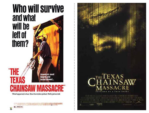
The Texas Chainsaw Massacre (1974 & 2003)

Oooh yeah, by now you can’t tell me that modern horror movie posters aren’t leaps and bounds ahead of the originals. The text and imagery work well together, as we are only given the briefest of looks at Leatherface through an image that echoes the grittiness of the film, both in style and location. The effect given to the text goes in hand as we are given typography that is only barely gritty, but is at the same time lovingly typeset. As for the original’s typography? Another movie title in quotation marks.
The Time Machine (1960 & 2002)

The remake is another one of those “well I guess it’s better” posters. The colours used are nice and aren’t over saturated. The glow behind the text works well and in tune with the shades of light from behind the main characters, but the menacing eyes in the sky are just a smidge overboard. Not to mention the copywriter should have just gone for it and boldly submitted “When would you go?” I must admit that the look of the new version is a nice change as it has that feeling of an illustration, rather than a photograph. A special mention – check out the bizarre creature so nonchalantly looking at you in the original.
When A Stranger Calls (1979 & 2006)

Clearly the remake is the better poster here. Typographically simple, all that black helps set the mood of what should be a terrifying movie. Perhaps it isn’t so bad when blown up, but the red gradient in the text feels uncalled for and the quality of the image in the phone is a little too crisp. Not because I think phones wouldn’t give that quality an image (obviously they can) but because it’s out of place. It should be desaturated and the screen should be scratched up and gritty like the rest of the phone. Not to mention the photo is upside down. The dirty arm in shadows is shockingly beautiful.
Willard (1971 & 2003)

And to round off the list we have Willard. The original is interesting as it’s so beautifully simple and gets you to think about what the film might be. Is Wilalrd the rat? Is it a rat? Why does the rat look so freaked out? But the new version is the winner for me as the use of lighting in the photo is stunning. Shrouded in darkness, Chrispin Glover looks longingly at his fury little friend. This one gets into your head because you can’t help but ask your self “… whats with the dude and the rat?”
Find out what it means to me
Respect is something that everyone appreciates. Everyone wants to feel respected by those they interact with and it’s no different when they interact with a designer. What is different in this case is that they interact through a poster. A lot of these posters, the remakes at least, lets the audience figure a thing or two out. I’m willing to be the posters you were most drawn to were the ones that asked a question, but didn’t answer it.
I think well over half these posters let the audience try to solve a small riddle. Who is this kissing couple? Is it envy or spite in his eyes? What’s with the rat?
Now think about those posters that didn’t raise any questions. They’re a little laughable, right? Exactly.
So remember to respect the audience. They’re smart, after all, you are, aren’t you? Why would they be any different? Create puzzles, stories and raise questions. It gives extra depth and shows that you really thought about the work you were doing and wanted to give the audience a little treat.
Oh, and as a sign of respect, I’ll apologise for there being no Z. S-W just doesn’t have the same ring to it.
The other parts
Part I (A-G) • Part II (H-L) • Part III (M-R) • Part IV (S-Z)
REFERENCES & LINKS
Speakup: Dark and Fleshy: The Color of Top Grossing Movies
A great article on the colour scheme of the higest grossing films, lovingly put together by Armin Vit at Speak Up.
Characters on the Silver Screen – July 2008
A great article at the Fontshop blog about the fonts used in a few movie posters from the last few months.
Wikipedia – List of film remakes
This is where I found all the information needed for the film remakes.
Master Your Craft.
Weekly.
Become the designer you want to be.
Join a group of talented, creative, and hungry designers,
all gaining the insight that is helping them make
the best work of their lives.