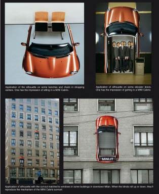
Some of the best and brightest creatives are in advertising. It is an area where most of the content is witty, beautiful, inspiring and memorable. But there is a darker side to advertising which often leaves a foul taste in the mouths of those who experience it at a constant level. Meaning pretty much all of us. I go into how I feel about advertising, but what I’m really interested in is how do you feel about advertising?
Love
It’s all about a good idea
It’s all about a good idea. Advertisers have a second to get your attention, elicit some sort of emotion, to become memorable and hopefully persuade you to purchase something. One second. Probably less. So at the core of this second is a good idea, an elegant idea. An elegant idea that needs to be wrapped in something beautiful, be it an illustration, photograph or typography.
This is what I love about advertising.
- Good, clever, elegant ideas.
- Brilliantly designed, illustrated, photographed or typeset pieces.
Of the above two, what is there to not love?

simply executed with powerful, witty photography.
Given the fraction of time given to get attention, the design needs to be fantastically simple, illustrating elegant ideas. Ideas that aren’t always all-bad. Ideas like donating to charities, or making a change in your life to make yourself feel better about yourself and more confident. Perhaps it’ll alert you to a product you’ve been waiting months for and is bound to improve your way of life. Not all awful things, no? And besides, if you don’t want to purchase something, you don’t! You just say to yourself ‘what a clever ad, time to keep moving’ and ignore it.

A lot of what we see is just plain awful, because most things don’t need to be over designed. A lot of people just want to cram a huge amount of information into a small space (think gossip mags). So when being bombarded by wads of information, a minimalistic ad can serve as a relief. Beautiful illustration, stunning photography, elegant typography and genius design can be a nice departure from pages full of photos and text crudely designed with the sole purpose of screaming at you. Oh and the copy! The witty, funny copy! You can’t tell me you haven’t laughed at an ad before! Or smirked in appreciation of a cheeky reference to a slice of pop culture.

It’s all so good because it needs to be so good. The advertising world is fiercely competitive, all those involved have to always bring their a-game, lest you lose the companies eight-figure account to those across the road. It’s not all bad, you might see them through the window! No, you need to be as good as you can. Almost everything needs to be almost perfect, because your client is spending the eight-figures on you, not those who you watch through the window eating lunch. You! Your idea. So it needs to be grand and fantastic and beautiful. It needs to be all those things to a million people a million times.

Because of this ferocious world that the advertising game has become, it has evolved quickly. War evolves technology; competition evolves ideas. So advertising has become a game for the very smart and very talented. Which of course, leads other very smart and very talented creatives to its arena, continuing the cycle of brilliant people coming up with brilliant ideas. Such beautiful ideas.
Hate
… But it goes too far. They’ve gotten smart. Really smart. Too smart. They’ve figured out how to infect us with the virus that is fear. But we’ll come back to that in a moment. For now I want to talk about why they use their powers for evil instead of good.
The client. The client, or the shareholders, or the board or whomever wants more units shipped. They want to increase sales, the bottom line needs to be prettier and the shares need to go up up up.
So how do they do this? Fear. It’s part of our nature to survive. Survival of the fittest is as evident now as it ever has been, it’s just that instead of being killed by the tribe across the river, you might not be as pretty, or hip, or cool, or sexy, or strong, or brave, or cutting-edge as those you watch eating lunch over the road.

We’re too old, too fat, too ugly …
our car is too slow, TV too small … x too y, y too x
I hate advertising because the people behind it are so good at making us feel or think a certain way, even if it’s only brief. So good at getting our attention and planting the seeds of emotion and thought that they can convince us of non-truths. We’re too old, too fat, too ugly, behind the times, unintelligent, our car is too slow, TV too small, couch too hard, x too y, y too x. We are inadequate, worthless and empty people. Luckily, this latest cream will smooth out our problems. We may be unhappy, but buying a product that costs more than you make in a month, more than your parents made combined in a month and more than it’d cost to feed a hungry family in a third-world country for six months will make you happier. Until a new model comes out. But then just throw out your perfectly fine current model, because it hasn’t got a doowhacky or smidgemort and buy another one and you’ll be happy again. It’s like one giant pissing contest.

Somewhere along the way it became easier to be convinced that we aren’t good enough the way we are, with what we have. It isn’t a case of eating right, drinking plenty of water, exercising and proudly aging gracefully. No, we need to hide all of these ‘weaknesses’; the age spots, the balding. Why? Because it isn’t what we see all the time and everywhere. What is normal must be that which is seen in every ad, right? Why else would it be up on that billboard, in that newspaper and magazine, on the TV, on the radio, in movies, on that taxi, bus and tram, on that guys shirt, that girls bag, that sign post, on the packaging, on this banana and that apple, above the urinal while you pee, on the road while you drive, on the seat-tray on the plane, the straw you drink from and the eggs you crack open. Ok, so I got a little over the top.. no one would put ads onto those last few things, right?
I’m not going to go all Bill Hicks on you here. Like I said earlier, some of the best design is in advertising as it needs to be the best. I just get scared when I crave Coke over Pepsi, or food that doesn’t taste good and makes me feel sick. I guess I’ll just have to go along and just enjoy the pretty pictures. I love advertising until it becomes time to tell me to buy something or when it becomes invasive. I want to choose to look at pieces of advertising without any effort to ignore it, unless it is so fantastic that I can’t ignore it, but am happy to see it.
That’s me out of the way, how do you feel about advertising? Do you love it, hate it, love to hate it or hate to love it?
REFERENCES & LINKS
Ads of the World For the love, Ads of the World is a great resource for ads.
Adbusters Because of the hate, Adbusters is where to go to revive the soul.
Master Your Craft.
Weekly.
Become the designer you want to be.
Join a group of talented, creative, and hungry designers,
all gaining the insight that is helping them make
the best work of their lives.


