Even when you’ve followed the plan perfectly, things go wrong. Especially if you’re doing creative work.
Even when you know exactly what works for you, what’s worked for you a thousand times, your own private little process, it isn’t impossible for a roadblock to be shoved in front of you. The feeling is awful – suddenly, instead of just thing that you need to keep working, you’re wondering why you bothered in the first place? You should have left it up to a real designer.
There’s one trick I love to use when stuck. It’s just a small exercise to try out after swearing, blaming the client, and drinking too much coffee in the morning and beer at lunch didn’t help.
Make an homage.
Once you’re sure the problem isn’t inherit to the job, that it isn’t the content that’s genuinely boring, and that you do understand it’s boringness thoroughly enough to design for it, perhaps it’s time to consider going back down memory lane.
Sorry Trees
It was Sorry Trees that I would turn to when I needed a rush of excitement and ignited inspiration. A monograph by English graphic designer Vince Frost, who was now living in the next state over, here in Australia; it’s a hefty size and never failed.
The work was exciting, original, and coolest of all, but unbeknownst to me when I first saw it, contained the poster that made me want to be a graphic designer.

Looking back, I now realise that the bursts of inspiration and energy that the work gave me was given form in small acts of homage. If I look back at my work from that time I’m sure I’ll see small echoes of Frost’s work everywhere – the way he’d bold use type, strong contrasts, powerful photography were all my borrowed tools.
Without realising it at the time, I was paying homage. So why not do it deliberately? Over time I’ve stopped going to that book, but not because I enjoy the work any less, but simply because I fell out of the habit. Upon recently going through it, I felt a kind of excitement I hadn’t felt in years and was reminded why I wanted to become a designer in the first place.
1. You have to be stuck, not bored.
Here’s the kicker – this isn’t an excuse to rip off work that you like.
The content of has to bore you, it has to be genuinely uninspiring, it has to be well researched, and the problem needs to be understood. You need to do all those important big-person-designer things before you start all this. You have to have sketched out a hundred ideas that didn’t work.
Why? Because if you’ve done all that and you’re still stuck, then pulling out this trick doesn’t feel as dirty – as if you’re letting someone else do the work for you.
2. Make a list of your favorite pieces.
“…everything we need in order to t ell our stories in a reasonable and exciting way already exists in each of us. Everything you need is in your head and memories, in all that your senses provide, in all that you’ve seen and thought and absorbed.”
– Anne Lamott, Bird by Bird, pp181
This is the fun part! Go nuts! Dig into your mind and pull form it the deepest memories of inspiration that you can.
It’s not the time to worry about what they are, what medium they’re in, what their message or audience was. It doesn’t matter if you feel that you’ve outgrown them, that you’ve moved away from where you started. It’s easy to think back to our earliest beginnings and see ourselve stumbling about, learning to walk and falling down constantly. Instead, focus on the fact that you were learning to start moving, the benefits.
3. Look at each piece, slowly, away from your desk.
Go offline if possible, the distraction is too great and easy otherwise.
Notepad in hand, start taking notes. Draw sketches and highlight the elements of each piece that you notice first, the way the photo stares out at you, the way it flirts with you and entices the eye to read the text hanging to the side. Now look at the smallest detail you can find. Look at how the lines of text are spaced so that the heading grabs attention but doesn’t float away.
To look at the work with the eyes you had as an amateur will start to stretch the muscles of memory, filling them with blood and energy and strength. In doing so you may ignite long-forgotten passions and ideas.
Looking at the work with the eyes of professional will help you appreciate the work in ways you wouldn’t have understood years earlier. When you see great work for the first time you notice the large shapes, the huge swathes of color, the face in the middle of the canvas.
It’s not until you’ve trained your eye and your heart and your mind to see the smaller details of the brush strokes and texture and lighting and graduation of colour does a piece of work shift from being beautiful to being breath-taking.
4. Forget about the final product.
Don’t worry about the audience, not this very second, just start to sketch digitally, letting those embers of excitement you felt while looking at the work ignite into something that’ll keep you warm.
That list of ideas and sketches and methods can serve you well as instructions. They’re not perfect, and you’ll end up with too many screws, or not enough brackets, but start building anyway.
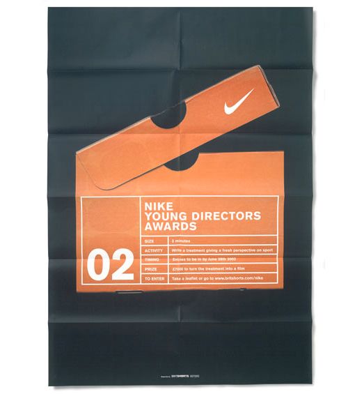
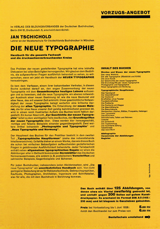
Borrow the orange and black colour scheme from the old Nike poster that you love, steal the grid from the German modernist that still excites you for reasons that you can’t explain nor understand, and maybe use a big fat ink-drown brush to manually write out the headlines.
5. Don’t show anyone, and revel in the mess.
I’m not going to lie, it’s probably going to look a little bit awful. Which is kind of awesome.
From this mess you’ll notice what doesn’t work and how to fix it. At this point you’ve used the amateur eye to do something exciting, so it’s time to do the professional thing and start to notice what doesn’t work and fix it.
The colour scheme might be close, but the hues are slightly out of whack – fix them. The balance might not quite work with the huge text and small photo, so make them more appropriate.
Don’t show anyone this work, this is just for you and maybe the person sitting next to you. It’s just an exercise.
It’s not a final product.

This exercise isn’t to end up with a final product – it’s to help you get unstuck.
By looking to the pieces that made you want to be a designer in the first place, you’ll hopefully be reminded of why you decided to become one.
There’s an odd kind of power in the earlier pieces of design that we’re drawn to, one that only exists for you alone. While others might have seen a fine piece of work, you saw something that might have changed the course of your life.
Much like a song can take you back to a moment of heartbreak or love, much like a film helps you remember your childhood and invokes you an energy that you thought long lost, much like a book reminds you of who you are, so too can design bring back inspirations long forgotten.
You’re not ripping someone else’s work off because chances are you won’t use most of it. You may borrow a piece here and there, make it your own, passing it through your own lens of experience, but that’s what inspiration is.
It’s important to always focus on the client and their audience, using the language that works best for them, not forcing your own ideals and nostalgia upon their message. In this exercise you’ll probably only borrow the things they’ll be too naive to notice, the things few will pick up on – a grid, or marriage of colours, perhaps a typeface pairing.
Getting Stuck Hurts
“What you have to offer is your own sensibility, maybe your own sense of humor or inside pathos or meaning.”
– Anne Lamott, Bird by Bird, pp181.
I know I’ve often hit roadblocks. Sometimes for minutes, sometimes for hours, I worry that I’ve made a huge mistake and that I’m a phoney about to be found.
I hear the dogs howling and the guns clicking. It can get awfully dark. It’s only natural, I hope. Doing creative work can sometimes come from a very personal place because it’s the culmination of every piece of work that’s ever inspired you. Paula Scher has said it before and said it well – when you’re hiring her you are hiring every movie she’s seen, every book she’s read, every piece of design she’s ever done. It all serves as a source book, unique to her alone.
It’s why we must fill up as best we can. But sometimes we run empty. It can happen in an instant. The wrong day, the wrong brief, the wrong client, and we find our barrel of inspiration has sprung a leak and suddenly we’ve gone thirsty.
Going back to the pieces we love, especially older ones that we’ve failed to visit in too long, is a good way of stopping the leak, and maybe, starting to fill up again. In a small way it always feels like a small way to pay tribute, a small thank you, to the pieces that first got us started.
Master Your Craft.
Weekly.
Become the designer you want to be.
Join a group of talented, creative, and hungry designers,
all gaining the insight that is helping them make
the best work of their lives.