I utterly adore the book. Especially when given shape in the form of crushed plant matter and ink. It makes me all warm and jelly-like.
I find myself tickled with delight when talk of a newly published design book trickles through. So, to indulge in this little addiction of mine, I thought I’d share some of the more interesting books relating to design and general creative thinking with you every month or so. I haven’t read any of the following (unless otherwise noted), and can’t completely vouch for their quality other than what I find in the publisher’s descriptions, the author’s past work, and, let’s be honest here, the cover. Plus a little gut instinct.
Writing and Research for Graphic Designers: A Designer’s Manual to Strategic Communication and Presentation
Steven Heller
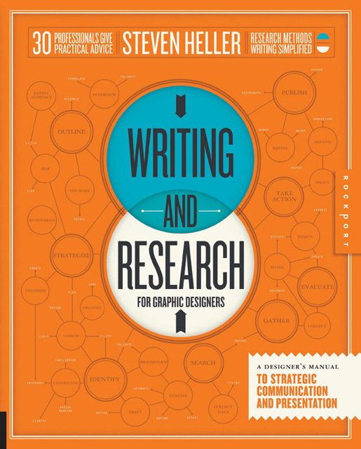
Hardcover // 176 pages // ISBN: 9781592538041
From the Publisher
For designers, wwriting and research skills are more necessary than ever before, from the basic business compositions to critical writing. In this competitive climate, designers are routinely called upon to make words about the images and designs they create for clients. Writing about design is not just “trade” writing, but should be accessible to everyone with an interest in design. This book is a complete, introductory guide to various forms of research and writing in design—and how they explain visuals and can be visualized. These pages address communication on various levels and to all audiences:
- Designers to Designers
- Designers to Clients
- Designers to the Design-literate
- Designers to the Design-agnostic
Being able to express the issues and concerns of the design practice demands facts, data, and research. With Writing and Research for Graphic Designers, you’ll learn how to turn information into a valuable asset — one of the key talents of the design researcher.
Alex’s Thoughts
I’m fairly sure Steven Heller writes, co-writers or curates more books each year than most people read. I could go on and on about Heller’s genius and how lucky we are to all be alive at the same time so we can enjoy is prodigious output year after year. I could wax poetic of the joy his books give me, and thousands of others. I could go on and on about brilliant his biography of Paul Rand is, or how Iron Fists: Branding the 20th Century Totalitarian State was that book I just had to have. But I won’t. Instead I’ll keep it simple:
When Steven Heller writes about design writing, you listen.
Sitting in the dark room, part of an audience of a hundred or so other designers, I was starting to notice a pattern that permeated the process of those who took to the stage. They all researched, often an incredible amount. It seemed as though they were spending as much time researching as I was designing. This was a small revelation to me – it was when the importance of research genuinely illuminated that dulled part of how I went about my work. In collecting information, understanding the problem at hand, the audience who will use the solution I developed, the client and their past products and materials, much of our work is done. The answer starts to become obvious, becoming easier to defend in the face of questioning clients. Best of all, it allows us to focus on the aesthetic expression of our concepts, as we know the concepts are strong. And, if we’re lucky, means that we can execute the solution in such a way that we can simply let it do all the work. All we have to do is keep quiet, letting our researched solution take centre stage.
I’m really excited about this one and cannot wait to get my hands on it.
Popular Lies About Graphic Design
Craig Ward
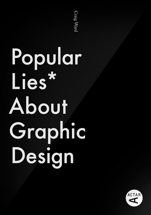
Paperback // 160 pages // ISBN: 8415391358
From the Publisher
Multi award-winning designer, typographer and TED speaker, Craig Ward, presents his first self-authored book – Popular Lies About Graphic Design. An attempt to debunk the various misconceptions, half truths and, in some cases, outright lies which permeate the industry of design.
Lovingly designed and written both passionately and irreverently, Ward pulls from his ten years of experience to tackle lighter subjects such as design fetishists, Helvetica’s neutrality and urgent briefs, alongside discussions on more worthy topics such as the validity of design education, the supposed death of print, client relationships and pitch planning. In addition, the book features contributions and insights from more than a dozen other established practitioners such as Milton Glaser, Stefan Sagmeister, Christoph Niemann and David Carson making it a must for students, recent graduates and seasoned practitioners alike.
Alex’s Thoughts
I think we all have this idea of what the industry would be like before we entered it, and perhaps for the first couple of years that we’re working, we take any little hint that we could be right about our preconceptions and magnify it about a hundred fold. How often is this at the cost of reality? I know I’ve wasted a considerable amount of time unravelling the ideas I’ve had that proved utterly wrong, time which could have been better spent moving forward, rather than catching up.
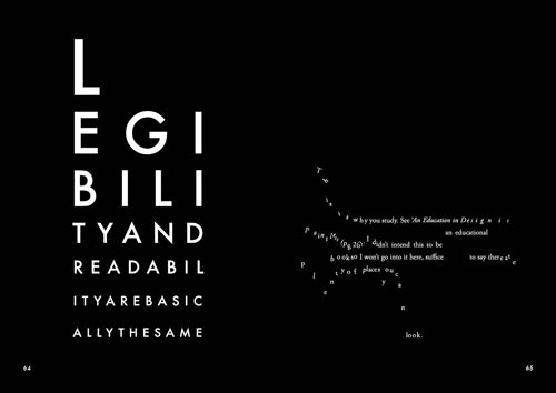
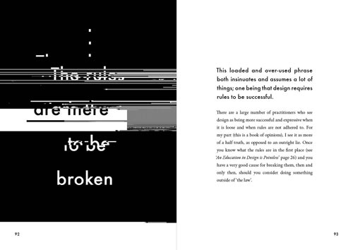
A book like this is a good reminder of how seriously we often take ourselves, and how strongly we stand behind nonsensical arguments, seemingly for the sake of having an argument to stand behind. It’s an easy habit to fall into – when we argue over the rules of our craft as if they were laws, we inflate their importance. Which is handy, so that when someone questions something we’ve done, we can point at our laws and, you know, scoff at them, because, like, they just don’t get, that what we’re doing, is totally, like, art, man, and, you know, they can’t be right, because, heh, they don’t know the rules.
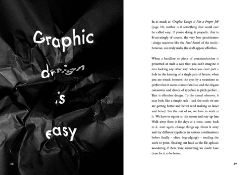
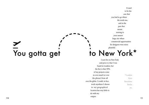
Ward bring his exceptional skills to the internals, and it’s no surprise that each title page is well considered and executed experiments in type, each with a heady dose of wit and craftsmanship. It serves as a great reminder of not only how clever one can be with just typography, but how much can be communicated with a single color. I can’t recommend spending some time looking through his folio enough.
Scripts: Elegant Lettering from Design’s Golden Age
Steven Heller & Louise Fili

Paperback // 352 pages // ISBN: 0500290393
From the Publisher
Seen in everything from wedding invitations and birth announcements to IOUs, menus, and diplomas, script typefaces impart elegance and sophistication to a broad variety of texts. Scripts never go out of style, and the hundreds of inventive examples here are sure to inspire today’s designers. Derived from handwriting, these are typefaces that are stylized to suggest, imply, or symbolize certain traits linked to writing. Their fundamental characteristic is that all the letters, more or less, touch those before and after. Drawn from the Golden Age of scripts, from the nineteenth to the mid-twentieth century, this is the first compilation of popular, rare, and forgotten scripts from the United States, Germany, France, England, and Italy. Featuring examples from a vast spectrum of sources—advertisements, street signs, type-specimen books, and personal letters—this book is a delightful and invaluable trove of longoverlooked material. 275 illustrations, 254 in color.

Alex’s Thoughts
I sat quietly, rudely ignoring our dinner guests, flicking through the pages. My sleeping mouth woken only briefly in fits of “oh, wow” and “that’s beautiful.” A friend had lent me her copy of this wonderful book, the second entry from Steven Heller in this months Designer’s Shelf, and I was simply blown away.
Quickly moving through a brief four page introduction, we are thrown into hundreds of pages of full-bleed images of some of the most beautiful lettering I have ever seen. Covering the countries mentioned in the Publisher’s description above, each getting their own short introduction, the range of the work is considerable, from type specimens to store-front signs. If you’re a designer, you’ll find this tome amazing. If you’re a letter, it’ll be inspiring, and if you’re the general public, you’ll probably wonder why on earth people get so excited about letters, then find a page that grabs you and embarrassingly sigh “ah, now I get it.”
And, you know, when Louis Fili says “hey, you should look at this”, why on Earth wouldn’t you do so?
Little Book of Lettering
Emily Gregory
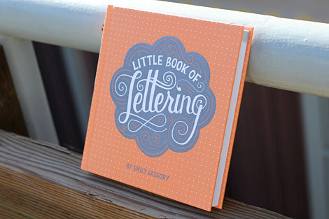
Hardcover // 192 pages // ISBN: 1452112029
From the Publisher
Typography is always one of the designer’s first considerations when it comes to making a statement, and in recent years the world of lettering and type has exploded in an unprecedented wave of creative discovery. Contemporary artists, typesetters, and designers of all kinds are exploring new horizons in illustrated and hand-drawn lettering, digitally rendered lettering, and 3D lettering. This collection—large in scope but petite in size—surveys the recent lettering renaissance, showcasing a diverse range of talent in gorgeous, eye-catching examples and profiling today’s innovators. In a stunning little package that expertly combines a handmade feel with a modern aesthetic, this is the ultimate inspirational collection of contemporary lettering for design buffs and type enthusiasts alike.
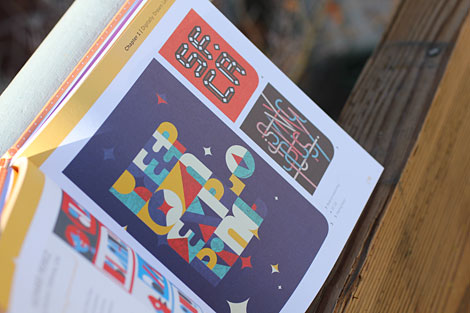

Alex’s Thoughts
After a look at historical scripts, it felt right to show off a book of contemporary lettering.
In the last few years, lettering has taken off in a big, beautiful way. I wonder if it’s born from the marriage of technological advancements and the slick corners and shiny surfaces it brings, and our seemingly inherit urge for the unique and natural. Lettering has always been the latter – something beautiful and crafted, using the skeleton of letters we can all draw, but presenting them in a wholly unique way. I’d venture to say that while this is a little book, it’s massive in its appeal.
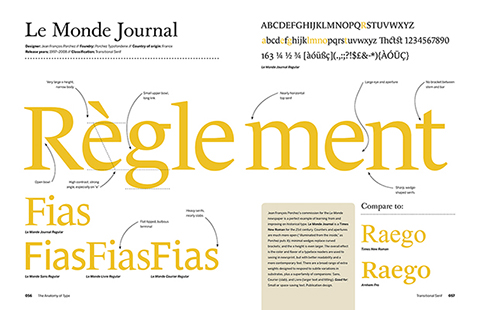
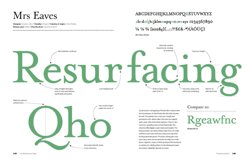
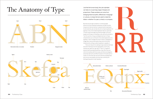
The Anatomy of Type: A Graphic Guide to 100 Typefaces
Stephen Coles

Hardcover // 256 pages // ISBN: 0062203126
From the Publisher
A visual treat for anyone who loves fonts and typographic design.
The Anatomy of Type explores one hundred traditional and modern typefaces in loving detail, with a full spread devoted to each entry. The full character set from each typeface is shown, and the best letters for identification are enlarged and annotated, revealing key features, anatomical details, and the finer, often-overlooked elements of type design. Containing in-depth information on everything from the designer and foundry, the year of release, and the different weights and styles available, The Anatomy of Type is more than a reference guide to the intricacies of typeface design. It is a visual send-up of some of the world’s most beloved typefaces, beautifully displayed in vibrant color.
Alex’s Thoughts
I’m embarrassingly addicted to Quora, and I think Stephen is a big reason why. He manages to answer what seems like every interesting typography related question that is thrown up, and the depth of his knowledge is astounding. This isn’t anything new, of course. Stephen has been educating us in all things type through Typographica and Fonts In Use. When I read that Stephen was releasing a book of his own, one which would help use develop our skills in type identification and appreciation of the craft, I got the kind of excited I normally only get when one of my favorite musicians announces a new album.
Thanks to the new life typography is experiencing via new technologies, droves of designers are starting to work with letters in ways they never have. While it might be normal for those who have worked in print to spend a considerable amount of time with different type families in a matter of a week or less, for web designers, this hasn’t been the case for longer than a couple of years. The information Coles gives us here is what this new group of type-loving designers need.
It’s worth noting that there are two editions – The Anatomy of Type which was released to the US market, and The Geometry of Type, released to the UK market. Why the difference? I’m not entirely sure.
The Elements of Typographic Style:
Version 4.0: 20th Anniversary Edition
Robert Bringhurst
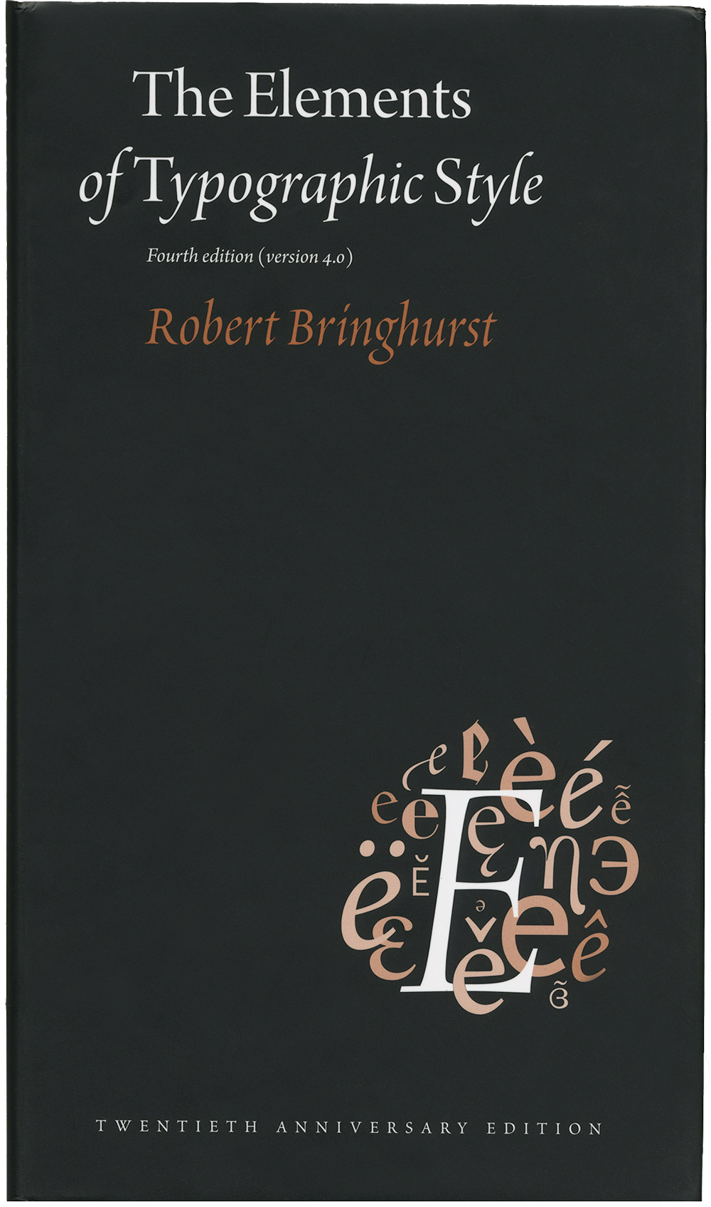
Hardcover // 352 pages // ISBN: 088179211X
From the Publisher
Renowned typographer and poet Robert Bringhurst brings clarity to the art of typography with this masterful style guide. Combining the practical, theoretical, and historical, this edition is completely updated, with a thorough revision and updating of the longest chapter, “Prowling the Specimen Books,” and many other small but important updates based on things that are continually changing in the field.
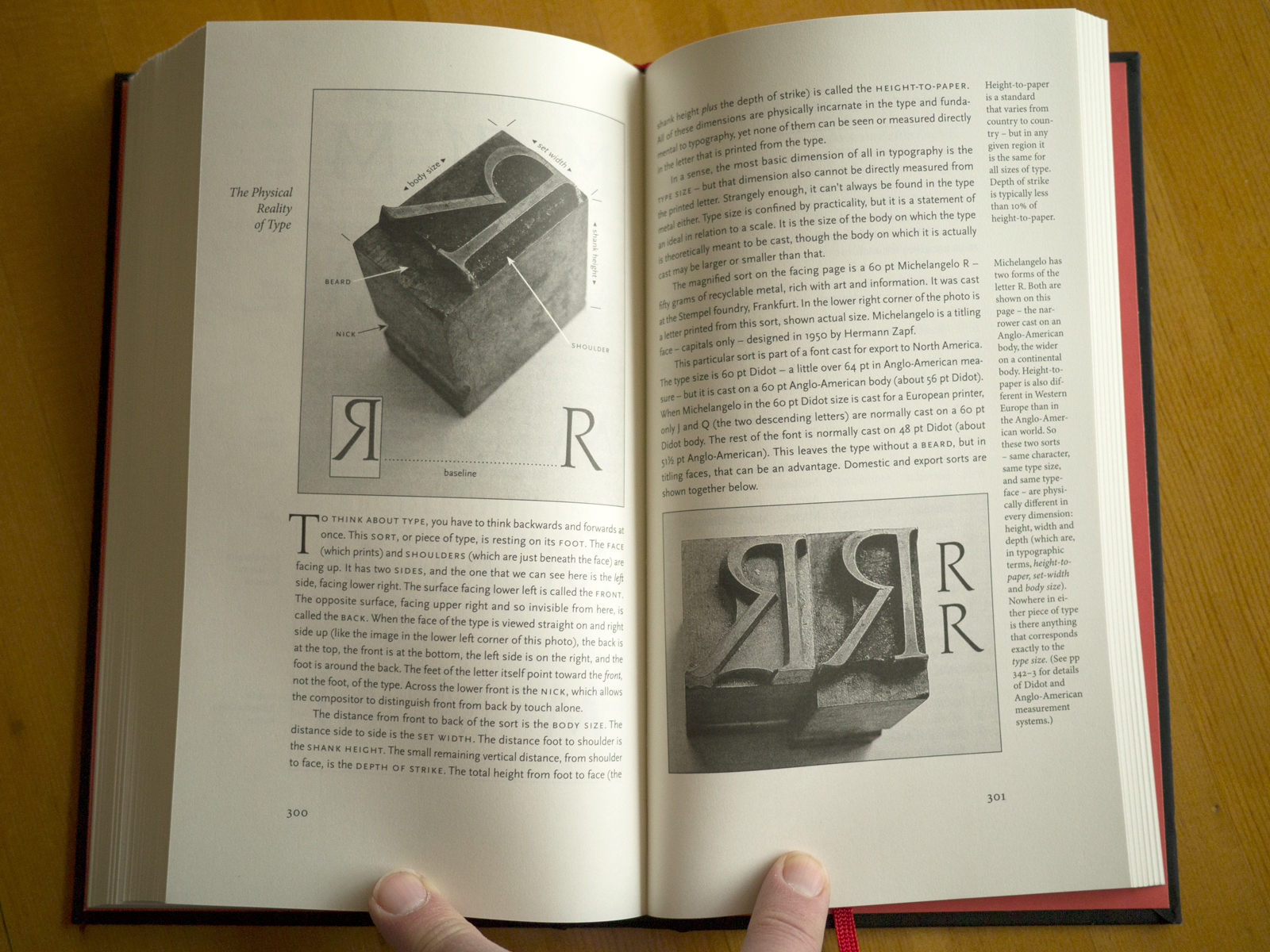


Alex’s Thoughts
Bringhurst’s Bible is a wonderful thing. But you know this, don’t you? You probably own a copy, maybe more than one. One question that feels awkward to ask, and even challenging to answer, is – is it still as deserving of its reverence. There’s no talk of webfonts, or the (not so) new mediums in which type is used. It might take some effort to explain it’s importance.
Elements has a place in the hearts of many (most?) of us, having paved the path into the beautiful gardens typography offers while we were students, either formal or not. While trying to justify why I should buy this new edition, in hardcover, I, without realising it, said “it’s probably the most important design book I own, I feel like I should buy the hardcover edition.”
It’s perhaps the book I’ve recommended to green designers more than any other, and I will continue to do so. It gives a grounding and understanding of typography, but at this point, it must come with the caveat that it isn’t modern practices that you’ll learn, but timeless fundamentals, ones which adapt to medium, even if at times clumsily or by force.
If you don’t own a copy, get this version, but know what you’re getting into – this is a book for those who care about crafting a page of any medium, not just a page of pixels.
If you do own a copy, then we both know why you might consider purchasing this new edition. Not for what’s been added (arguably not much). But because of what it is, and what it means.
There’s a great review by Maurice Meilleur at Typographica. Which is where I pinched all the above images from. Thanks Maurice!
Phew, where there it is! The first For the Designer’s Shelf! Let me know what you think – was there too many words, not enough words? Did you not care about the publisher’s description, my thoughts? Not enough books, too many books? Let me know, I’d love to hear what you have to say!
But most of all, I’d love to hear if there are any books in here that caught your eye?
Master Your Craft.
Weekly.
Become the designer you want to be.
Join a group of talented, creative, and hungry designers,
all gaining the insight that is helping them make
the best work of their lives.