Let’s be honest — most design books become nothing more than fancy bookends that hold in other fancy bookends.
It’s no surprise why — we love pretty pictures, so many publishers assume this is all we need. Just a few pretty pictures.
I don’t know who these publishes have spoken to, but the designers I know are enviably smart and don’t suffer fools, even if pretty and even if made of paper.

So we need real content — something to provoke, intrigue and teach.
And we need something that will last long enough to be worthy of revisit.
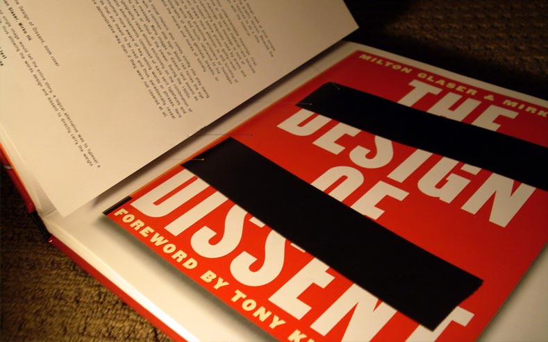
Consisting of a dash of theory, a splash of process and a dollop of history, The Anatomy of Design, by Steven Heller and Mirko Ilic manages to grip this fault-line pretty damn well. Being both beautiful and enlightening, it takes an interesting look at wonderful work and shows that “originality” hardly exists—and this is nothing to be bothered by.
The Anatomy of Design is a collection of projects that express the same ideas, or theories, in different ways, at different times, and most importantly, in different voices. It’s brilliant.
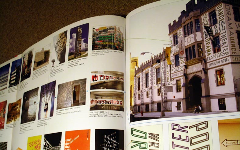
A culmination of parts

Design is often a meal of sorts — we throw ingredients into our pots, some of which we are familiar with and use often, others which are new and exotic, in the hope of having a beautiful meal at the end of the process.
What Steven Heller and Mirko Ilic have done with The Anatomy of Design is an attempt to realise these ingredients, whether or not the chef designer knew how they had been used by others.
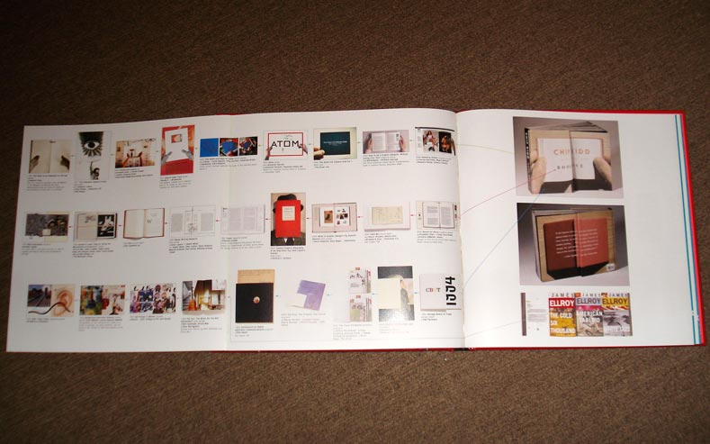
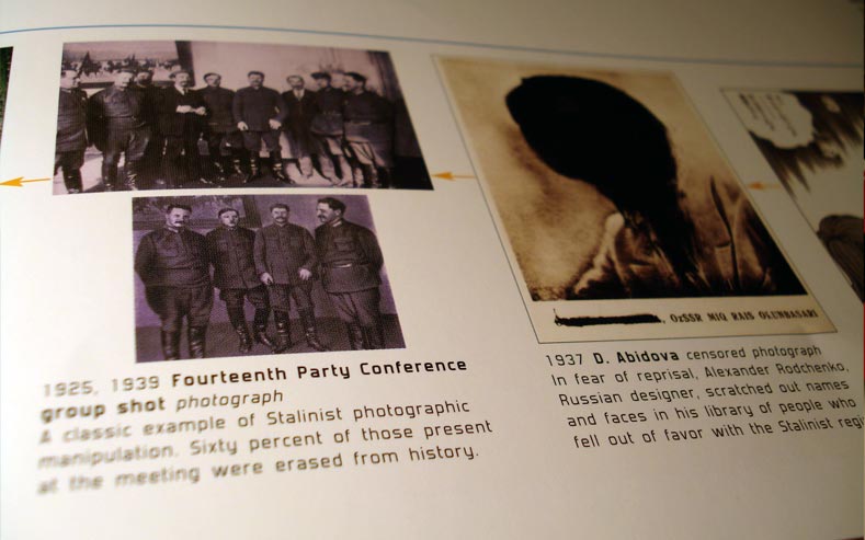
The duo dissect forty-nine (why not fifty? oh well) meals for us, looking at a range of beautiful work ranging in style, time and theme.
Each is broken down into a series of streams, highlighting influential, historical and just plain beautiful pieces of work that proceeded the featured piece. They look at imagery, message, style and other elements to understand where it sits in a historical context of similar works — it’s kind of a natural selection for design.
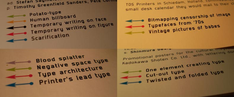
The streams range from elements used (lead type, stock photography, type in a grid), to styles and techniques (op-art, collage, ripped paper) and often the just plain fun (“Lots of things piled up neatly”, “Defacing faces” and “Human billboard”) highlighting as many as five per featured design.
The amount of effort and the massive variation in source material is astounding. Work from around the world, from large studios and freelancers, old, new, known and the unknown are all on show. Even better is an impressive amount of knowledge that show that either the authors are mad-scientist smart about design or they can research like its nobodies business. Considering who the authors are, I’d say it’s both.
The authors didn’t set out to show the literal origins of the work featured. Instead, they wanted to show the “time-line and influence” of various ideas, elements or styles used in each. This is what’s great about this book — it quite simply shows that nothing is never truly new; everything has been done before in some way and all we can try to do is make it new by saying it in a different way that is shaped by an infinite number of influences.
Many of the ideas had, even though perfectly appropriate in their application, have been had before, we are simply shown how these ideas have been expressed by others.
Which is quite a relief to realise — we often strive to create something original, fearing that we’ll be found out if are too heavily inspired by the ideas of others. I’ve known designers who avoid looking at the work of others as they strive for originality. But too much is to be lost in doing so — why not be influenced by the wonderful things we can show ourselves. Flick through these pages and you’ll realise that there is plenty of wonder to be enjoyed and used in our meals later.
Words! Actual words that form sentences! Ha!
A lesser duo might have just left it there — at series of images showing the same ideas in different contexts. I’m grateful this isn’t the case as our authors did something not enough design-writers do. They wrote copy. Great, wonderful, intelligent copy.
While this book is inviting because of the imagery (although the smaller pieces are occasionally just too small), it’s the few-hundred words that accompany each piece that makes this book valuable.
The writing to be found is rich in historical references, discussions about the work featured, the process involved, some cool wit and interesting quirks that relate to the time, the idea or the execution.
It’s good. Very good. The writing is rich in voice and informative enough that you’ll read it before you look at the images in detail, then again once you’re finished. It adds a great depth of understanding that would otherwise be lost if this were a book about pictures.


The Anatomy of Design is a book I return to often, having yet to grow tired of it.
It’ll find an adoring home on your coffee table and is great for referencing inspiration. It also cures a sense of self-loathing when you realise how close that work you’ve always liked resembles the piece you just produced in concept or execution, or even worse, discovering a historical piece of design for the first time and realising that it looks similar to the one you just sent to print. Our minds haven’t evolved much in the last couple hundred years, so chances are that two creative people are bound to travel down similar paths to find similar solutions to similar questions.
It’s still a surprise to me how much I enjoy this book. Having had it for a couple years, it should have become a little dusty, a little forgotten. Or perhaps still have a few pages which are held together by glue yet to be cracked. But there is great pleasure to be found in flicking through it and remembering that the great dishes that we admire (as well as the ones we make our selves) are made of many ingredients often forgotten or used greatly by others.
Master Your Craft.
Weekly.
Become the designer you want to be.
Join a group of talented, creative, and hungry designers,
all gaining the insight that is helping them make
the best work of their lives.