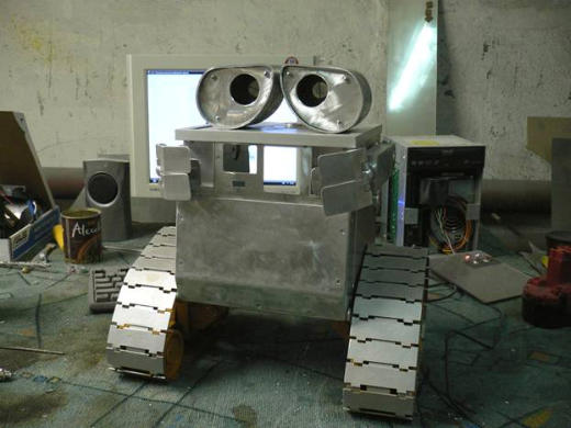
To be found this week is much in the way of publications. There are beautiful books, metal type, respect to white space and dramatic contrast in type sizes between body and heading. Not to mention a great deal of care taken in choice and positioning of photography and illustration. Everything I adore about publication design, be it magazine or book, online or off. There is also patterns and blades, a Wall-E cases mod which’ll do well to cure any bout of laziness you have once the amount of work involved is witnessed and you’ll want to keep your hands anything but idle.
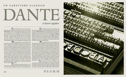
Tipoitalia
An interesting bilingual Italian magazine dedicated to all things typographic, from type design to history and good design.
The work held within is both beautiful and informative and is well worth browsing through and absorbing a little bit of type knowledge and inspiration.
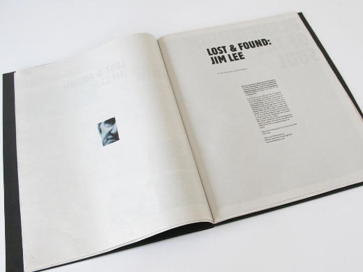
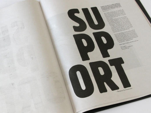
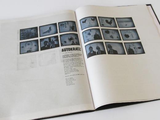
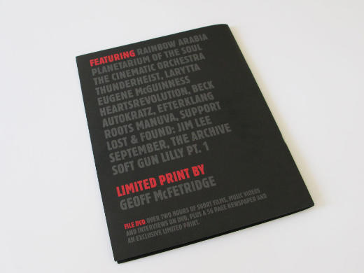
File Magazine
I’m enjoying the typography of File Magazine. Simple and beautiful, well balanced and a nice strong focus on photography. Lovely! The bravery in use of white space is to be commended, especially when one can get away with managing only a couple hundred words to a page and not have the space look empty.
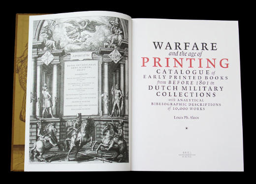
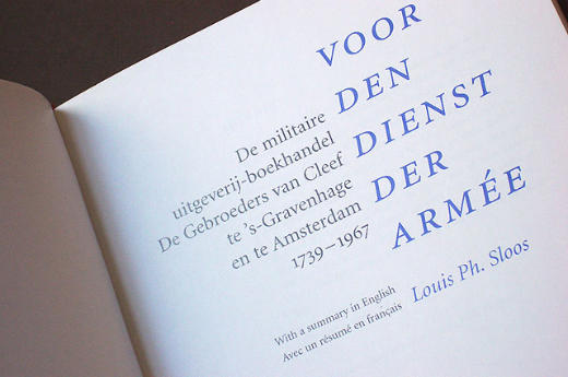
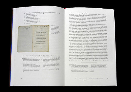
Bart de Haas
Some seriously slick book design to be found at the portoflio of Bart De Haas. I wish I could post more images, as the selection on his blog is quite amazing. All clean, structured and yet not boring or dull. The design does exactly what it should – gets out of the way as to let the content shine throuh and speak clearly.
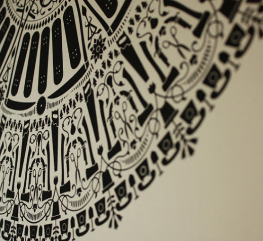
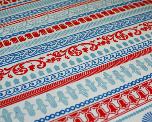
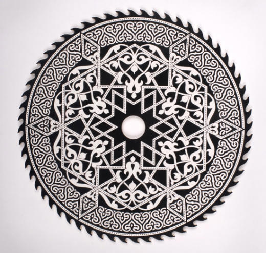
Dan Funderburgh
The contrast in feel of Dan’s work is what originally caught my eye. Delicate patterns inside blades, florals on a coat of arms and a rainbow made of sharp edges is what is on offer at his portfolio. Oh, and it’s all beautifully letterpressed.
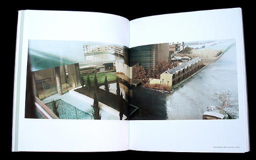
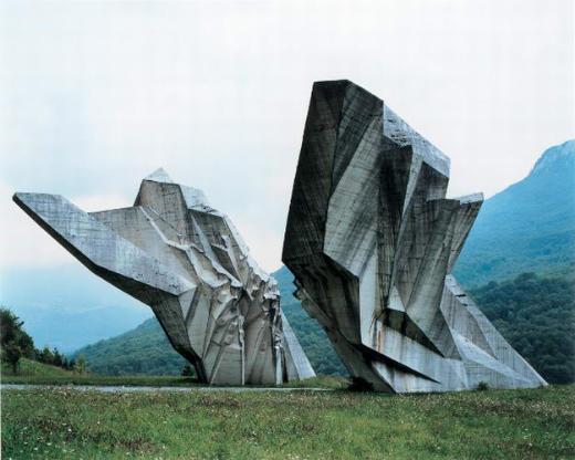
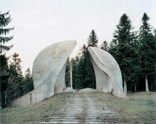
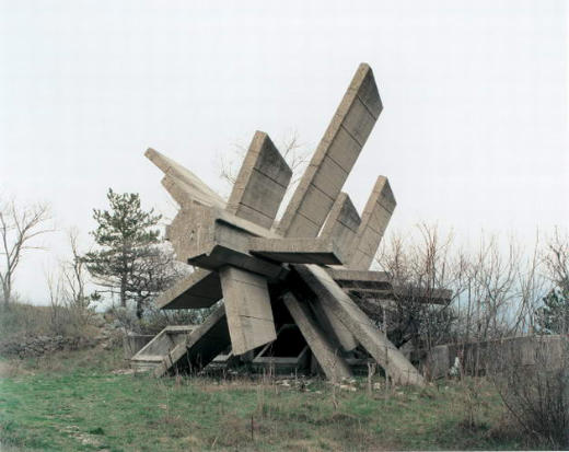
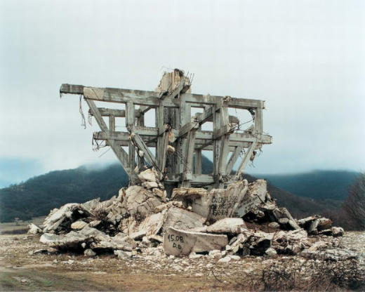
Spomenik: The End of History
A few weeks ago I linked to a photographer who took photos of some amazing and unique architecture from Europe during times of dictatorships. It looks as though Jan Kempenaers is of the same thought. The collection below is a small sample from a smaller-than-I-wish-it-were portfolio. Enjoy!
Excerpts From The Annals of Everyday Life
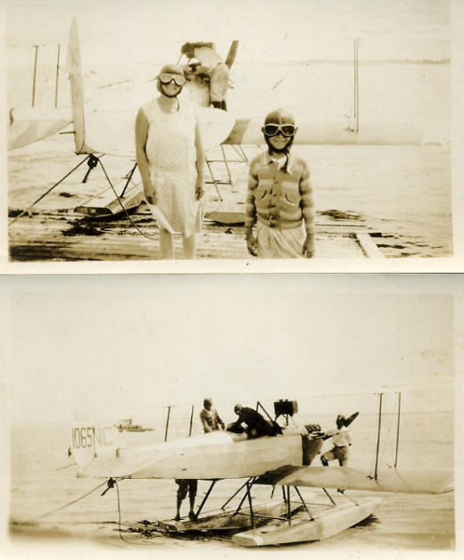
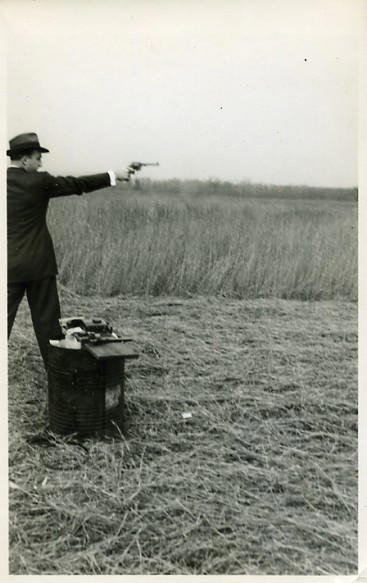
An amazing collection of photography mostly from the first half of the 1900s, which is in an effort to give us a “a few notes towards a complete account … of everything that has ever happened” in America.
Some are beautiful as they show a romanticised past and moments of social break-through, while there are others that show us smiling Klansmen and Nazi Flags, but all are taken by amateurs and collectively tell a rich story.
The site isn’t the easier to navigate on the web, so from the link in the title above, make your way down to the bottom and find a few curated collections, otherwise, click here to find a few random bits and bobs.
Wall-E Case Mod
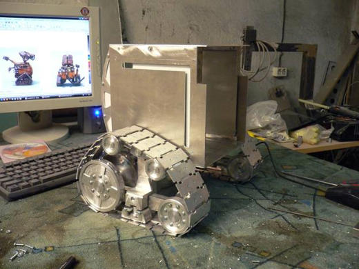
I’m some what familiar with the world of case mods. I was quite the computer nerd earlier in life and would salivate over transparent cases with lighting, embossing on the side of cases, external fan controls and whatever other trick was going around at the time. But I never found anything quite this beautiful.
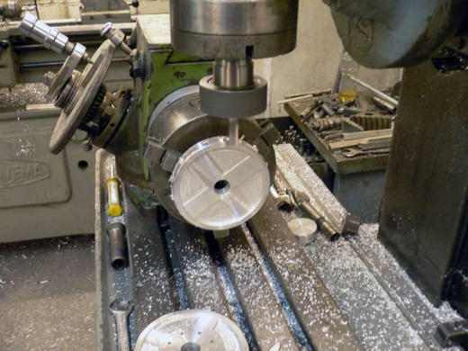
This took 18 days to complete after the creative behind it saw the Pixar masterpiece. It’s solid metal, with each piece cut from sheets. Click the link in the title above to see many, many more photos than what are below.
The Tarantino Mixtape
Found via Scene 360, this Tarintino mixtape is just fantastic. At first I thought it would be nothing but painful to watch, but the syncing between the music and the editing suckers you in! From the the clever Electric Method.
“A personal style is like a handwriting—it happens as the byproduct of
our way of seeing things, enriched by the experiences of everything around us.”
—Massimo Vignelli
Master Your Craft.
Weekly.
Become the designer you want to be.
Join a group of talented, creative, and hungry designers,
all gaining the insight that is helping them make
the best work of their lives.
