Second week in and this stuff is still fun to put together. Today, I present to you, monsters of the typographic kind, the darling Maira Kalman, type from the streets, school-day style type, an RSS feed worth subscribing too and a bad-ass type game. Yup, looks like this is a type heavy links post this week. Enjoy!
KERN iPhone game
A typography game for the iPhone, the goal of KERN is to correctly place a letter into a falling world so it’s, you guessed it, kerned. Fantastic!
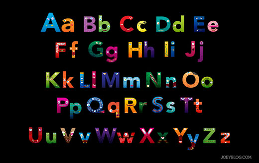
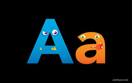
Letter Monsters
I’m in love with these letter monsters by Joey Ellis, who put them together for his son to learn his alphabet. Which letters do you like the most?


Stuart Tolley
Stuart Tolley’s name has come up a little recently because of his role as Art Director of the Peaches (the Sir’s daughter) Geldof and editor James Brown’s new venture in publishing – Disappear Here. The content of the magazine and direction has been questioned and without seeing the full magazine, it’s hard to pass judgement without relying on the words of others. That being said, Stuart Tolley is clearly capable of producing some outstanding work – perhaps it’s the direction of the 19 year old “editor” that’s the problem with Disappear Here? Either way, sit back and enjoy a sampling of Stuart Tolley.


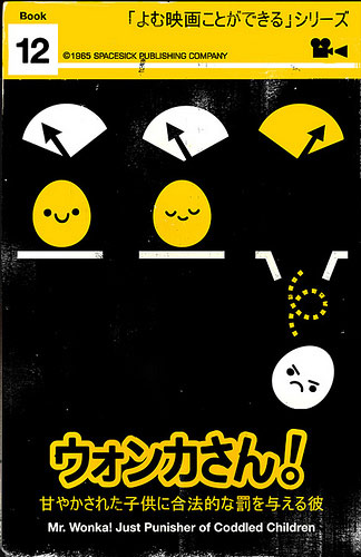
Spacesick Photostream Feed
One of the best moves of my week was subscribing to the RSS feed of Spacesick’s flickr account. The brilliantly applied textures, colours and the illustration style just suits the era that he’s going for perfectly. The attention to detail is just right – not going over the top with the textures or repeating himself too often like so many do, the public library style damage and repair is icing on these beautiful cakes. His work is fantastic and he absolutely deserves the attention he’s been receiving. Sign up to his RSS feed and get his updates daily – a good way to ensure a grin a day.


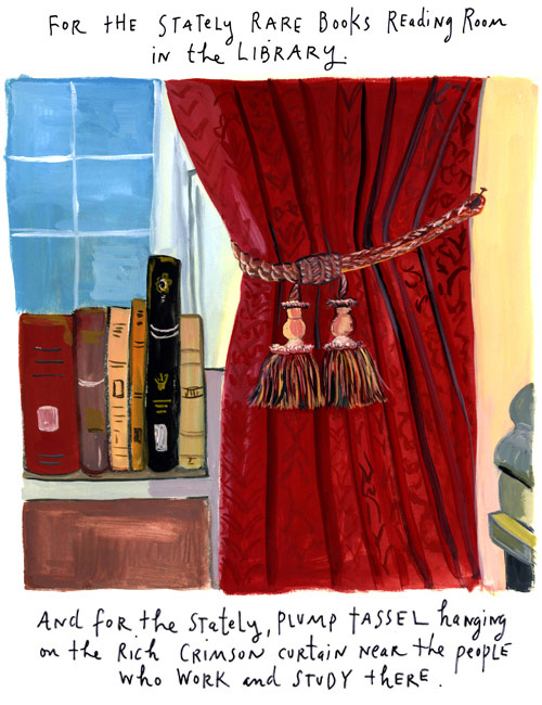
Maira Kalman and the Pursuit of Happiness
I was so pleased to read that Maira Kalman has a new online column over at the New York Times that she will be contributing to on the last Friday of the month. Grab yourself a cup of tea and enjoy the dozen and a half or so illustrations already online. [Just as a side note, I picked up her illustrated version of the Elements of Style and it’s a real piece of gold – go pick yourself up a copy.]


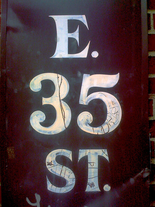
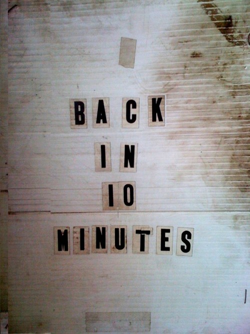
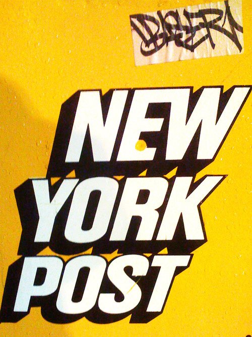
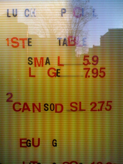
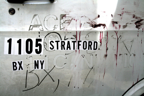
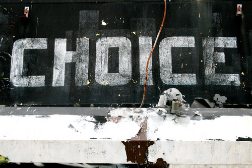
The Journal of Urban Typography
I moved away from one of the best cities in the world (beautiful Melbourne, Australia for those playing at home) and whenever I return for a visit, one of the things I love the most is the huge array of cheap and nasty typography to be found in shop windows, on walls and pretty much anywhere that someone needs to have themselves heard. The Journal of Urban Typography gives me my fix whenever I’m home sick.


So, how much does Sagmeister charge?
Made You Look is one of those design books I’ve wanted forever, yet haven’t been able to find. Luckily there is a new run being printed, which should make it easier. One thing about the book that makes it extra interesting is a credit section, in which the projects covered are given a rating, from 1 to 5. And surprisingly enough, we are given the time spent and money charged for each job. It’s just money, right?


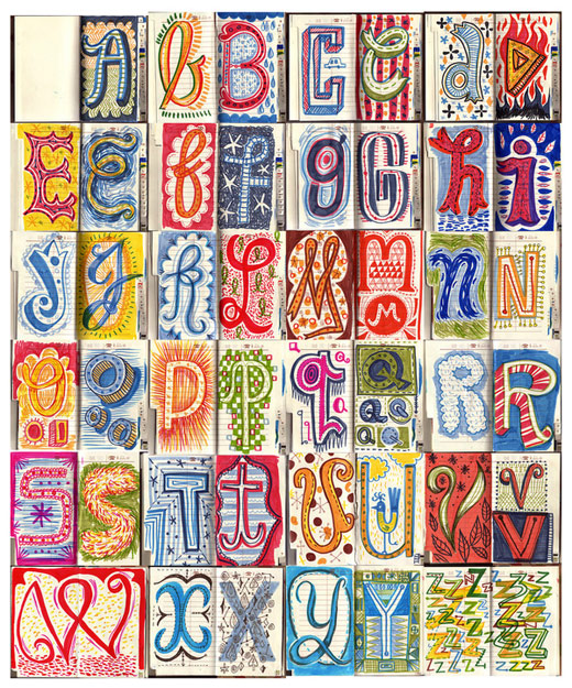
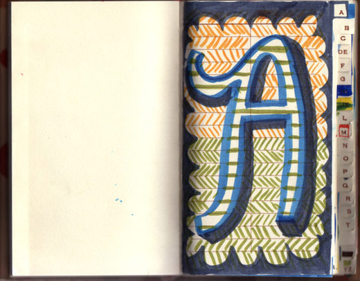
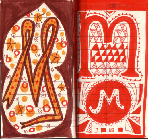
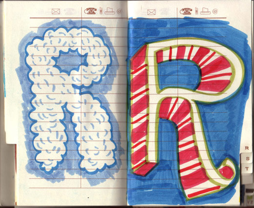
Lettering Sketchbook
I really love these lettering sketches! The child-like scribbles remind me of the front pages to assignments we all did when we were in primary school. So playful and innocent.

Have a good week everyone!
Master Your Craft.
Weekly.
Become the designer you want to be.
Join a group of talented, creative, and hungry designers,
all gaining the insight that is helping them make
the best work of their lives.