It is a good day to come to the races ladies and gentlemen, we are here today to witness something beautiful. Something elegant! These ponies are going to fly through their air for your amusement! We have the unforgettable Oceans 11 looking far stronger and faster than its older brother, Eddie Murphy ruining yet another piece of creative output, several horses of horror that’ll knock your socks off and a 44 year old backed by Alfred Hitchcock that’ll knock the pazaz off it’s competitor.
The other parts
Part I (A-G) • Part II (H-L) • Part III (M-R) • Part IV (S-Z)
The Manchurian Candidate (1962 & 2004)
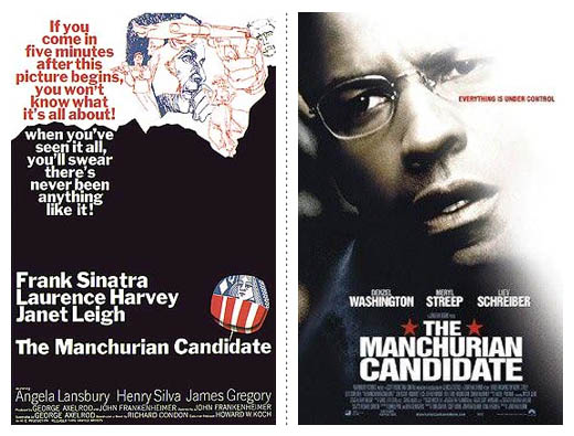
The remake of The Manchurian Candidate sports a better poster than its original. A good sense of hierarchy, you don’t get the feeling the names of the actors is more important than the title of the movie. Even though in the original this may have been the case. The typography is strong and the layout is nicely balanced. All except the tag line that Mr. Washington is crying.
Mighty Joe Young (1949 & 1998)
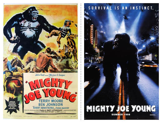
Survival is an instinct. Red is a colour. Water is wet. Thank-you for the advice. This one line pushes me to prefer the original, even though we’re being spoken to for no apparent reason. I’m really starting to dislike taglines. Bitterness aside, the newer version isn’t awful design-wise at all. The type is nice and simple and they didn’t just use a roughed up font which most do, so no repeating textures in multiple letters. All the darkness with splashes of bright lights works well, and light through dust/smoke/clouds is always interesting to look at.
The Mummy (1932 & 1999)
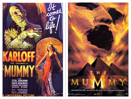
The Mummy cops an eye-full in the original. Clearly, over 60 years later, there aren’t as many women for the Mummy to be looking at, so he’s having a good ol’ yawn.
Mostly Martha/No Reservations (2001 & 2007)

Another one where the characters in the original actually look like they’re into each other. Not that the “we’re opposites, so we’re going to lean our backs against each other, but we’re kind of into one another, so we’ll have a glance” look isn’t inspiring on the sepia-toned, flat background.
The Nutty Professor (1963 & 1996)
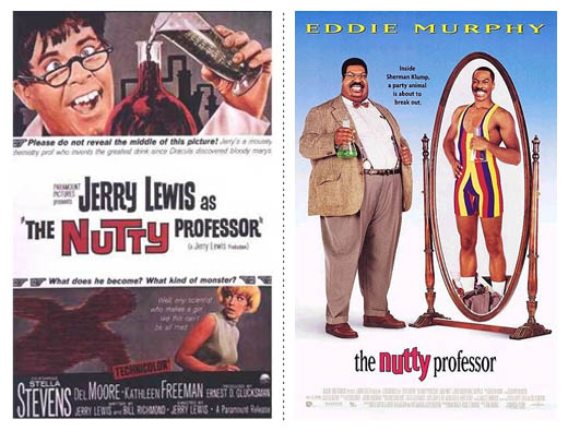
Not only is the presence of Eddie Murphy wrecking films these days, but it’s also wrecking posters that look like they were designed in Word. Stretched text for the stars name, Murphy in a fat suit and a white to blue mystery gradient in the background make the newer version a loser. I do hope I’m wrong about the text being stretched out and it actually is the font, but I’m not so sure.
Oceans 11 (1960 & 2001)
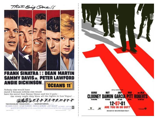
This is one my favorite comparisons. Both films were what they were because of who stared in them. The first one isn’t even subtle about it, but the second one couldn’t be more subtle. The original went as far as having exclamation points between Frank Sinatra and Dean Martin, while having all the actors names the same size as the title of the film, and large illustrations of all those involved. In the 2001 version above? Not one face. A movie staring some of the biggest names in the industry this decade, yet we don’t see a single face. Instead we have a stunning combination of red and black in a beautiful, simple illustration.
[It should be noted that this is a good example of what I mention in the introduction: these are the posters Wikipedia gives as the theatrical versions when I wrote this article. Are there other version of the Oceans 11 poster with the actors faces? Of course.]
The Omen (1976 & 2006)
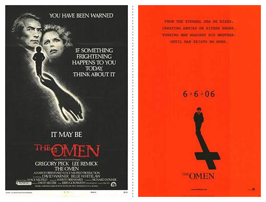
Oh man, this is a good one. Both use red and black very well, both have good typography, good direction for the eye and are both elegantly creepy. But for me, the 2006 version is better. Why? Because it’s almost bad. It’s almost tacky and the layout feels like a student project, yet something about it throws it into the realm of beautiful work. Which is what makes it memorable. The upside down cross and the 666 being the strongest piece of typography aim this at exactly the audience worth aiming at for this film. I like it because it dared to be the opposite of so many modern film posters. It isn’t filled with photos of the stars, it isn’t brightly coloured, it isn’t overly noticeable in itself, which are all strong points. If you put this on a wall full of brightly coloured, photoshoped faced and filled to the brim either with photo montages or type, it’ll be noticed. You just have to love the underground night-club flyer look.
The Parent Trap (1961 & 1998)
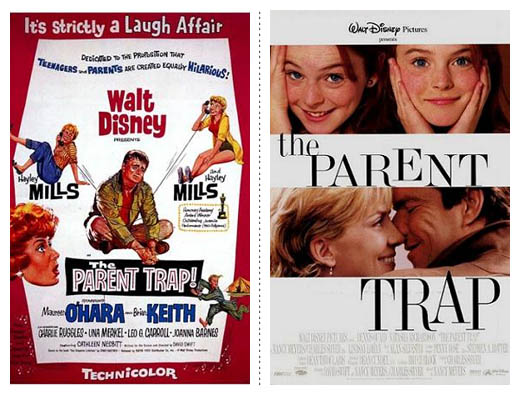
The original is fantastic for one reason. The father looks miserable. Absolutely miserable, exactly what you want to see when going to go see a Disney family comedy. Nothing is going to get a parent to take their kids to this movie more than seeing a miserable adult in the poster. Also, I might just be a little slow on this one, but what’s with the floating E and A in the 1998 version? Granted, it’s a lovely font, therefore the floating letters are lovely, but they’re just a little odd. Design-wise, it isn’t even really a question, is it? The 1998 version is laps ahead. Simple, no taglines, actor names aren’t shown and it just works as a somewhat time less piece of design—that is to say, it doesn’t feel stylistically conceived.
Dial M For Murder / A Perfect Murder (1954 & 1998)
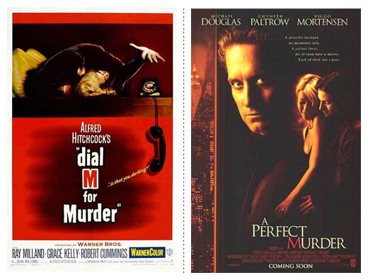
A Perfect Murder. A perfectly generic movie poster.
The red M is a great throw-back to the original though, assuming that is the case.
Planet Of The Apes (1968 & 2001)

While I prefer the 1968 because of the colour, the black boxes for the cast/title information and the illustrations of the ape, I do like one aspect of the newer version very much. The cast shows the apes as if they were real people. The faces are big and aren’t hidden away – it wouldn’t have been surprising to see only Mark Wahlberg’s face, but no, we get the monkeys too. Good move! I do keep coming back and enjoying the original over the new one in all other respects though. The original is just so different to any other movie poster, so this daring originality makes it the clear winner.
Nikita / Point Of No Return (1990 & 1993)
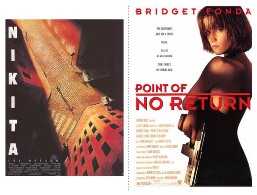
Such a fall from grace. The beautifully illustrated version from only three years prior gets remade into a oh-who-gives-a-crap disaster. I get more emotive response from the character in the original poster, and we don’t even see very much of them aside from this birds eye view. The type is simple, put to the side as to not get in the way of the real hero of this poster, the artwork. The title is subtle, without being weak and I feel has been masterfully hidden in the shadows, not slapped wherever it can fit, filling every little space found, ala it’s younger sister.
The Producers (1968 & 2001)
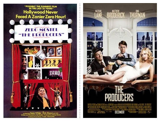
The 2001 version is simpler, with less to try and grasp visually. The 1968 version has too many elements to it and is harder to absorb because of it. There isn’t a main focal point and the title text is harder to read than the tag line at the top. 2001 works because of a few reasons. It isn’t too over the top, the text is rather subdued and there isn’t a tag line, which is always nice to see because they almost always come off horribly tacky and condescending. You can instantly tell the type of people the main characters are and the imagery works in layers visually (first the desk, then the room, then the city) rather than being flat, which is odd as it’s setup to look like a stage set.
Prom Night (1980 & 2008)
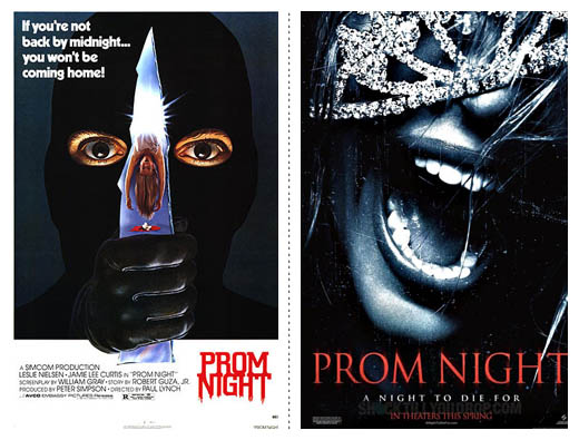
Ok, neither of these are fantastic. The original isn’t awful and is a little terrifying, but for some reason I almost want to have a giggle at it. The newer version isn’t exciting, but that image just doesn’t work for me. Perhaps it’s because the teeth are so clean, or perhaps it’s because if the photo were in colour and the font a sans-serif, you wouldn’t be blamed for thinking the girl is having a top night out and is laughing.. almost. However, it is on the side of design that this poster is saved. A tagline, yes, but it looks nice and is part of the design, not living on top of it, and as always worth mentioning, the focus is on the imagery, with the design supporting the photo and letting it do all the heavy lifting.
Manhunter / Red Dragon (1986 & 2002)

This is a fun one because while looking at both of them, you can’t help but feel that either the designer/team behind the 2002 version were creating an homage to the 1986 version, ripping it off (I kinda doubt it) or if it’s a complete coincidence. The new version is obviously the stronger version, with the Doctor looking right at us in his devilish way. There is a little bit too much copy used because of the two (!!) taglines and the big cast, but it’s not the ugliest thing in the world. Something worth wondering about though, is if you have so many well known actors, do their names even need to appear at all? Wouldn’t worth of mouth work quite well? All it needs is some farva beans and a nice Chianti.
The Ring (1998 & 2002)
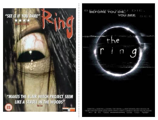
Come on, do you even have to ask? The 2002 version is infinitely better, even if the 1998 went without the tedious Blair Witch reference. As with a couple of the posters so far, the ‘Before you die…’ tag line screams marketing people crowbaring it in somewhere. The subtleness of the worn-out video tape look and the child-like scrawlings of the title are just beautiful. Notice no screaming lines of text with the actors names, nor any quotes from critics? Just.. just a tag line.
Keep it simple stupid
There is no need to include that which does not pull its weight.
Looking at these posters, that is what I’m left with for most of the winners. Strong in photography, typography and design.
The other parts
Part I (A-G) • Part II (H-L) • Part III (M-R) • Part IV (S-Z)
REFERENCES & LINKS
Speakup: Dark and Fleshy: The Color of Top Grossing Movies
A great article on the colour scheme of the higest grossing films, lovingly put together by Armin Vit at Speak Up.
Characters on the Silver Screen – July 2008
A great article at the Fontshop blog about the fonts used in a few movie posters from the last few months.
Wikipedia – List of film remakes
This is where I found all the information needed for the film remakes.
Master Your Craft.
Weekly.
Become the designer you want to be.
Join a group of talented, creative, and hungry designers,
all gaining the insight that is helping them make
the best work of their lives.