A list of numbers that make it easier to set type. But why these numbers? What relationships do they hold with one another? Is there some mythical secret held by the casters of the fonts of old? Why is it that when you combine 8, 10, 14 and 36 points of height something beautiful happens? In an effort to better understand this list of numbers I did that which excites any warm-blooded designer – I played with typography.
In its infancy, typesetting was much less an avenue for creative expression than it is today. That isn’t to say there was no beauty in the work done, it was more a case of limitations of technology. Which is an odd thing to say, as it was because of this technology that the rules could exist in such a defined manner. The typesetting was deliberately strict because it was now possible for it to be so. When our letters went from being written by scribes to being moved by the typesetter, the creativity in the hand-crafting turned into an element to be held by a different group of hands.
The Typographic Scale
With this new ability to set size, spacing and layout in stone (or metal), it is no surprise that some habits became ruling and some rules became habit.
While we are now able to set our text size at whatever we please, in the time of the true font (metal type in one face at one size of one weight), a number of predefined sizes were the norm.

I pondered the meaning of the sizes included in this historic scale that is now routinely found in virtually all applications that you let work with type. I wondered their relationships to one another. I tried to understand the increments and if a formula was used to get to these numbers. I wanted to figure out the secret in this list of points.
Then the obvious hit me
It hit me hard. It isn’t in the sizes of the fonts that relationships of hierarchy solely exists – that’s something for the aesthetic sensibilities of the typesetter to decide upon, not something to be spelled out by a list of numbers. No, the sizes were chosen because of convenience as much as they were because of some special, fancy-pants relationship they shared. The scale is more of a guide. A way of saying ‘if you stick with these sizes you’re given a hint to develop beautiful typography’.
Read almost anything on the typographic scale and it’s juxtaposed with the notes of music and it’s easy to see why. Imagine someone sitting down at a piano, having never played, but knowing that if they stick their finger on a key at one end and run it up to the opposite end, it’ll make a little bit of noise that may be considered musical. But really, it’s bit of a cop-out, isn’t it? Now imagine someone who knows how to handle those keys, those notes, sitting down and playing something befitting to a king. They play with the notes, they have them dance and swing together. The same can be said with the notes of the typographic scale handled by an artist whom knows their instrument.
While you might be able to go, bam! 8pt for body, 10pt for headings and 14pt for title, you’re really just emulating the amateur pianist’s fingering of the keys from one end to the other. Much like the musician who has the notes dance, it’s the time around those notes, the space around your text, that will make a real difference. This is where the scale gives you some more hints.
The notes of the typographic scale serve as a guide, as options that one can use, and if used properly, can create some beautiful music.
Of course, the other reason predetermined sizes would have become the norm is because it makes it easier for printers and typesetters and publishers to work. Much like all the printers of today work with Pantone colours, having most printers carry the same, or close to the same, fonts meant that things were easier for everyone from the typesetter who may have apprenticed at the print shop in another town, to the metalworker who could cast multiples of the same font and sell them to different clients, all of whom are safe in the knowledge that these fonts work because they’ve worked before, for that other printer. But I digress.
Body
I thought we’ll start with the body and work our ways up towards the title.
For the most part, a font-size of 8pt for body copy will suffice. Of course, it depends on the typeface chosen and how much text there needs to be on a page (especially in relation to page size and margins), but 8pt-10pt is a great range for body type.
Another safe bet is to set your leading to 10pt, or using the standard short-hand of 8/10pt. Leading is a delicate thing when it comes to large bodies of text, so you wouldn’t want to loosen it too much – 8/10pt, 9/11pt, 11/13, 12/15 (notice how it starts to get slightly bigger the larger the font? Knowing what size to set will come from experience with the font you’re using – some will need more, some less, but go with 120% and rounding up to the next whole number is another nice starting point) are all good pairs.
Most applications automatically set your leading to 120% of your font-size. While there is nothing wrong with this most of the time, working in whole numbers is something I prefer and it makes the next few rules about spacing a little easier to work out on the fly.
Another general rule is to use half to a whole line of your leading for space-after a paragraph, that is, if you aren’t indenting your first lines and avoiding space-after altogether. So 8/10pt will result in 5pt for space-after. Let’s see how that turns out.
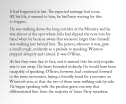
Comfortable, no?
Subheads
What is a body without a well proportioned head on its shoulders? If not treated correctly, it’s easy to end up with a monster befitting the labs of Frankenstein.
For this article, we’ll discuss two ways of setting subheads – setting in the same size as the body text, or setting it in a larger font-size.
If a subhead is to be set at the same size as the body text then it is up to spacing above and below to give it strength (plus a little flare if you’re daring, but we’ll get to that).
The space above and below works best when it is equal to that of a line of text (the leading value), or a clean multiple of it.

The options being along the lines (see what I did there? Ha for me!) of:
5pt above and 5pt below – equalling one extra line
10pt above and 10pt below – equalling two extra lines
8pt above and 2pt below – one extra line
22pt above and 8pt below – three extra lines baby!
The first option is almost a last resort as 5pt is the same as our space after or body text, but
if you’re dying for space, this plus some styling is an option, but our third option of 8pt above, 2pt below is probably a better space saver. It’s just worth mentioning as a starting point of how spacing can work.
Don’t forget that our subhead belongs on the shoulders of our body – don’t put more space after it than before unless you’ve thought it through a smidge and are doing something more. It’s often also nice to have a little space after our subhead, but not much, just something of a chin.
The other option is to set the subhead at a larger size and, for arguments sake in this case, giving it some styling. Looking back at our scale, let’s try two options.
We’ll start simple and subtle. Like our leading did, let’s jump two steps up on the scale for our subhead – 10/12pt.
As for styling? There are an infinite list of options really, but it’s always best to keep it simple. Typographers craft their fonts and a lot of work has gone into them before we load up our copy of InDesign. More work than we could ever imagine. They are strong as they are if you’ve chosen right and don’t need to have layers and layers of make-up on them. Treat them gingerly and with a little respect.
A few simple, respectful, options:
Small Caps, spaced generously at 75 (elegant)
U&LC, Italic (delicate)
U&LC Red (subtle)
U&LC, Bold, Red (strong)
Small Caps, spaced generously at 75, Red (confident)
Headings
The same rules as the above work here—make sure that your heads are stronger than your subs and body through generous spacing, an increase in size or stronger styling. This is probably starting to get to be obvious so I’ll keep it brief at this point – keep following some rules of the scale and you’ll do just fine.

Example One
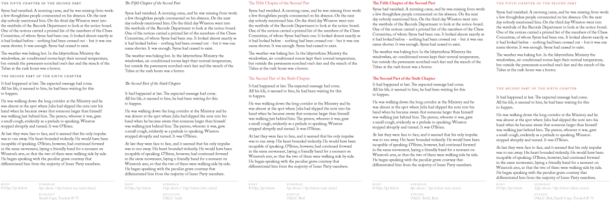
Head – 10/12 36pt above, 12pt below U&LC bold, Red.
Subhead – 10/12 8pt above, 4pt below, U&LC Italic.
Body – 8/10 0pt above, 5pt below.
In this example it is the spacing that gives strength as much as it is the red skin we’ve applied to our text. Even though our head is the same size/leading as our subhead, the red and spacing above and below give the line of text some extra strength.

Example Two
Head – 14/14pt, 36pt Above, 10ppt below, Small Caps, spaced at 75.
Subhead – 10/12pt, 8pt Above, 4pt below, U&LC Italic.
Body – 8/10pt, 0pt above, 5pt below.
You’ll notice that example two is 14/14 rather than, say, 14/18. The reason for this lies in the Small Caps styling. Having our text as solid lines makes the space a lot less dynamic and the space looks very large. 14/14 gives a nicer look. Beautiful type without the use of colour. You’re client and printer will love you for this.
Title

Ohhhhhhh yeah, 36-points-high. Big. Beautiful. Strong. That’s some sexy type right there.
At 36 points, our title is strong enough that no extra styling is required. U&LC, black. Simply stunning? To add too much styling, too much flare, will turn a piece of typography from strong to obnoxious.
Something worth keeping an eye on is the text that follows the title. In this case it is our heading, so I’ve left the before-spacing of the this line of text to do the work. However, should you run straight into body text (subhead will never come up), then consider adding extra space after.
A part of your kit
As I mentioned early in this article, the typographic scale is only part of your kit. On it’s own, you’ll get somewhere. But when you learn to use this instrument, you’ll do something beautiful. Whatever the reasoning behind the numbers chosen is beyond me (aside from aesthetics and the benefits of having defined sizes when metal type was a bigger industry), it serves as something closer to a map that outlines giant pieces of fruit and men with beards of bees. It makes for an interesting trip.
The values I outlined here are what works for me at this point in time. My tastes will no doubt change. I might prefer to go up a point here or there in a few months. I wasn’t trying to write a canon on the usage of the typographic scale. I’m only want to show an application or two of this scale and see what we can learn through a little exploration. You could of course make changes to this historic scale to suit your tastes and needs. But have reason for your decisions, whether they are strict or anything but.
REFERENCES & LINKS
Mark Boulton
Mark gives us something great in this article on designing with the typographic scale for the web.
The Elements of Typographic Scale
The online version of The Element of Typographic Scale. In this entry, the principals of the typographic scale as discussed by Robert Bringhurst are applied to the web.
Master Your Craft.
Weekly.
Become the designer you want to be.
Join a group of talented, creative, and hungry designers,
all gaining the insight that is helping them make
the best work of their lives.