There are many typographic marks which are familiar to most, but understood by few. Most of these glyphs have interesting histories and evolutions as they survived the beatings given to them through rushed handwriting of scribes and misuses through history. They now mostly live on our keyboards and in our software, and a few are used often, so it seems only fitting to know where they come from and how to correctly use them.
The Pilcrow
History of the Pilcrow
As with many elements of language today, it all started with Latin. While the pilcrow has evolved to resemble a backwards P, this is nothing more than incidental. In its early forms, the pilcrow was a C, a shorthand used for the Latin word capitulum, meaning chapter, mostly in a religious sense, which may be why it isn’t uncommon to see it in use in Biblical texts today.
Replacing another symbol, the paragraphos, to become the new mark representing a paraph—a new line of thought or break in text—it evolved over time through the natural development of handwriting. Initially starting as the C, a slash was drawn through it, perhaps to make it more noticeable, then a second slash was added, and through time the C went from being the vertical centre of the lines, to the top of them. All this ended in what is often now seen as a P backwards.
The evolution of the Pilcrow
Using the Pilcrow
Initially the pilcrow was used to separate blocks of text, rather than dividing them with space. While this is, of course, now the normal thing to do, it isn’t impossible to find modern text that do the same as what was originally intended, mostly in an effort to insert a little bit of flare or maybe to serve as a throwback to typesetting that may be seen as a little more classical. An example that is often cited is Eric Gill’s An Essay On Typography. It is also used by proofreaders to denote a paragraph that should be split, and also as a mark used to reference a specific paragraph is legal documents (an example is included in the Section Sign below).
While graphic designers, and especially those outside the field, would have no major need to think about using the pilcrow, it is worth noting that they can be a pleasure to design for our typographic friends.
The Ampersand
History of the Ampersand
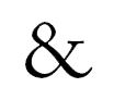
As with the pilcrow, the ampersand has Latin roots. Originally a shorthand mark for et, Latin for and, the ampersand has a very traceable and visible evolution. Simply put, the & is not much more than e and t coming together. The ampersand is a marriage of the two letters, which came about through rushed writings and abbreviation starting at its birth around 45AD.
Through time the symbol has changed to the point where most ampersands are distant cousins of the original et. But there are a few typefaces that have more of a distinct features relating to its ancestry.
An example of the evolution of the Ampersand.
An article with a few great shots of early ampersands can be found at the Adobe Fonts site.
Using an Ampersand
The ampersand shouldn’t be used as direct replacement for and. It is best used when pairing names in titles or in a business name.
It is usable in body text when need to indicate multiple couples, such as Gilbert & Sulivan and Rodgers & Hammerstein, but this rule is more of an extension of the above.
Section Sign
History of the Section Sign
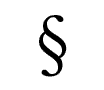
There isn’t much out there for information on the section sign. So the easy speculation to make is that it is two S‘s that came together as a shorthand for referencing a section and that it happened at some point in time.
If you know more, let it be known in the comments and I’ll improve the above.
Using the Section Sign
§15
Most commonly used in legal texts, the section sign is used for referencing. For example, the above would refer you to section 15.
§8—20
Something I love about the Section Sign is that when you need to refer to a range of sections, you use it twice, as above. Why you don’t use it once is beyond me, as it seems somewhat redundant, but if you know otherwise, let me know.
§15, ¶4
And when you are referencing a paragraph within a section, you get to use the lovely pilcrow.
Asterisk
History of the Asterisk
Originally using six arms, it is now more commonly designed with five. It is a mark most often used to denote a side note.
Like the section sign, not a whole lot is known about the asterisk. The best, and practically the only, piece of historical information I could find was in my Bringhurst Bible, so I’ll let him tell it best:
‘It appears in the earliest Sumerian pictographic writing and has been in continuous use as a graphic symbol for at least 5,000 years.’
Using the Asterisk
Most often used as a superscripted glyph, the asterisk is primarily used for notes, references or to mark a keyword. It can also be used to indicate a person’s birth when appearing with a year—with the dagger indicating death.
Hedera
History of the Hedera
Another mark for which little information is known, but that may be because it isn’t necessarily an important mark as it’s mostly decoration. The hedera was used in Latin texts as a punctuation mark between paragraphs in long documents, when line breaks weren’t as common, similar to the pilcrow.

When it rains, it pours. It was hard to find any good examples of hedera marks, then I found a font that is all hedera marks.
Hedera is Latin for ivy, which isn’t surprising when you see that the hedera is an illustrated ivy leaf. Found in early Greek texts, it makes the marks one of the oldest typographic ornaments.
Using the Hedera
A latin mark used for punctuation, it is now most often used as a
fleuron (a typographic ornament) that is often seen, yet not easily
found.
It is now sometimes, albeit very rarely, used by designers between paragraphs (new lines and space included), for splitting very large lists, such as an index; used between lists of entries for each letter, replacing the appropriate letter as a header.
It may also be used as an opening element of a paragraph when a text-indent is in use, sitting in the open space which would normally be left empty.
Why & When
Knowing why and when these marks came to be isn’t necessary information. But it is useful in a number of ways—it helps us understand the context in which to use these marks, it’s interesting for type nerds (and who isn’t one?) and it will help you justify using these marks when employing them to give a piece of work a little extra flare. At the very least, you might have a few extra terminologies you can throw around when talking to fellow type nuts.
REFERENCES & LINKS
The Lovely Pilcrow
An article at Hoefler & Frere-Jones’ blog about the pilcrow and the joy of designing it.
Adobe Fonts: The Ampersand
Article at the Adobe Fonts site about the lovely ampersand.
The Elements of Typographic Style by Robert Bringhurst
A lot of information for this article was found in The Elements of Typographic Style by Robert Bringhurst.
Copy Past Character
A neat little site that makes it easier to copy/past a lot of special characters, included is the pilcrow, section sign, the daggers and a few others.


Comments
56 pieces of brilliance put forth by the audience
LaurenMarie – Creative Curio
21st of September, 2008 • www twitter
Totally didn’t know that what I call a paragraph mark is actually called a pilcrow. I would love to see some work designed with it the way it was meant to be used.
I love the Garamond Italic ampersand. It’s just beautiful! It harkens back to the original “Et”. Ooo, and from the Adobe page, those Poetica alternates for the ampersand… wow!!
I also like using & in titles, especially if it’s a long one that will run to the next line otherwise :} Maybe not typographically correct, but it works. It also makes for great title styling sometimes.
The double section sign is similar to the double p when referring to multiple pages (at least here in the US). Like if you want to say, “see pp. 5-8.”
Hedera, another I never knew about! When I first saw the icon in the header graphic for this post, I thought it would just be a generic representation of a bullet point. Oh, I think it would look lovely occupying an indent in a paragraph!
Alex Charchar
21st of September, 2008 • www twitter
I’m working on a job now where the ampersand in the font I’m using is a good reference to its et roots, and I’m using it quite a bit, so it’s loooovely..
I’m actually about to send off a proof where I’ve had to put all the text into one block.. but i’m sort of going for a letterpress design look, so its working, and I get to use a hedera like the pilcrow — inbetween paragraphs. It’s odd how well it works actually
LaurenMarie – Creative Curio
23rd of September, 2008 • www twitter
I would love to see that piece, if you’re allowed to share it! If you can’t post it online, maybe you can email me a little JPG? :D
LaurenMarie – Creative Curio
23rd of September, 2008 • www twitter
HAPPY BIRTHDAY!!! I just read your last email :) Don’t have time to reply right now, but I wanted to at least wish you a happy birthday. I hope you can get a motor for the Heidelberg!
Alex Charchar
24th of September, 2008 • www twitter
Thank you very much! I got the motor and it’s currently sitting next to the beast waiting to be installed — something I hope to do this weekend. I think I’ll document it all to do a little article on it and running it for the first time..
and I’ll fire you a PDF of the job when I get a chance!
carolina falcao
24th of September, 2008
i just love those typographic marks! :)
could you please tell me where did you pick the hedera used as a example? to what font does it belong? i’ve been searching for one to tattoo myself, and this one is just perfect!
thanks!
Alex Charchar
25th of September, 2008 • www twitter
Hey Carolina.. in this example, the hedera is from Zapf Dingbats. It’d make an awesome tattoo, you’ll have to fire me an email if you get it done!
And just so it’s noted, the reason I used Zapf Dingbats is because it’s the only font I could find a hedera like this in! It’s a tricky little bastard. I used Adobe Caslon Pro for all the other marks :)
Caslon does have a hedera, but it isn’t similar to the one I used, which I feel is a pretty classical version of the hedera which would be more recognisable
Escoofield
26th of September, 2008 • www
Wow! those are nice! thanks! hehe!
Escoofield-
http://alotofit.com
Have fun!
Don’t forget to visit my site!
Steve
26th of September, 2008 • www
As a catalog writer I found these mark were often used for multiple footnotes. Each catalog had it’s own order marks were supposed to use but it usually followed this order:
asterisk, dagger, section mark, paragraph mark, double asterisk, double dagger, double section mark, double paragraph mark. Some places also used the pound sign and @ symbol. I think they avoided using numbered foot notes as to not compete with price numbers.
Alex Charchar
26th of September, 2008 • www twitter
Hi Esco, glad you liked the article :)
Steve – no kidding! I wouldn’t have thought that the pound and at sign would be used for reference wouldn’t really happen. They’re odd glyphs to be using for such a thing?
But thanks for mentioning the order in which they are normally used, handy thing to know
Tommy
27th of September, 2008 • www
Very interesting. Thanks for posting. I use the pilcrow allot in my work referencing paragraphs of customer specifications. Did not know its history.
HIM
3rd of October, 2008
I think ill go jack off now.
Evan Passero
3rd of October, 2008 • www
I have to say this is one of the greatest things I have ever read on the internet. I would love to see a follow-up article for more marks.
Sadly, when I looked at my wife and said “Do you know how old the asterisk is?!?” she sighed and told me I was a dork.
Alex Charchar
3rd of October, 2008 • www twitter
Tommy
it’s a little nice knowing where some of the marks we’ve used so much come from, isn’t it? Not essential information, but still fun stuff.
HIM
Good to see we have a type love on our hands
Evan
That’s very kind to say, thank you. You’re the second person to suggest doing a second article with a few more marks, so I think I’m going to have to. And my wife has been known to call me a dork when I ramble on about type too, so you’re not alone buddy.
Free Iphone
4th of October, 2008 • www
Great Thanks :)
melanie
4th of October, 2008
there is more than one asian restaurant in my city that uses the hedera in their menu to denote spicy items. i’ve always wondered how that trend began.
Alex Charchar
6th of October, 2008 • www twitter
Hi Melanie,
I guess it’s a beautiful little mark that works well as a way to note/signal something. Since writing this article I’ve started to seeing hederas all over the place!
Renny Hutchisonn
7th of October, 2008
Nice. Thanks
Mic
7th of October, 2008
The Et turning into the & was one of the cooler things I’ve seen
Ryan G
7th of October, 2008 • www
Thanks. Stumble thumbs up from me.
Alex Charchar
8th of October, 2008 • www twitter
You’re very much welcome Renny and Ryan, I’m glad you enjoyed it!
Mic – it’s a great little evolution, isn’t it? Was so excited when I first saw it!
Goji Juice
9th of October, 2008 • www
Nice and informative article…
Miss U
10th of October, 2008 • www
Asterisk also means multiply as in 4*5=20
Torley
11th of October, 2008 • www
Such a gorgeous article!
This site is very beautifully-designed. I like the organic horizontal swooshes for section headers.
One thing tho: wish the background was seamlessly tiling, that sort of ruins the illusion of it being like a real material, if that’s the intention.
Alex Charchar
12th of October, 2008 • www twitter
Thank you for the compliments Torley! You’re not the first person to mention the background not being seamless – a friend of mine really hates it.. But i like it and it was very much a deliberate thing.
i wasn’t meaning it to look like a material, but it’s interesting that was your thought.. i think the abrupt and hard lines add to the roughness and hands on feel of it.. makes it a little bit less flat.. but I have thought about changing it as I wouldn’t like it to turn people off
Torley
12th of October, 2008 • www
@Alex: WOWZA, you’ve got a beautiful 404 page. Thanks for explaining more about why you did the background this way, I appreciate the context!
Another thing: glad you have a comment notification system but the notifications it emails show an incomplete link next to “Content item”.
As a result, it’s hard to click back here. Also, looks like apostrophes and newlines are visibly shown, e.g., “\n\ni wasn\’t meaning”, which makes it difficult to read.
Alex Charchar
13th of October, 2008 • www twitter
Thanks!
About the notification emails — don’t get me started! Oh man does it drive me nuts. Unfortunately my CMS isn’t the greatest and the plugin I use for comments has some serious issues (no html in comments to make it easier to bold, include links, etc).. I’m in the process of lazily moving over to WordPress though.. something I should get back onto sometime soon.. thanks for the reminder :)
Matías
14th of October, 2008
Simply great, man. I like this beautiful stories.
Alex Charchar
18th of October, 2008 • www twitter
Hi Matias, thanks for stopping by, I’m glad you enjoyed the article :)
Peli
20th of October, 2008
Greetings Alex,
very nice article. Thank you.
If you haven’t found it yet, the section sign is from latin as well, “signum sectiones”.
Sign between sections therefore and also formed from two letters s.
Or so I believe.
Alex Charchar
20th of October, 2008 • www twitter
Hey Peli,
Thank you very much, it was fun to write and I’m happy you enjoyed it! I hadn’t read about signum sectiones before, thanks for the tip
Benny
14th of November, 2008 • www
A very interesting read; worthwhile information! Thanks.
www.krembo9.com
30th of November, 2008 • www
Woow.. Great post …. It is really very interesting to read about the signs we use everyday, And i must say that not once I wondered myself where did they come from..
Thanks for the info !
Travis Neilson
13th of May, 2009 • www
Thank you. Made and awesome lunch break read.¶I read an article in an entertainment mag about the new terminator salvation movie and the designer of the article used a pilcrow instead of linebreaks to infer paragraph seperations. it was asesome, and from such an unlikely publication. I would have peed my pants if I wasnt already sitting on the toilet.¶Thanks for the article.
Alex Charchar
13th of May, 2009 • www twitter
No problem, and nice usage ;)
I’ve found it really interesting that the use of the pilcrow to divide paragraphs, without a break, seems to be getting quietly popular amongst magazines lately.. w
jive
18th of May, 2009 • www
Great post, I think many of the typographic marks are misused and the origins are were lost due to the typewriter age, but probably more because of modern keyboards and people using other similar signs in place. For example using the straight quotes or double quotes instead of the curly ones, or using an asterisk instead of a “x” for multiplication.
Maybe there should be a better keyboard for typographers, to make things simpler to find.
Alex Charchar
19th of May, 2009 • www twitter
Hi Jike,
I’m not sure it’s so much keyboards as it is software.. software and understanding would be a better option than making up new kinds of keyboards, especially as well written software works with you, if you deal with type. ie. InDesign always gives you curly quotes.. although it would be interesting to use the old linotype style keyboards ;)
as for the asterisk instead of x for multiplication, I agree, but unfortunately it’s kind of like the ampersand — most don’t care, few understand. Although I wonder if that came from programming. ie, instead of punching in the letter x, they wanted something a little more distinct for multiply?
Evan
19th of May, 2009 • www
Just posting to unsubscribe. You can delete.
Sara Barrett
29th of June, 2009 • www
This is great! It really was interesting getting to read about the true use of these “glyphs” that one usually regards as decoration or mere things in the Symbols section of your phone or computer.
Wired magazine is quite (read: very) fond of the pilcrow, something that I noticed the first time I picked it up. Whether I liked it or not at first, it seems it’s become an essential part in the type-and-layout of their stories; they use it so much. Frere-Jones has done some (Or a lot of? I dunno.) font styling for them in the past, if I’m remembering the masthead credits correctly, so the whole pilcrow-thing shouldn’t have surprised me that much in retrospect.
Still, I don’t think anything’s as interesting to me as the hedera (although I love a nice interrobang), even if it is used most of the time to dress things up.
Sara Barrett
29th of June, 2009 • www
How I wish there was an edit button- I lamely messed up my web address in the prior comment. Hope I’ve fixed it now.
designloft.org
4th of July, 2009 • www
Great info, I always was wondering about the origin of those symbols ..
Banner Stands
19th of June, 2010 • www twitter
I think the use of glyphs in posts and articles is great. It’s nice to hear about the background of these marks!
csg255
7th of July, 2010 • www twitter
Great writing
lunamargherita
22nd of July, 2010 • www twitter
The Ampersand evolution just made my day.
Thank you!
Vik
23rd of July, 2010 • www twitter
Interesting article, thanks.
Tess Elliott
26th of July, 2010 • www twitter
Just a thought, now that I am reading your other posts, about the section sign. Coming from an art background and calligraphy, it looks like it probably came from the decorative marks called cadels, which I think of as underlining the way an artist would do it, but often also functioned as a graphic “pause” in the text of printed material. But I think it started as underlining, and later became part of the actual letters, and decorations. Google doesn’t seem to know what to do with that word–I am not happy with it’s new searching mode, especially for images. I love cadels, but never learned to do them without a freehand “map.”
Andrew
7th of August, 2010
Thanks for a good article. I came to it because I was looking for the name of the section sign which appeared as a light on my car’s dashboard, of all places. By the way, I think that the use of the section sign twice when referring to a range of sections is another example of what used to be a common practice of doubling to indicate the plural. Hence you used to see pp for pages, cc for copies, &c.
PASCAL MARTY
2nd of October, 2010
I have first to apologize for my English: in the real life, I speak French…
I found your blog two days ago (I was looking for images about Heidelberg presses) and I liked it. A man who can write (roughly) “It’s not that it IS really useful, but it’s better to know it” can’t be altogether bad. Anyway, it makes me think of the ways of Lewis Carroll and I would call that a compliment.
About the pilcrow: we call it “un pied-de-mouche” in France (literally, a fly foot) and its use is perhaps somewhat different. In 1723, Dominique Fertel explains that “Il y a deja quelque tems qu’on se sert des pieds-de-Mouche dans l’Imprimerie; ils sont pour faire connoitre les remarques qu’un Auteur veut distinguer du corps de sa matiere; mais il en doit avertir le Lecteur dans sa Preface, afin qu’on scache pour quelle raison il les place”. (There is still some time that Pilcrows are used in Printing. They are meant to show remarks that an Author wants to separate from the matter of his book. But he has to inform the Reader into his Preface, in order to let be known the reasons for which he is using them”.
And never, never did I read or heard the word Hedera. Thanks for make me learning it!
Bien cordialement.
kannect
22nd of November, 2010
This is just a great article, I loved it.
It’s really good to know some historical facts about so many symbols.
Can I refer your article at my blog post? (it will only redirect to your thoughts only)
If yes please let me know.
Whiteboard
16th of July, 2011 • www
I guess it’s a beautiful little mark that works well as a way to note/signal something. Since writing this article I’ve started to seeing hederas all over the place!
Westley
23rd of October, 2011
In the part where you discuss the section sign, you say that it is used twice in referring to a range of sections, yet the example only shows it once. Can you please clarify? Is it used before each section number (as in s8-s20) or doubled as implied by Andrew’s post of the 7th of August, 2010?
woof
23rd of October, 2011
LaurenMarie, a good place to see the pilcrow at work is in a traditional printed edition of the King James Version of the Bible. There, books are divided into chapters which are divided into short verses. The verses are grouped into paragraphs indicated by pilcrows.
Aramond
27th of October, 2011
Westley, the correct usage — in legal texts, at least — is doubled before a multi-sectional citation.
E.g., §§5-19.
Source: I am an attorney.
Jason
28th of October, 2011
I read somewhere that the pilcrow evolved from proofreaders marks: the single or double line represents a cesura –indicating a complete break in thought– combined with a C indicating that the beginning of the next word also needed to be capitalized. C//
Valerie
30th of October, 2011
I recently started painting icons in the 15th century (Russian) Orthodox style. There is lettering on them, Greek abbreviations for things like “Mother of God”. Above each abbreviation is a symbol quite reminiscent of the hedera, or at least some of the representations of it in your chart.
It appears as an elongated tilda with tiny boxes at either end – left protruding downwards and right up. In the center is a slash. It stands for “this is an abbreviation”.
Know anything about that?
Pamela Capraru
30th of October, 2011 • www twitter
Delighted. And I adore the courtly tone of your contact form—archaic yet somehow refreshing. Oh my, and I just clicked on the boxes below for Yes (May I please remember these details? Shall I send message to notify you of new thoughts?), and was rewarded with your lovely glyph, the name of which remains a mystery to me.
I’m a magazine editor and type enthusiast, although not with the fervour expressed by designers. This post satisfied two appetites: for the history of typography; and for wordsmithery and words in general—even better if they apply to a familiar thing with an unknown name and origin.
Ahhhh, “pilcrow,” wonderful, far superior to “paragraph symbol.” And the lovely “hedera,” so elegant in repose…and so uncharmingly referred to by my Mac’s Character Palette as “rotated floral heart bullet” (ugh!). See what happens when programmers and HTML appropriate typographic expression?
P.S. Just for you, I hand-set the quotation marks and apostrophes herein, rather than using the default unidirectional ones.
Shall you delight, entertain & enlighten
us with your own thoughts?