Without intention, the design half of this week’s links are all strongly typographic. I’ve been wondering of late what weight good typography holds in good graphic design. If what is shown here is any indication, it’s must be the majority of the work, no? But then there’s the art, with which the typography has something to play off and reflect. Hmmm. Ponderings aside, enjoy this week’s links!
Jenny Grigg
I remember when I first saw the book covers of Jenny Grigg. I remember flicking through a magazine and being stopped, and floored, by some of the covers below. The simple layout lets the complexity of the textures play amongst themselves to draw the audience in and make one swoon. I thought they were brilliant a couple of years ago, I think they’re brilliant now.


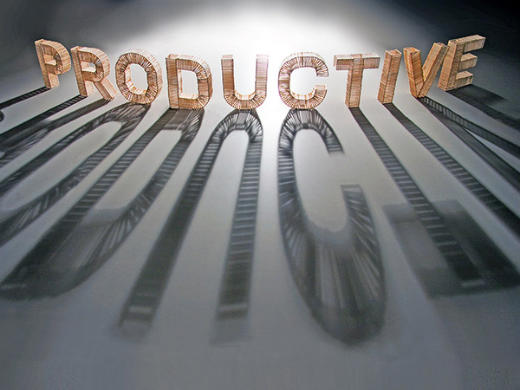
I’m most productive in the morning
Steve Haslip was part of a course Sagmeister was teaching at SVA recently and was given the task of giving some tangability to a life lesson, in the same spirit as Sagmeister’s latest publication.
What can I say? I dig it. I love the amount of effort that was put into such a seemingly simple construction. I love the photography and the lively shadows these letters of sticks make. And I love the message (oh baby can I relate).


A shelf full of letters
I love this project by Amandine Alessandra, in which coloured books are surrounded by white ones to form the shape of a letter. Which is then part of a lovely little phrase; “A shut book is just a block”.


Robbie Powell
It’s always nice when you find good talent right next door, isn’t it? Australia being the size it is, any creative within the boundaries of water that surrounds us is right next door. Robbie Powell is no exception. A recent graduate from Think College Of Design in Sydney, Robbie’s work is fresh and solid, with skills that’ll hopefully grow and develop as he enters the working world.


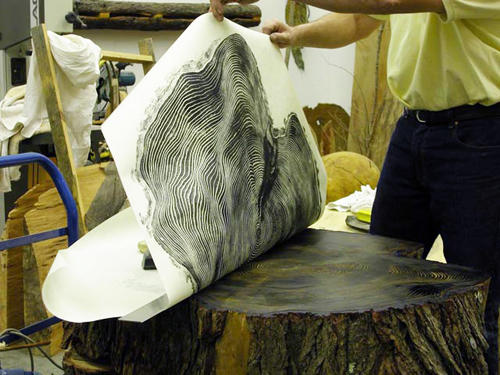
Tree Prints
I love this idea so much it hurts. Relief print of a tree stump done slowly by rubbing each bit gently with a finger tip. Great great stuff that couldn’t be much more organic.
Found on swissmiss and grateful for it


Chamarelli’s Simple Complex
These illustrations are fantastic examples of why many artworks need to be seen in person. I can’t help but feel that that complexity and image-within-an-image level of depth found here can’t be truly appreciated unless seen printed.
Unfortunatly, that isn’t exactly an option for pretty much all of us, is it? So instead, click through to Chamarelli’s flickr feed and look at these beatufiul pieces at full size.


Andrea Daquino
The work of Andrea Daquino is delicate and quirky and beautiful — a lovely combination, no? Her’s is the kind of work that I would one day love to hang in the fantasy cafe I visit in my day dreams. Just lovely.


Plastic Shards
Plastic Shards is the online play-pen of Matt Laskowski and has a number of jems to be found. The only problem is that there isn’t enough work online to keep you busy for very long, but luckily, what is there is good stuff! The first one shown here is beautiful at full size.


Onwards…
I was almost going to bail on this after the emptiness of the first few moments. I’m glad I decided against it because to have done so would have been an exercise in all sorts of foolishness. This is a beautiful little video that is bound to add a little smile to your day.
.
via @HeleneScott & Wander
“Graphic art is my secret garden, the place where I can get lost but also find territories I didn’t even know existed.”
—Kari Piippo
Master Your Craft.
Weekly.
Become the designer you want to be.
Join a group of talented, creative, and hungry designers,
all gaining the insight that is helping them make
the best work of their lives.