Grab yourself a cup of coffee, this weeks links post is a hum-dinger. We meet a snail named Victor, ceramics so cool that you’ll be happy if Granny gave them to you, beautiful illustrations, more beautiful illustraions, erotic awesome stairs that makes me wish I lived in 9 level house so I could have stairs EVERYWHERE, some type history, some delicate type and some heavy type. Oh, and the first lucky caller to ring in and give us the novelty word wins a trip to the Grand Canyon!
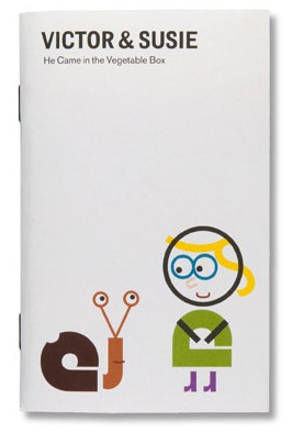
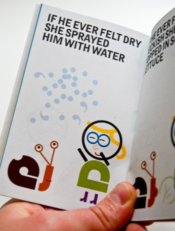
Victor & Susie
Designers Review of Books has a brief review of a cute little book about a girl made of type named Susie who meets a snail made of type named Victor. Victor & Susie can be picked up from Brighten the Corners.
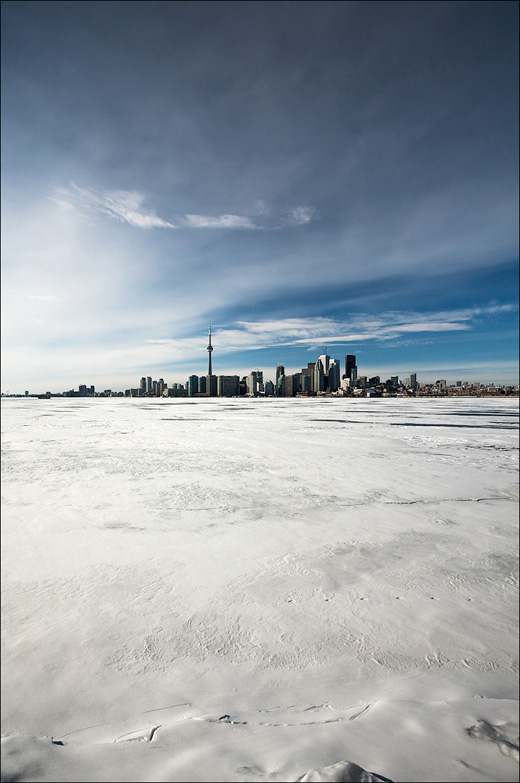
Daily Dose of Imagery – Ice and the City
I’ve been enjoying the daily photography of Sam Javanrouh for sometime and had to share this shot.
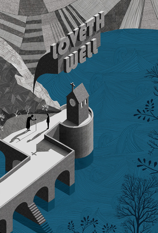
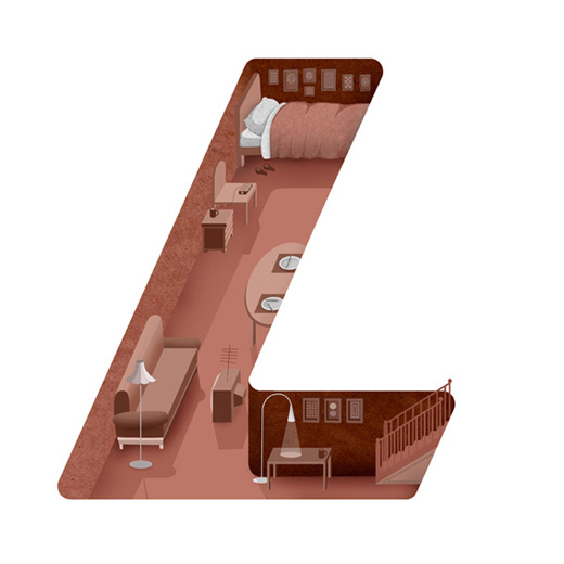
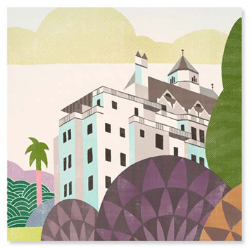
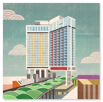
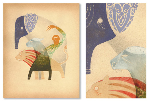
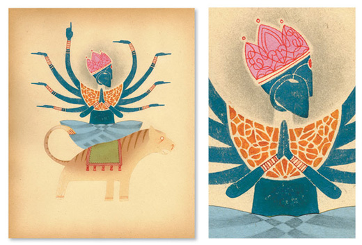
Adam Simpson
Adam Simpson’s three-dimensional illustrations are a joy to behold. The attention to detail is superb and the textures of the shadows are as smooth as could be.

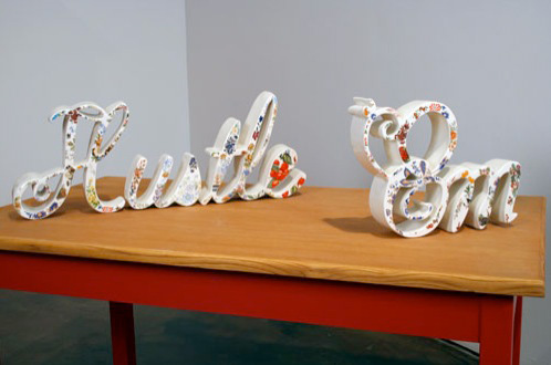
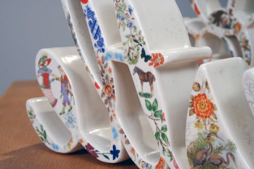
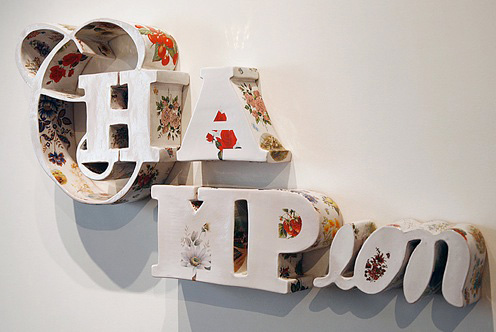
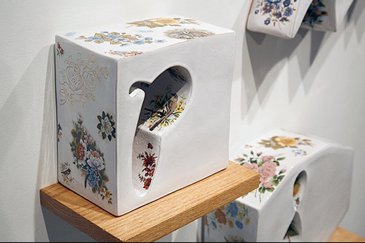
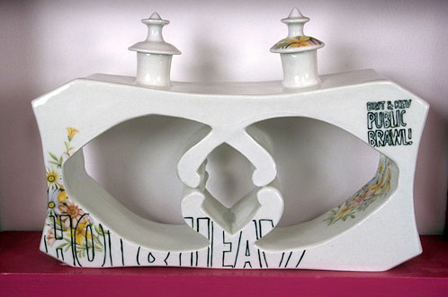
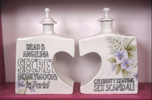
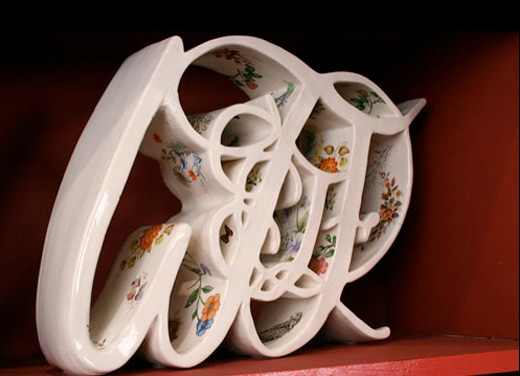
Stephanie DeArmond
Found on the always great Words & Eggs, the ceramic work of Stephanie DeArmond is gorgeous. Her ceramic letters with floral patterns provide a great contrast to the fonts chosen and the words made. Something about the word hustle in a script font with floral patterns makes me go wild. Not to mention the inclusion of pop-culture references on such work gives us a kind of irony I’m not smart enough to get. Is it irony? Ah well, pretty much any 3D type is beautiful, but DeArmond’s 3D type is delicately so.


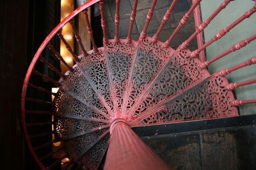
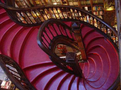
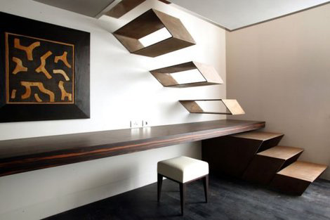
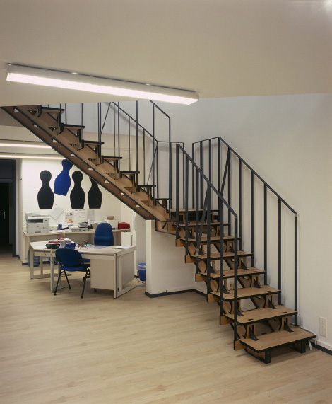
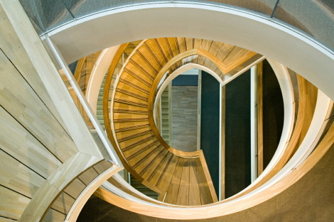
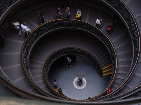
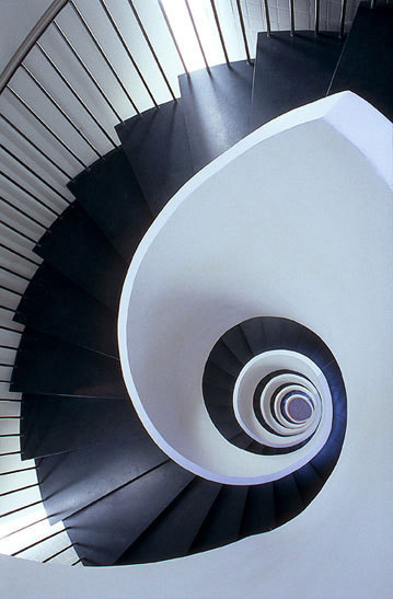
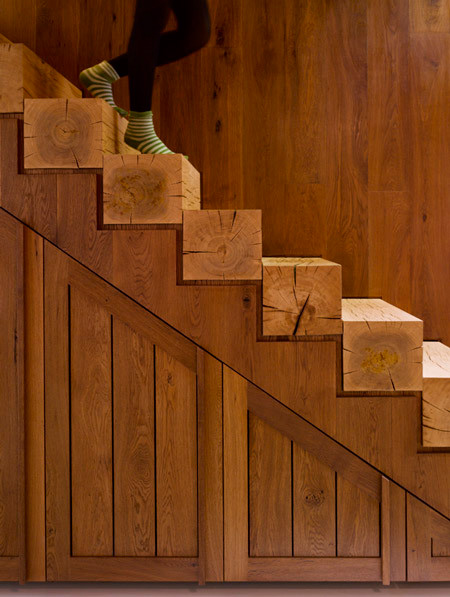
Stair Porn
Haha, exactly what it sounds like and it’s surprisingly good. Except for the heavy bass guitar background music.


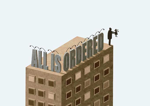
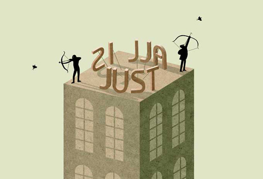
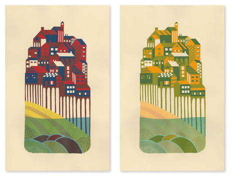
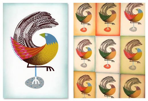
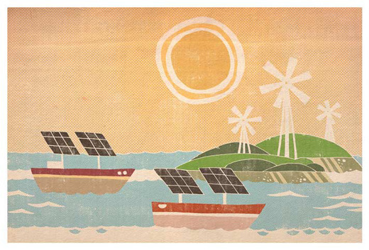
Andrew Holder
Found via It’s Nice That, the illustrations of Andrew Holder are making my morning today. I love the textures and the use of simple coloured shapes.

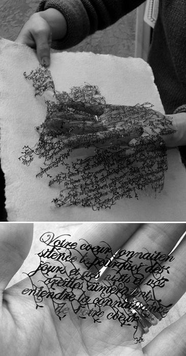
Delicate Type
This is another one that I haven’t got much more info on except for where I found it. Whatever the reason for its creation, this is just stunning. Whether it was done with a laser cutter or done be scalpel (which, if it was, is an amazing effort), it’s a stunning piece of typography and craft.
Khoda: Six-Thousand For Five.
There are some creative works that make you stop and take notice, if not for their quality then for their craft. If not their craft, then the effort and scope of the project. This captures all of those and you can’t help but feel damningly lazy and vibrantly inspired.
Student Reza Dolatabadi spent two years painting a total of 6,000 pieces and then stitched them together for an exhilirating 4 minutes and 52 second video. Bravo!
Khoda from Reza Dolatabadi on Vimeo.
FF Din Minisite
I can’t help but love and loathe this site. You see, Din is one of our two corporate fonts where I work, and being part of an in-house studio I see it a lot. So while Din is a lovely font, there are days that I see it too much and a site like this one seems like a sinful idea. But, good fonts being good fonts, I find little things about it that I like that bring me back to appreciating its characteristics. And this site and the stories it tells make it easier to love, rather than loathe.
The Letter Museum
Ohhhhhhh, oh oh, this is something worth traveling around the world to go see. A museum is being established in Berlin to help remind us and future generations of the beauty that can be found in letterforms.
“The goal of the Letter’s Museum is to awaken the public’s interest and awareness in typography.”

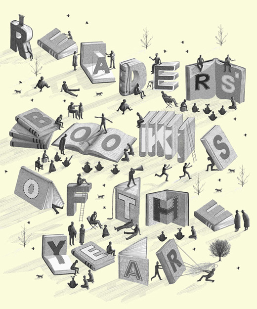
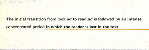
In Defense of Readers
One of the best online reads of the week was Mandy Brown’s thoughts on how we read and how online readers and the content they read should be treated and displayed.
Have a week!
Master Your Craft.
Weekly.
Become the designer you want to be.
Join a group of talented, creative, and hungry designers,
all gaining the insight that is helping them make
the best work of their lives.