I love the old, I love the new. I adore the editorial, I adore the illustration. I lust for the the grit and grime, I lust for the the cut and pasted. And the blackletter and script; I am infatuated. This week’s links!
The Face
MagCulture, yet again, shows us something great. A Flickr pool has been set up showing some of the work The Face, from 1980 through to 2004. The internals shown seem to be mostly from the last couple of years of its life, which means we don’t see much more than the covers of the Neville Brody years, something I would have loved to have seen. But no matter! There is still plenty of gold to be found.
Czech Books of the 1920s and ’30s.
A great collection of Czech Book covers from the 1920’s and 1930’s.
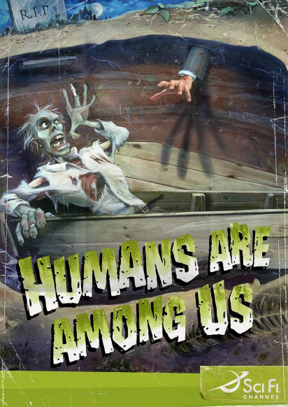
Sci Fi Channel Ads
I really love these ads for the Sci Fi Channel.
Don’t know much more about them except they were done by Saatchi&Saatchi Italy and I found them via I Believe in Advertising


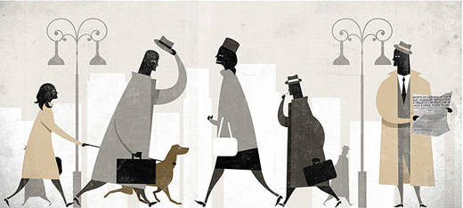
Borja Bonaque
I love the elegance of these illustrations. Simple curves and shapes with characters and buildings with a look so delicate that it suggests a strong breeze could up-root them. Tie in the gentle, muted colours with the textures and I’d love to see hanging in my favorite coffee shop.
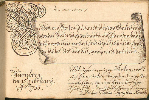
Facebook of the 1750’s.
While the illustrations contained within this recent offering from BibliOdyssey are quirky and interesting, it’s the beautiful mix of blackletter and script that has caught my eye.
Sfaustina
Sfaustina has a style that no one can match. The incredible richness in the textures and brave use of such heavy mixtures of spray paint, ink and marker is second to none. I’ve been a huge fan of the work to come from Sfaustina over the last few years and have especially enjoyed one of the best PDF magazines around – Bloodwars.
Martin O’Neill
The collage work of Martin O’Neill is simple and beautiful. The more I look at his work the more I love the balance he strikes in his illustrations. The nature of collage illustration often means a lack of gudience for the eye, but nothing could be further from the truth for Mr O’Neill – it appears as if every placement of every element was thought about, not just thrown to the page.
Wired – Design Under Constraint
Grids has an article on the March 2009 issue of Wired in which limitations on design is discussed. While the images below are fantastic, it’s the introductory essay by Creative Director Scott Dadich that blows me away.
Go check out the article and give it a read. Really. Right now.
Heinz Ketchup redesign
Ohhhhh, this is what a well designed, thought out and successful product redesign looks like.
Pret a Voyager’s typographic birthday
Such a great birthday idea for all those typophiles out there. The painted letters hanging from the roof have such a charm and the serif sherif is so bad ass.
I hope you’ve had a good week! If not, grab yourself a bottle of rum, a Hunter S Thompson book and enjoy the weekend.
Master Your Craft.
Weekly.
Become the designer you want to be.
Join a group of talented, creative, and hungry designers,
all gaining the insight that is helping them make
the best work of their lives.


