Another week, another batch of links! This one is a big one so strap in and get ready! We’ve got some beautiful and eerily alienesque architecture, some gorgeous business cards, books, books and more books as well as beautifully delicate packaging.
Kim Holtermand
Found via ISO50, the work of Danish-born Kim Holtermand is breathtaking. The soft colours contrast well with the hard edges of his subjects, which is mostly architecture. Between the colours, framing and topic of his photographs, you can’t help but be reminded of images of our past, that showed us what the future would look like – they have a great familiar-yet-alien quality to them.
Frederic Chaubin – SciFi Soviet Architecture
PingMag has an interview with Frederic Chaubin, a photographer who has been traveling around the former Soviet Union taking photos of some wild buildings that feel like they would be right at home in a Philip K Dick novel.
Card Observer
Business cards fall into one of three categories – 1. Awful. 2. Thanks-for-trying wankery. 3. Brilliant. Luckily, Card Observer looks like it mostly curates work that falls into the third category. A very nicely designed and easy to navigate site has much to be seen and enjoyed. The best part? Not every card is flat-out brilliant, but not every card submitted gets shown, which means no matter your tastes, you’ll find something excellent here.
Mike Stilkey
The always enjoyable Fecal Face has a great interview and studio tour with Mike Stilkey. His beautiful work has a dream-like quality to it that grabs you and a recent installation he put together is breath-taking.
Pepsi Logo – A Response
Lawrence Yang from San Francisco has a different view on the new Pepsi branding. It also serves as a nice introduction to the rest of his work which has a beautiful and delicate feel to it.
Harry Potter Redesigns
There has been a number of these kinds of works lately and truth be told, the whole time I’ve been thinking “oh man, I’d love to see some Harry Potter redesigns”. M. S. Corley to the rescue! I really dig these covers and the spot on references to the book’s story and not just the title.
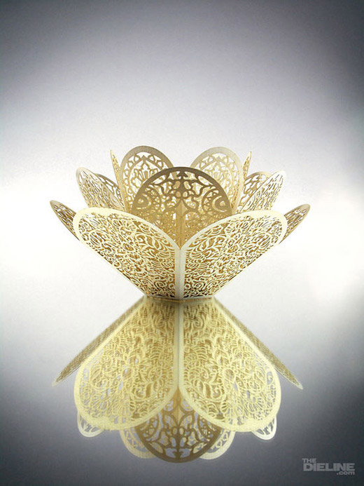
Lotus Tealight Candleholder @ TheDieline
TheDieLine is fast becoming one of my favorite blogs and it’s because of finds like this one. Trine Design Associates recently put together this paper tealight candleholder, which came to be from “the intricate result of an experiment exploring form, material and laser production methods. Inspired by the beauty and resilience of a lotus flower blossom, the structure of the candleholder comprises of three rings of petals. The intricate patterns on each ring of petals features one type of traditional floral motifs found in Chinese, Arabic and Islamic art respectively.” Absolutely stunning work that I would be too scared to actually put a lit candle into because of the fear of setting the whole thing alight.
National Library of Australia Digital Collection
The National Library of Australia has an amazing collection (over 1700 says the homepage) of printed materials ranging from political pieces on the legalization of alcohol to a series of plates from A voyage to the Pacific Ocean by James Cook.
The screen is a magic medium
I’m not sure how to explain but does it float. It’s an interesting site that seems to have the sole purpose of posting beautiful, intriguing or just plain odd images. This series in particular caught my eye. Normally I wouldn’t find these types of images enticing, yet I find that I’m amazingly drawn in. All from moresoon.org.
Retinart
Coming up is a few fun articles that I’m sure you’ll all enjoy! I’m going to share some old press manuals, a profile on Jan Tschichold, the sketchbooks of Leonardo Da Vinci and why kids have a better mindset for design than we do. Have a good week all.
Master Your Craft.
Weekly.
Become the designer you want to be.
Join a group of talented, creative, and hungry designers,
all gaining the insight that is helping them make
the best work of their lives.


