The Timeless Beauty of National Geographic
Who isn’t familiar with that wonderful yellow frame?
It holds breathtaking images of exotic destination and mountains of nostalgia! It’s the flag of the editorial institution that National Geographic has established over the span of 120 years.
The eponymous yellow rectangle has seen virtually no change, much like the interior pages, since it first bordered the front covers of the 1888 launch issue.
I thought it could teach us a few things about timelessness in graphic design, so I randomly picked four issues to look at; March 1964, November 1988, April 2000 and a recent December 2009.
The Front Cover
National Geographic’s front cover is a great example of how well simple branding can be tied to a product or message. In this case, the slightly warm yellow has become a symbol of wonderful photography, intriguing articles and serves as a doorway into places worlds away.
The ’64 issue is clearly the most different because of a floral border that, while taking up space, being distracting and kind of just kitsch, is romantically wonderful. It feels so appropriate to the sixties (echoes of William Morris?) that I’m glad to see it. Though I must say I’m also glad to see it evolve to nothing more than a yellow border.
The yellow frame works the hardest as a piece of branding, being more recognisable than the logotype (which only changed slightly — notice the slight type size change in the ’09 issue?) and far stronger than the floral badge that was used in the ’88 and ’00 issues.
It appears that idea of having such a formal mark was to give dignity to the Society, which has its name so proudly printed at the bottom of all the covers. But for me it just adds extra clutter, distracting from the marvelous photography.
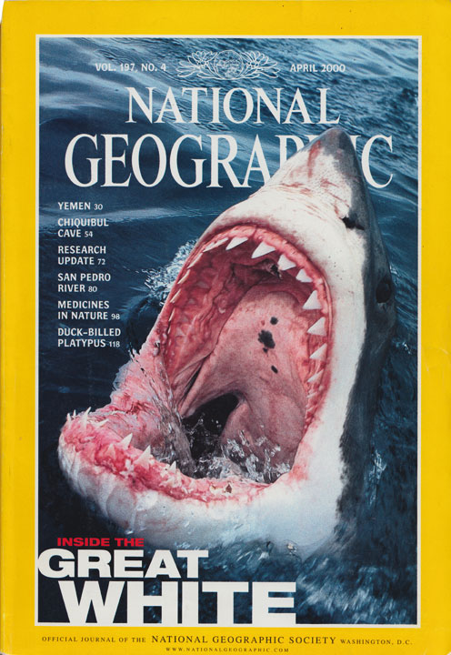
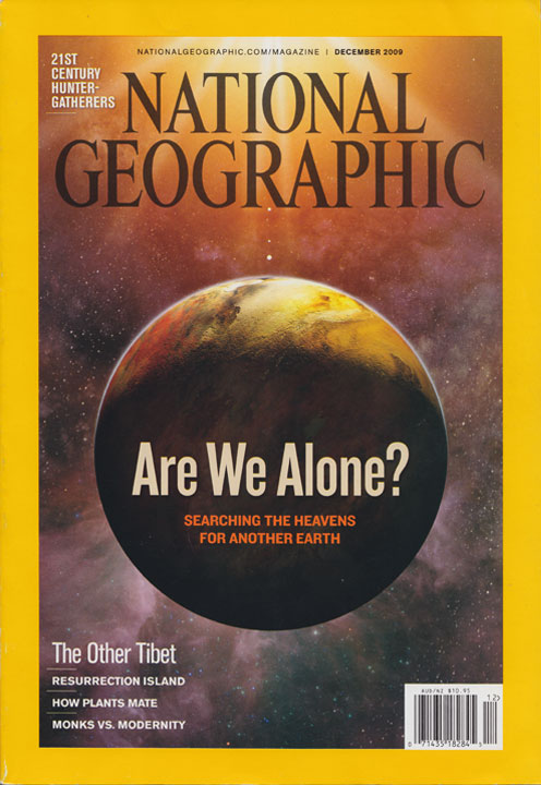
Luckily, I’m not alone (perhaps its just the shifting of tastes?) as the ’09 goes without it and is replaced with a (questionable) inclusion of the URL and date, giving a much cleaner design.
The Contents Pages
The ’64 issue doesn’t have a contents page as it’s from a time when the publication was something to enjoy as part of a set. This issue starts at page number 306 and has the article page numbers appear on the cover.
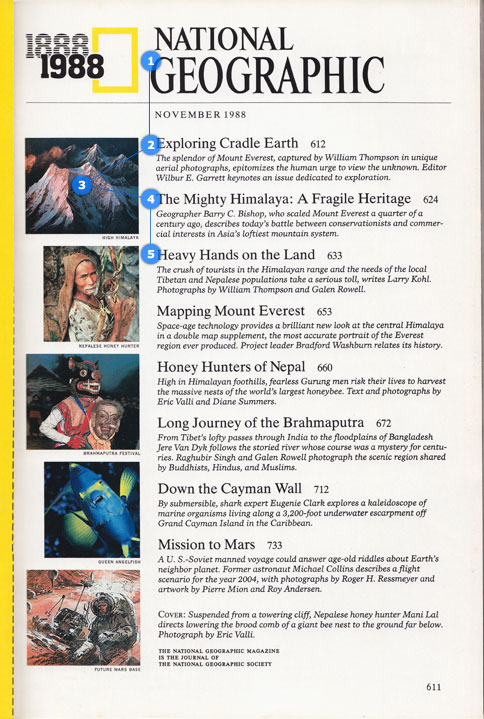
I really like the contents page for the ’88 issue. It works well because the contrast in font size of the article title and the summary text is strong enough (12pt & 8pt?) that it shows off the face nicely and the titles standout well in little space. The long-running italicised summary text actually works nicely here because of this relationship with the title font and this type harmony sits in a simple (boring?) grid.
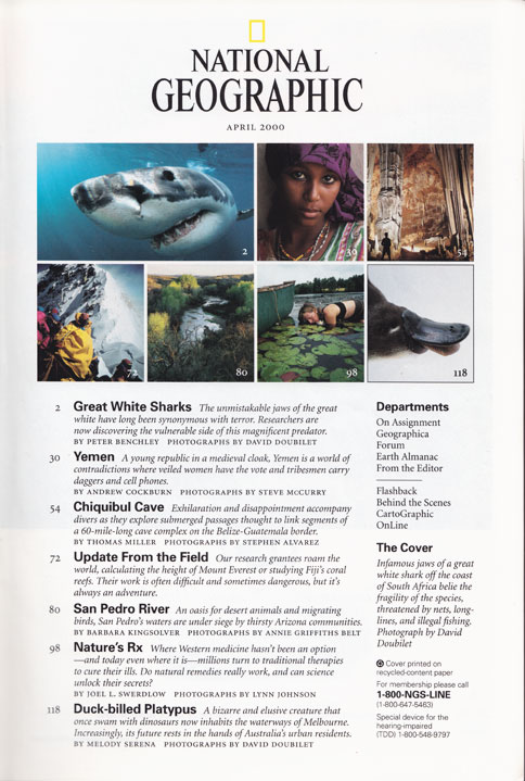
Then we jump to the ’00 issue and find an odd mix though it’s much nicer overall. The serif titles are replaced with a nice bold sans, while the italic text of the intro looks as if it’s trying to pull away from the heavy shadow the sans is casting. It’s a good example of how the relationship typefaces have with one another impact the feel of a page and can cause visual tension.
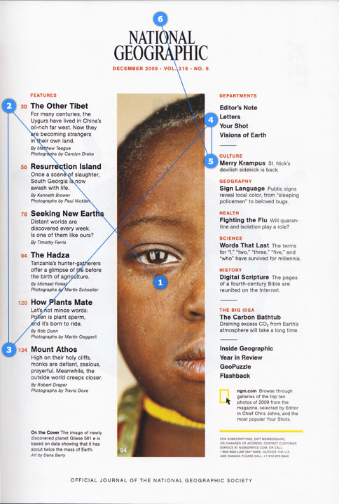
The ’09 issue does something wonderful with the photography — giving it more strength than anything else on the page, which is easily achieved through the white space, its placement and the way the eye is guided to it. It’s much better executed than the photo grid of the ’00 issue and leaps far ahead of the ’88.
The photo is framed well. The white space on either sides of the logo directs you to the middle of the page, but the logo is quiet and recognisable enough that you happily skim right past it as your vision is gripped by the magnet that is the image.
And that quiet logo? I can’t help but notice its crown like feel, sitting atop the image, with that line of rich red serving as a beautiful shining ruby.
Also worth a brief mention are the lovely hanging numbers, causing less clutter, a clearer hierarchy and the everlasting colour combination of black, white and red.
Eye direction
I thought it’d also be worth having a quick look at how the (ok, my) eye darts around these pages.
For me, it’s better when the eye skips past the logo at the top as the reader knows what it is they’re reading. I also feel that it a distraction that your is continuously being pulled up towards, even when reading the other content.
Page Design
The four issues break into pairs quite nicely, with the older two being classical while holding an argument between imagery and typography, where as the newer pair allowed the imagery victory.
Behind The Veil of Troubled Yemen & Down The Cayman Wall
The first thing we notice is the use of a large serif face for the headers, something we don’t see nearly as often these days as most editorial designers (and designers in general?) would be more likely to use a sans for headers for a cleaner opening.
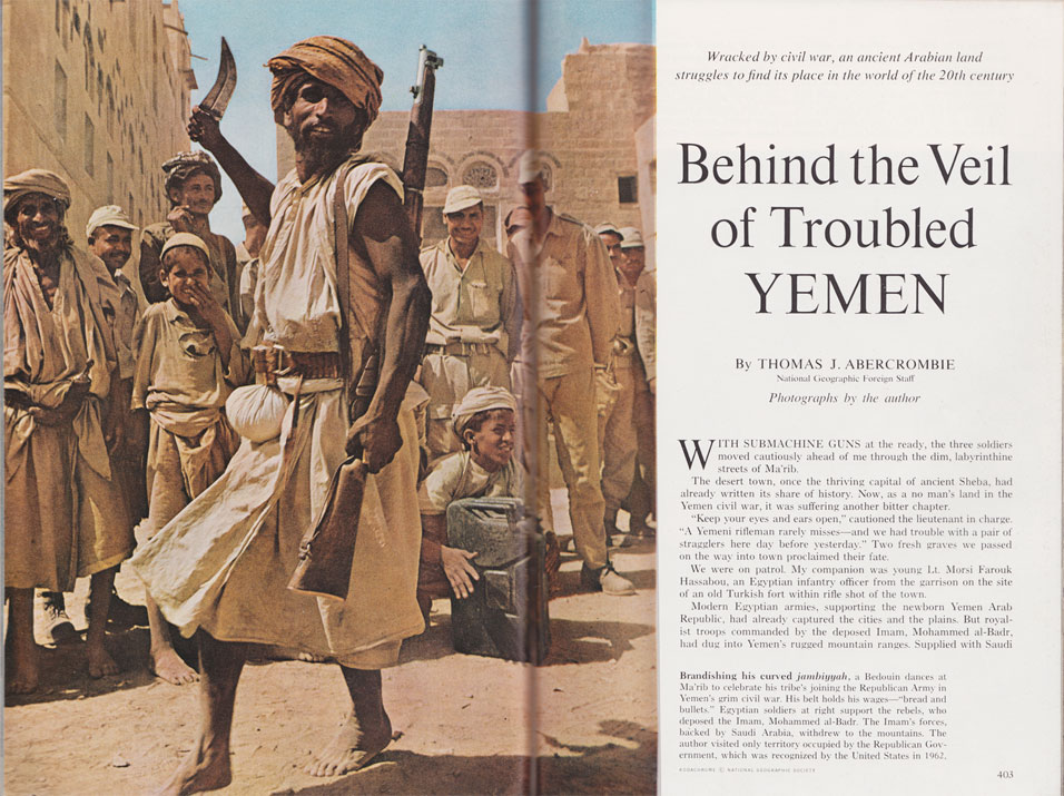
Also worth noting is the centred alignment above the left align (or justified) body copy, another little ditty from the past that we wouldn’t see as often today as open space is better respected these days — though the ’88 issue is at least cleaner and more inviting as the type does somewhat play around with sizes while screaming “eighties!”.
The typographic texture of these two pages is also quite different as the earlier issue, wracked by lesser quality printing, is lighter and spottier. Where as the texture of the ’88 issue over comes this with heavier printing and ragged right text, which works nicely in such a wide column, next to an image.
Yemen United & The Other Tibet
Then we move onto the photo-rich ’00 and ’09 issues and all is well.
The images for both work so well as the eye is pulled down to the titles. The ’00 issue does it via the rich magenta against the headdress of the women, then to the title that is tugging it along. The ’09 issue does it by having the boy in the blue cap staring around the man, and we look with him, at the title sitting boldly in the corner.
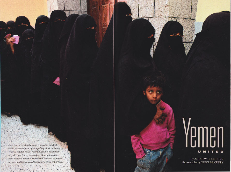
The typography used for ’00 really hits me, with the use of a narrow and wide of the same font family (which I tried to figure out — is it a certain cut of DIN?), but I hate to see the by-line and photo credit set in the standard serif face. It isn’t awful, but it’s not a happy marriage, instead it’s perhaps a tedious one.
But the ’09 version hits the spot with the perfect mix of serif and sans. The title is strong with the same face dressing the subtle byline and photo credit, which is small enough not to argue for attention but still be noticed.
The use of italic is quite nice, but its placement encroaches on the title and steals its precious space. It’s odd as the following pages of this article are so powerful that I’m not sure the five lines of introductory text is needed.
Content Pages
The ’00 and ’09 issues do something new — they have photo spreads that introduce the article, and then have gentle introductions into the actual content. The earlier issues stand somewhere in the middle.
The ’00 issue has that charming elongated sans-serif J serving as a great drop-cap from which the opening paragraph grows. And it would work well if the life weren’t being choked from the text by a gripping lack of oxygen.
The ’09 issue treats the typography with much more respect and the whole spread is wonderfully executed.
The picture shows us a small glimpse into a horrific scene and is more powerful for it, sucking the eye in immediately. In a publication full of full-bleed images, this small peering-through-the-window kind of image is in stark contrast and is more powerful because of it. The date doesn’t need to be included, but it anchors the image and the little drop of blood-red below a photo of a man gunned down creates the right kind of tension.
Then we jump into a (finally!) wonderful mix of sans and serif. The bold sans guides us to the serif, which sits so nicely as it gently hangs over the edge on thick strips of lead — if it were less, it’d probably look as if it had be shoved into the corner, but no, it sits well.
Then the page is balanced so finely by the caption for the image appearing at the very bottom. The alignment, size and italic text helps it obviously stand as the caption, but without being too noticeable, giving us an elegant page to work through.
It’s often the small details that can make a spread like this work, so I thought I’d show you one thing that made me grin ever so happily — the vertical rhythm.
Invisibly Noticeable
I’ve always wanted to have a closer look at the design of National Geographic. While it might not set the world on fire, it’s always been solid. Timeless design like this is essential in creating a reason for leaving the copies on your shelves for years and years, which many of us are guilty of.
While I may prefer where the design of this legacy is now heading over the earlier stuff, that doesn’t mean I wouldn’t consider the ’64 edition any less well designed than the ’09. It’s kept simple with the focus being on what is always sure to work — beautiful images and content that is interesting, with no design to get in the way.
In a sense, the magazine does exactly what design should. It’s hardly noticable. The typography doesn’t stand out in a way that’ll win it mountains of awards for innovation in design and the layouts aren’t exactly something you’d see on many (any?) design blogs. But it’s for exactly this that it’s a kind of perfect design — it sits behind the content, not in front of it, and is beautiful while it works.
It’s worth taking a moment to look at this kind of design so we can better understand what details we should pay attention to. Even when we try to develop a design that will stand strong against the grit of time, we often have some elements that won’t last too well. It’s hardly our fault as it’s often hard to know what’s fad and what’s ornament worth having. The kind of looking that we did today is a good way to learn the difference.
But I’d love to know — what do you think of the design of National Geographic?
Photo in title image is copyright Thomas Chudalla and National Geographic — thank-you for a wonderful image.


I wish I had the entire collection of NG, even though I don’t have time to read a tiny fraction of it. When I used to read NG magazines, I was so fascinated by the captivating photos. They took me to different worlds. I love that yellow frame. It’s so recognizable that a simple tiny empty version would yield the word “quality.”
Great post Alex.
Thanks as always Jin!
I’d love to have the entires series! I’ve got a fair few (I sent out a global email asking if anyone had old copies at work and got a box full of them) which is great to flick through and read some of the slightly older stuff on science. You can get the entire collection on either a series of DVDs or on a USB HDD, which I’ve very seriously been considering.
I’m a huge believe in print, but the option to have every single National Geographic on a HDD makes me happily say “oh, maybe digital magazines aren’t ALL bad”.
Great article.
But when reading it some times becomes quite confusing, because the images were not marked with an identifier, legend or alt-text telling the reader which issue was depicted. Which issue is this picture showing? The ’64 or ’88? The ’00 or the ’09 issue?
Hi Jonas,
Ah! Thanks for pointing out my silly oversight – I haven’t got time right now, but either this afternoon or tomorrow I’ll go through and make some changes! (As per your suggestion, I think I’ll add alt tags as well as a little note to each full image and something in the image caption for each one).
Great post! The consistency in quality over time combined with such a strong visual character has made the brand so recognisable worldwide. The yellow border seems so simple, but has achieved so much! Great magazine.
One of my few regrets since I moved from Los Angeles back to my birth city Jakarta (Indonesia) a couple of years ago was leaving behind my 10-year collection of NG magazines (plus dozens of older issues I bought at the Public Library). There was just no room/no budget to ship them halfway around the world.
When I have the extra spending money, I’ll splurge for their DVD collection!
Thank you for such an insightful article. As both a graphic designer and writer, I really appreciate your thoughts and observations on my most favorite publication :).
Another thought on that ‘yellow frame’: ever since he was a toddler, my oldest son (now almost 6) already recognizes it as “National Geographic”, whether he sees it on the magazine or on TV (NatGeo channel). It’s as familiar to him as the outline of Mickey’s ears.
Great post, lovely website!
Hi Ant, thanks for stopping past and leaving a comment. The thing that makes most brands strong has very little to do with the mark that is devised to represent the brand, but a consistent dedication to quality, huh? And National Geographic has done exactly that. It’s a YELLOW RECTANGLE and it’s brilliant because they have done brilliance for so long.
Evening Tessa, that sucks! Sorry to hear you had to leave your collection behind! I recently purchased a very much needed set of shelves, and I was so proud to put up my (albeit patchy, but still loved) collection of about 60 issues after being hidden away for a couple of years after a move.
When I first stumbled over the DVD/HDD collection I could have cried! Such a wonderful resource, isn’t it?!
Thank you very much for your kind words, I really appreciate it :)
(And I love that your son knows the rectangle as well as Mickey’s ears – he might become a marvelous photographer after having such great inspiration his whole life!)
Lovely, lovely post – I enjoyed seeing the comparisons, and really what a wonderful look that ’09 issue has. So clean. (Though the rest are beautiful too!)
I commented, because I was going to guess that the Yemen font is Akzidenz-Grotesk Condensed BUT it seems even tighter than that – it really is gorgeous, though.
Hey Emily, thanks for giving it a go. Akidenz-Grotesk is pretty damn close, if it isn’t actually that font (I’d like to think they wouldn’t have, but perhaps they warped it slightly?). Akidenz-Grotesk is a heck of a lot closer than DIN ;)
Thank you for posting this insightful article. I’m a big National Geographic fan, but I’ve never thought to survey the subtleties of the design over time. One your beautiful comparison reveals is how the design of the magazine has managed to grow gracefully with time, becoming more sophisticated and lovely with each passing year. Few publications have managed to maintain such a strong brand equity while at the same time refining and enhancing their appearance…such restraint. Such attention to detail. I have always admired the photography, but over the years, I’ve come to admire the design equally…for knowing when to be present and knowing when to be quiet. We are lucky it has survived and continues to inform and delight (to steal from the great Milton Glaser).
I think you captured the essence perfectly:
I’ve always admired NG for a design that respects the content with full-bleed images and treatments that respect both narrative and image. Over all these years, NG has been good at getting out of the way of the reader’s relationship with the writer and photographer…and there’s a lot to be said for that.
Verbose, tiny-font, long scroll like a toilet paper roll, huge margins on either side, most un-readable.
Beautifully done. I love the magazine and enjoyed the article. I wonder about the use of the word “eponymous.” For whom is “yellow rectangle” named?
I worked with National Geographic Channel from the time it was launched until 2007, and I can assure you the Channel, the Society, the magazine, and everything that surrounds the business holds the Yellow Border Design (which is the “proprietary vocabulary” they use to refer to what you here call the “yellow rectangle”; sometimes, we’d call it “the YBD” as shorthand) as sacrosanct. You never mess with its dimensions, objects do not traditionally pierce the YBD, and you never, ever change the color.
It takes enormous discipline for individuals to come along and NOT try to “put their personal stamp” on the NG brand. But it’s that consistency, discipline, and dedication to excellence that’s a hallmark of National Geographic. Lovely people all around – but fiercely protective of the brand, and rightly so.
Loved the article!
Univers 39 for the Yemen spread.
One of my favorite of the family. So beautiful.
I have held a subscription that pre-dates the internet. It is by far the best magazine in the world. Something tells me that when the dust settles it will still be standing.
Unlike other magazines, I feel like my support is keeping something important alive. The writing is intelligent and friendly, and the photography is some of the best in the world.
If something is not broken – don’t try to fix it.
- Nice article.
I do some work for National Geographic Television, and I know that the Channel does use a custom cut of DIN for their on-air branding and promos, so I wouldn’t be surprised to see that typeface show up in the magazine as well.
Very nice article, but given the subject matter I was surprised you didn’t make mention of the border change that occurred sometime between your 2000 and 2009 examples; namely, the removal of the thin white rectangle within the yellow rectangle. Not sure exactly when it happened, but I grew up with the little white border, and the latest design, without it, seems colder and less inviting to me.
Wonderful review of the evolution of a classic style. You might be interested to know that if you go back just a few more years, to 1959-1960, you can see the origins of those elements. Prior to mid-1959, the covers were all-text, sporting the table of contents. Then in mid-1959 they began introducing graphics to coincide with the lead story (e.g., a national flag for a story on Alaskan statehood, a jet fighter for a story on Naval aviation), which soon became full-width color photos on the top quarter of the cover. Eventually, these grew to photos and art that encompassed the full cover.
Another subtle change: the spines used to say simply “The National Geographic Magazine,” but beginning in 1960 NGM introduced the familiar subject “keywords” to help quick browsing of issues on the shelf.
It’s also interesting to flip through old issues and see the gradual changes in the magazine’s advertising over the century…
Lisa
Hi, thanks for dropping past and taking time to leave such a nice comment :)
A graceful growth is such a lovely way of putting it! It’s absolutely true; with the collection I’ve got and what I’ve seen of the magazine and the life it’s had, there doesn’t appear to be any moment where there was a sudden, unexpected push for growth.
It’s the restraint that I especially love – they could really push it and do something that might be considered ‘contemporary’ but the temporary gain just wouldn’t be worth it, would it?
Eric Mirgalia
Hey Eric :)
The way the design steps back is a fantastic reflection of the content, isn’t it? The articles always present a place or people or situation without being overly critical or opinionated. I think, to bounce off what you said, the content of the magazine does a good job of putting us not only in a direct relationship with the writer and photographer, but also that which they cover.
And through all this respect and well-meaning attitudes, it shows so much care for the audience, I feel.
Thanks for dropping past :)
Passerby
Oh :)
Scott
Glad you enjoyed the article!
I used eponymous as i was personifying the magazine – in a lot of ways it’s like an old friend—reliable, always something to show those who know it, been around forever—so I thought I’d see if i could get away with it ;)
Chris Laughlin
Thanks a million for verifying that – considering I couldn’t pick out a font like Univers by looking at it goes to show that I need to improve my knowledge of typefaces (I could blame the fact that I work at an in-house studio and for the last four years i’ve only been using our two corporate faces? haha)
Matt
National Geographic is a great example of what strong branding can do – it’s so easy to identify pretty much anything they do because of the use of the “proprietary vocabulary” ;)
As a designer, its great to see such respect given to their branding and that no one (seems) has been allowed to mess with it because they want to leave an impression of their time (which is what happens with other brands occasionally).
So from the inside looking out, what was it like working with such a group? Were you always conscious of the design (not just the yellow rectangle) and how it would fall into line with the rest of the materials being produced?
Adam J
I feel the same – when I subscribed a couple of years ago I thought the price was actually too low! I remember telling my wife at the time that I would be happy if the price was double what it was because the quality of the magazine is outstanding!
Mark Bosko
Ah great, thanks for letting us know!
Adam
Good catch! I know exactly what you mean and kick my self for not mentioning it in the article – I owe you a coffee for picking it up ;)
I think that with it gone it does give a different feel to a lot of the imagery thats used on the front cover. I don’t necessarily think it’s a bad step or a good one, just a chance. A little less clutter is always nicer though – but would we consider it clutter? Hummm!
Paul Lagasse
Thank you, I’m glad you enjoyed it :)
I decided to go with the editions that I did because that’s what I had on my shelf, so hearing what you said about the earlier issues is definitely interesting! I have had a quick browse through some of the older ones in the past (there’s an archive of the covers somewhere) and considered focusing more on the covers than anything else, showing the evolution from the very beginning – perhaps that’ll work for another article some time?
And thanks for the spine information – i was looking through my collection the the night and realised that it had hardly changed in the issues that I have and wondered at what point it started!
Great comment, thank you :)
[...] business presents itself in these pages before. Its an important element in branding your business. Here is a great essay on the consistency of National Geographic with their magazine’s identity. Here’s why you should read it: “National [...]
Hey could I quote some of the material found in this post if I link back to you?
Sure, as long as it’s referenced back to this page/me, that won’t be an (moral) issue at all :)
My friend is analysing a National Geographic magazine for our current Uni. project. This will aid as a great resource for him to make reference to.
Brilliant post – well written with cracking observances. Thanks – very inspired now!
I love Nat Geo’s covers, I can remember lots over the years that just jump off the shelf, great post,and some excellent examples here. thanks!
Love this magazine..
[...] The Timeless Beauty of National Geographic ‹ Previous Post National Park Service Library Symbol [...]
Alex; I have looked once or twice and couldnt find the answer and dont think you said it here, but maybe you stumbled on it… Who came up with the design? What was the origianl thinking behind it (replicate a classical gold portrait frame?)? Would love to hear about that even if you just shoot me some links you dug up. thx
Hi Jfox :)
It’s been so long since I looked into this info that even if I had stumbled over it, I’ve no memory of who originally designed the magazine or what their thinking was behind it. If I were to throw any information out now, it’d be purely speculative (coming from a poor memory).
I’m sorry I can’t be of more help!
[...] The Timeless Beauty of National Geographic This entry was written by codybaldwin, posted on August 21, 2010 at 11:25 pm, filed under Uncategorized and tagged design, magazine, national geographic. Bookmark the permalink. Follow any comments here with the RSS feed for this post. Post a comment or leave a trackback: Trackback URL. « Previous Post (via kottke) François Truffaut was a french film theorist, critic, and filmmaker. He’s probably one of the most well know of the former categories. If you’re not familiar with his work, but interested in film, one place to start is with Truffaut’s early writings which were later typified as “Auteur Theory”. » [...]
bhn ji in rachnaaon ki phnrssaa ke liyen mere paas shbd hi nahin hai or tlaashne pr mil bhi nahi rahe hai fir bhi badhaai ..akhtar khan akela kota rajsthan
auto insurance quotes 8-PPP auto insurance quotes nwwl
Brilliant post. NATIONAL GEOGRAPHIC identity design and all other collaterals are truely timeless. Congratulate you in earnest for archiving one of the best examples of Graphic design that mesmerizes you with truely beautiful application of a single, bold and yellow frame. The identity is universal, seamless and yet frames different genres of Flora and Fauna :) Truely amazing post!!
[...] http://retinart.net/graphic-design/timeless-beauty-national-geographic/ [...]