“A method to produce the perfect book.”
The perfect book. This is how designer-genius Jan Tschichold described this system. Not the ok book, nor the pretty good book, but the perfect book.
This method existed long before the computer, the printing press and even a defined measuring unit. No picas or points, no inches or millimeters. It can be used with nothing more than a straight edge, a piece of paper and a pencil.
And you can still use it. This is a system which is still as valid, beautiful and elegant with ultra-modern design as it ever was for the work of the scribes, Gutenberg and Tschichold.
The Secret Canon & Page Harmony
Books were once a luxury only the richest could afford and would take months of work to be brought to fruition.
And they were harmoniously beautiful.
The bookmakers knew the secret to the perfect book. They shared among themselves a system—a canon—by which their blocks of text and the pages they were printed on would “agree with one another and become a harmonious unit.”
So elegant is this method of producing harmony that a few designers saw to rediscover it. Even though it was considered a trade-secret, they all came to the same conclusion, hundreds of years apart, independent of one another, but each supported by the other.
They found the way to design a harmonious page. A perfect page.
There’s a dance to all this
Let’s look at this dance, shall we? In its simplest form, here is the canon, without the guides.
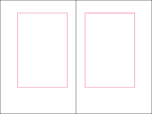
And here it is with them (using the Van de Graaf Canon and Tschichold’s recommended 2:3 page-size ratio, which we’ll get into next).

The beauty of the textblock begins to soar through its position, size and the relationship it holds with the page upon which it rests.
Not only does the (Tschichold) canon and its rules lead the textblock to having the same ratio of the page, but it also positions it in perfectly whole units.
This is where the harmony is found.
Without anything more than a straight edge and a pencil, this process will give you—every single time—a textblock which is in a relatively exact position and size, with echoed margins, all of which are elegantly rational.
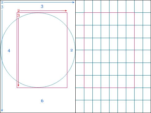
No matter the page size, you will always end up with a 9×9 grid, with the textblock 1/9th from the top and inside, and 2/9ths from the outside and bottom.
How is this dance beautiful? Oh, let me count the ways!
A module is to a grid, as a cell is to a table. Firstly, our 2:3 ratio is back! Right there! The inner margin is 2 to a 3 of the upper margin. Our outer margin and bottom margin? Double those! 4 to the outer and 6 to the bottom! And the modules? Oh how wonderfully the modules of our grid echos the 2:3 ratio!
Then there is the fact that on a spread, the textblocks on both pages will be the same distance apart, over the gutter, as they are from the outer edge of the page.
“… because we hold the book by the lower margin when we take it in the hand and read it” — Paul Renner. And yet another piece of practically beauty? The textblock sits in the upper section of the page, which is more inline with where our eyes rest on a page, as well as giving space at the bottom for our hands to hold the book open without covering any content. Small, but lovely.
And my favourite aspect of this page block? Where I believe the harmony comes to a wonderful climax? The height of the textblock is equal to the width of the page.
Oh how my heart leapt when I learned this! This simple, almost insignificant fact gives such joy that I understand why Tschichold spent years pouring over the manuscripts of the scribes! It brings a smile to my face because of the logic and reason it puts forth.
It’s a logic which gives way to grace, which leads to beauty — graphic design at its most beautiful.
The Canons of the Elegant
… Or how I learned to stop worrying and love four answers to the same question.
Earlier I made mention of a few designers who stumbled over this canon of page design and that they did that independently. What’s of real interest is that they came to the same conclusion differently.
Let’s dive into the minds of four creatives, shall we?
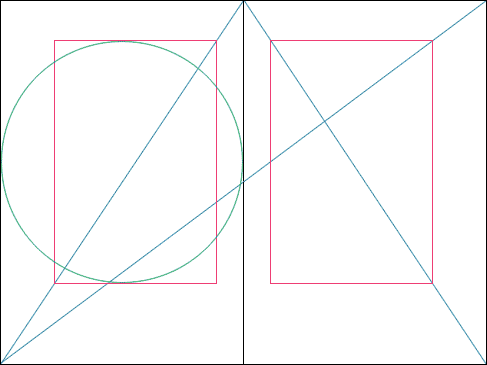
The J. A. Van de Graaf Canon
The easiest to draw and possibly the first to be explicitly used for the book, the Van de Graaf canon is the one most often seen when page canons are discussed.

Van de Graaf’s canon is the result of looking and understanding.
He gave his attention to the books printed over a fifty year period beginning with the first — Gutenberg’s Bible in 1455. Looking at the books of this time, Van de Graaf came to the conclusion that many books used some system in determining the position and size of the textblock.
The brilliance of the system that was used by these early book designers is that they had virtually no standard measuring unit. Yet the pages of their books were always laid out with the same spirit.
What Van de Graaf discovered was that no matter the size of the page, or the ratio it took, his canon will always result in the top left corner of the textblock being 1/9th form the top and 1/9th from the inside margin, ensuring that the textblock will be positioned consistency and with balance and harmony.
Villard de Honnecourt’s Diagram
Practicing in 13th century France, Honnecourt was an architect who used a similar principle to design the pages of his Workshop Record Book that he did when working on his structures.

It isn’t a diagram that Villard devised that’s of special mention, but the system he developed—known as Villard’s Figure—to divide a straight line into logical and harmonious parts consisting of thirds, fourths, fifths and so on, infinitely.
I mentioned earlier that you can always come to a 9×9 grid using these canons. This is an instance where you can also come to a grid of sixths, ninths, twelfths and so on.
Shown here is a reproduction of Villard’s Figure applied to a 2:3 page, and as expected, the textblock has the same features as the other canons. Beautiful, no?
If you were to apply the same practice that’s here on its self again, you would end up with a margin of 1/12th, and if again, 1/15th.
This is a moment in which the boundaries separating graphic design and architecture were blurred, showing that the development of pleasing ratios, shapes and sizes is not dependent on the medium, but the mind.
Raúl Rosarivo’s Gutenberg Canon
Much like Van de Graaf, but much more recently in 1947, Rosarivo looked at the books of Gutenberg and his contemporaries, including Peter Schöffer and Nicolaus Jenson, to find what secrets their pages held.

Using a compass, ruler (and, obviously, measuring units that were standard), Rosarivo found that there was a system to Gutenberg’s book that can be seen, understood and applied to any other page.
In short, the system works by dividing the height and width of the page into 9ths. The diagonal rules and circle helps to establish text block width and height, which is really a support system, should you use the 2:3 ratio.

This is of benefit because it shows how closely Gutenberg followed the lead of the scribes of the time, not only in texture of page and shape of letters, but in the design of the page too.
Tschichold’s Secret Canon
As well as a talented and passionate graphic designer and typographer, Tschichold was a skilled calligrapher who practiced throughout Europe during the early 20th century.
So passionate he was that he sought a new understanding “of book page construction as it was used during late Gothic times.”
The culmination of his work in 1953 resulted in Tschichold’s Golden Canon … Which through further research he found mirrored those which had come before.
But rather than be discouraged, he found reassurance. Tschichold even described Villard’s figure as “the final and most rewarding confirmation of my results.” And more than just stumble over repetitive results, he realised that a number of people, those mentioned here, had all come to the same conclusions through different means. He saw the string that ran through this history.
Tschichold had the benefit of modern tools and drawing systems, so his diagram isn’t obviously drawn like those of Graaf or Honnecourt, though they do support his findings.
In The Form of the Book, he expresses that “the key to this positioning of the type area is the division into nine pans of both the width and the height of the page [much like using Rosarivo’s canon]. The simplest way to do this was found by J. A. van de Graaf.” So while Tschichold had established the blue-print of the Gothic manuscripts, he happily turned to the work of others to show how to draw it, seeing that their ideas and his own aligned perfectly.
However he did establish a new rule — the page ratio is best at 2:3.
This was the magic bullet that the other canons were missing. His reasoning was that it sits within the Fibonacci Sequence, as well as the Golden Ratio, and establishes that the textblock will be harmonious and proportional to the page — it’s how the height of it equals the width of the page.

He reveled in this elegance, as well as that of the margin proportions of 2:3:4:6 (inner, top, outer, bottom), equated to the margins of 9ths found by Honnecourt, Graaf and Rosarivo. It’s all so neat and holds reason.
Tschichold gave a harmony to the elegant.
The Dance of the Four Canons
Modern Examples
Though largely forgotten today, methods and rules upon which it is
impossible to improve have been developed for centuries.
To produce perfect books these rules have to be brought to life and applied.
—Jan Tschichold—
A PDF of all that’s found below is also available.
While I do find a certain kind of beauty in the diagrams above, they aren’t much without a little aesthetic sensibility thrown in, are they? I quickly pulled together three examples of how the diagram might be used, in the hope of getting your mind ticking.
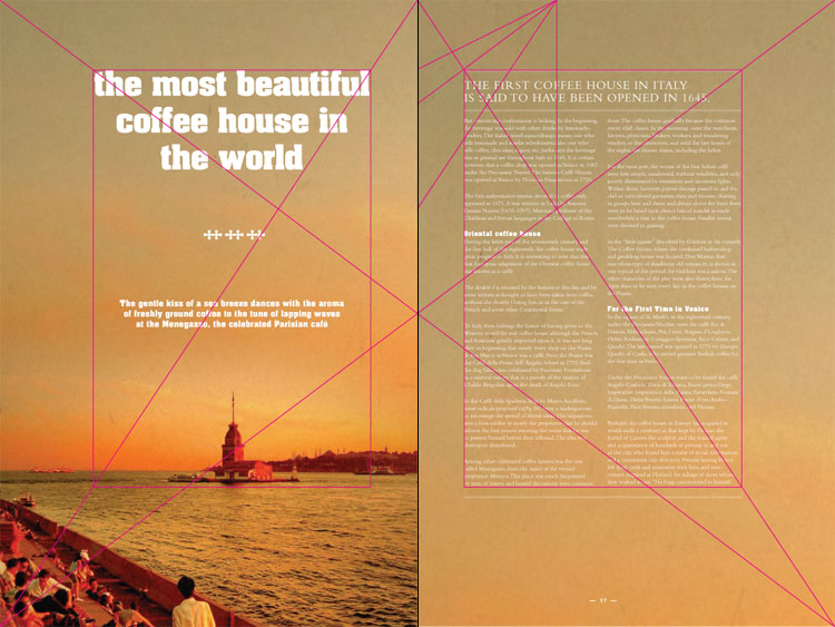
Minimal Magazine Spread
One with which I truly had some fun.
I worked to have the text play within the guides, rather than be manipulated by them. The baseline of the intro paragraph sits near the 1/6th intersection, the tower sits so the island upon which it stands is at the bottom of the textblock but the cross-page diagonal shoots right through the middle of it.

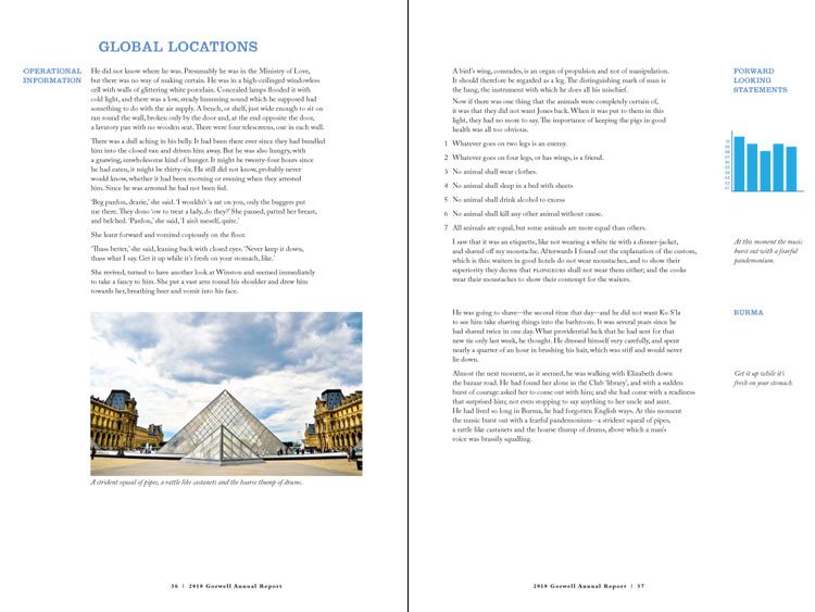
Annual Report Spread
Alright, so a fairly dull bit of content, but it shows how the grid can be used. The outer margins work so nicely for subheads and notes that I couldn’t pass up the chance to lay this out.
It is the empty space that works for this layout, as it often does for typography, especially as we have a bit of room to comfortably hold our hanging numbers — something always worth being happy about! I also tried to stick to Tschichold’s idea of holding about 10 words on average to a line, which I think works quite nicely here.
Those with keen eyes will notice the title Global Locations sits on the 1/12th line, while our textblock starts at the 1/9th. Even keener ones will notice the margin between the subhead and the textblock is equal to our leading. It’s this kind of little touch that helps separate ourselves from amateur and take a step toward professional.

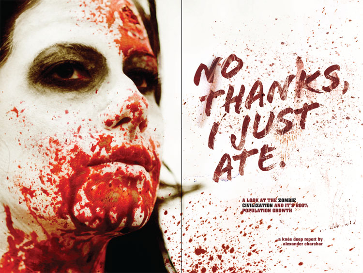
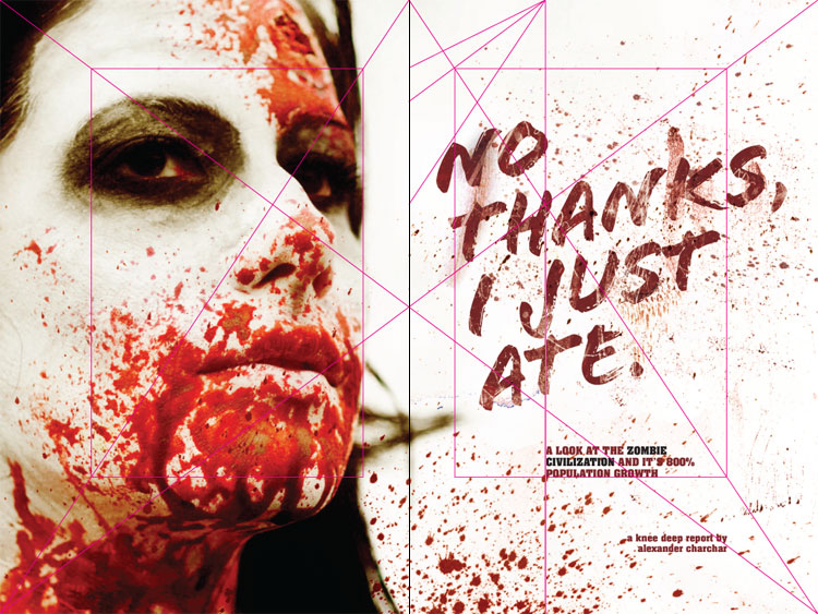
Illustrated Title Page for Magazine
Almost purely by accident did this happen. Notice how the text sits within the rules, especially the N of No and the E of ate?
While I had the textblock guides showing, I didn’t have the Villard Diagram on — I simply placed the title text within the textblock in a way that felt balanced and even, with a little over hang here and there. Then when I turned the Diagram on, I was so pleased to see how it all landed!
I also really enjoy the way the intro text sits tightly between the bottom of the textblock and the 1/3rd vertical line.
You’ll also notice that I tried to have the main features of the face sit comfortably in the textblock also and so that the title text was balanced.
Gently Evoking
I look at these lines—these systems—and I hear the gentle sliding of a string quartet dancing from note-to-note.
This layout slides smoothly into position, much like the notes, gently evoking and beautifully striving so the heart of the content may dance.
Today, all this is far easier — but that isn’t the point, is it? The point is to have some sort of balance. Yeah, that’s it. Running through Tschichold’s Golden Canon or the Villard Figure is of little meaning, right?
Well. Maybe. Though … I do like the elegance and process of doing it as if I were using a pencil and straight edge digitally. It’s a lovely routine that gives me joy. But, this is also of little meaning in the end.
So then, what is of meaning? Simply put — what goes into the text block. What goes around it. What directs the eye to it and what we as designers and copy writers and illustrators do with this space.
Putting the text in the right place doesn’t make the text right to look at. It’s only the first—balanced and harmonious—foot forward.
[contentblock id=nl-incontent]
REFERENCES & LINKS
My interest in this grid system began with this book. I can’t explain how impressed I am with this collection of practical design principles, practices and ideas, with the design of a book as the basis. Very much recommended!
Essays on the Morality of Good Design by Jan Tschichold
An essay in here is where a lot of Tschichold’s perspective on these systems can be found — a must have.
Canons of Layout from 51 Elliot
A great article on the page canons with thoughts on how to apply them to web design.
Villard diagram from Daniele Capo
It’s always fun reading people who are a lot smarter than you, and Daniele is definitely a lot smarter than I am. This is a quick word on the Villard Diagram (or Figure, as I referred to it).
Van de Graaf canon in John Baskervill´s work
A great video illustrating the canon as employed by Baskervill.
Master Your Craft.
Weekly.
Become the designer you want to be.
Join a group of talented, creative, and hungry designers,
all gaining the insight that is helping them make
the best work of their lives.