The driving force behind all our decisions is emotion.
It’s what makes us human, is what defines who we are and how we react to different situations. Graphic design is a platform from which emotional fighter-jets can be launched. So why is so much of what we see not much more than lifeless paper-planes?
This logo makes me cry

Herb Lubalin’s Mother & Child was originally designed for the masthead of a magazine, but it was never to know the light of day.
Oh, what emotion this logo pulls from me!
The typeface gives a fitting air of femininity and gentleness.The heavier strokes of the letters negate any delicateness that one may consider this logo to have. The exclusive use of uppercase, the elegance of the lettering—especially the finials of the R and the E—lead to a quality of stability.
Then there is the child-in-womb beauty that the ampersand creates. This is the moment where my heart swells. The head of the fetus as ampersand that is sitting safely within the O just works. This is elegant design thinking at its best.
Not only does the ampersand look beautiful in itself, but the slight curve and attention to detail of it—especially the back of this child—and how it derives its shape from its mother O sends a tingle through my spirits. It looks so comfortable. It looks like the ampersand is fittingly the child of the O as their shapes compliment and reflect one another so well.
Reminiscent of a baby in the womb with face and feet so close, balled up, waiting for oxygen to fill its lungs, the ampersand creates a beautiful illustration that wouldn’t work if on its own. In lesser hands, this may not have been pulled off with such grace, but Lubalin manages it so well here. The concept is great, the execution perfect.
And it breaks my heart.
This bookmark slides a smile upon my lips

The stock has a velvety soft texture to it that is inviting, looking so warm that the fingers lust to reach out and touch.
The artists behind these prints know that it is the stock and the indentation of the metal that do all the heavy lifting, so the illustration and colours are designed to be gentle.
While bright, vibrant, Pantone colours could be used easily, the inks are gentle — a fitting reflection of the work, as well as the emotion that is so easily being evoked. The colours of the inks and stock create a feeling of invitation, saying “Why hello there” rather than “I demand your attention, spend it no where else!”
The beautiful little bird sitting on the speckled edges—which help convey the feeling of hand-made care and love—is a beautiful little touch that spreads a smile across my lips. The printed, but not indented, thread through its beak works so well because it dances and plays with the elements that are embossed.
This contrast of the flat and the deep, the printed and the blind—and the interaction and playfulness between the two—is what makes pieces like this so interesting. What is and what isn’t helps to define character.
These bookmarks make me happy because it remind us that not only is it the sense of sight that can establish an emotional connection. They make me happy because I desperately want to hold them. They make me happy because it offers something that we’re slowly losing grip of — tangability.
This illustration terrifies, saddens and angers me
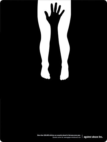
It’s worth noting that this concept was first done by Lanny Sommese, in 1987, who did a better job of it — but it’s the toe curling anguish of the reinterpreted (ripped off?) version that caught my eye.
I cannot express the disgust this image brings to my soul. With genuine anger I would rip this from my archives and never let it into my thoughts again … but it’s brilliant.
It is a very effective examples of how the right idea, and only the idea, can be so strong, that nothing else is needed, lest they get in the way. The illustration and design may be simple, but the thought within is astounding.
The menacing hand over the genitals (male? female? It doesn’t matter) says only one thing. Combine this with the in-turned legs and the curled toes and it’s clear that the body is in a defensive pose. It doesn’t want this. This person doesn’t want what is happening to them. They’re scared and so am I.
There is no heading. There are no 200 words of text. There is no colour for this black and white issue, there are no faces. No images. There is no evidence of gender, race or age. Everything has been done to let nothing but the idea within the illustration take charge and demand viewership. There is nothing between this idea and us.
Of course a photo could have been used, but the strength of this piece would be diminished greatly. If we were to be shown a saddened face, evidence of rough movements, or any kind of scene at all, we would dismissivly say “oh, this sad, but these people are merely made-up models in a staged situation.” We are numb to the acted. The image works because we cannot say that anything is acted.
This bomb is dropped when our emotions are controlled by the unknown. We are cluessless to everything in this scene except for the one truth. We become fearful of the unknown—we fill in the gaps—and then defensively step towards anger.
There is no background of a composed setting, no eyes to look into, no definitive suggestion but one. All is left is fear and anger and sadness. Utter, utter sadness.
I burn with fury because of the reality of this illustration.
Engagingly emotional
All of the work we do as creatives use the abilities we have to play with emotion. To make someone laugh is to be memorable. To scare someone is to be unforgettable. To make someone’s day easier is to be seen as positive.
We are the puller of emotional strings,
charged with the roll of delivering change.
We have this ability because we are communicators. We know the tricks to attract the masses. We know what’s effective. We have a sense that we develop to be able to distinguish what is and what isn’t engaging. If we aren’t able to do that, then graphic designers we are not.
We create emotion
So why isn’t it done more often? Why is it that so much of the work we see is flat, emotionless shells of style?
They just know that they need to be communicating something
Often what we see is boring. It’s a style wrapped in a technique, with barely a seed of an idea. The client—or the designer—doesn’t understand what they’re trying to communicate, they just know that they need to be communicating something.
Forget how good something looks. Aesthetics come second. They’re 80% of our game, but the remaining 20% holds more importance. If there isn’t an idea, if there isn’t a trigger for an emtional change, then it doesn’t matter how aestheticly pleasing a piece of work is — it’s ultimately worthless. When the winds of style pull in another direction, the piece will become more than ugly — it’ll become usless.
Before you think of the style your next piece of work will be in, before you sit to sketch your thumbnails, ask yourself what is the reaction I want them to have when they see this?
From this discovered emotion will come the concept, from which the aesthetics will grow. It’s a simple fact, one you may not want to admit to yourself, but if what you’re designing is emotionally boring, then no one will care in a meaningful way. If they’re not engaged and feeling something—anything—then you haven’t done your job as a communicator.
Master Your Craft.
Weekly.
Become the designer you want to be.
Join a group of talented, creative, and hungry designers,
all gaining the insight that is helping them make
the best work of their lives.