In 1954 Bob Gill developed a design the he would later call more pleasing “than any other design job [he] had done up until that time…”
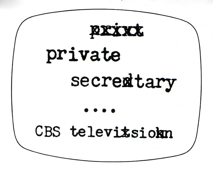
What pleased Gill so much was the Title Card for CBS sitcom Private Secretary, “because the result looks so inevitable and easy.”
He was 23 when he received this job and it served as the moment his career went into overdrive. Not only did it win him his (first) ADC medal and saw his name grow to demand more respect (he would joke it was the year that he finally got an answering service for his office), but it taught him something monumental.
Private Secretary was special because it helped him realise that a design can only be taken so far by an aesthetically driven solution.
“I stopped trying to ram my aesthetic prejudices down their throats. Why should clients have my tastes? … I talked to them about solutions and ideas instead of design.”
It is because of this attitude towards “inevitable” solutions that Gill’s clients thought so fondly of him. He was giving them tailored work that was concept driven and so well considered that he was able to effectively describe them over the phone.
He started to consider what the solution should be first, worrying about appearance second.

Not long after Private Secretary he began teaching at the School of Visual Arts, where he would encourage students to talk “about their solutions before they put them on the wall … Students began thinking of original ideas, rather than trying to impress [the class and Gill] with the latest graphic tricks.”
Gill’s 1981 Forget all the rules about graphic design. Including the ones in this book seats us comfortably in that classroom.
A marvelous classroom

Not only a documentary of a few good ideas about design, Forget all the rules … also gives us a sneak peek at the mindset Gill employed throughout his impressive career.
Our tour is guided through the rich logic that helped propel Gill to great heights and garner respect from his peers, clients and readers of design history. A logic that is lacking for many designers. A logic essential should one wish to do original work. A logic we are privileged to see wielded by a master.
A logic easy to talk of, implement and use to deliver powerful results:
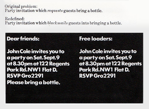
If the problem a client gives us isn’t worth solving, then redefine it so it is.
Redefine problems so they are worth solving
Typographic tastes sweeten and sour over the years, considered fundamental and benign is illustration and photography from one decade to the next, and moving from redundant to intoxicating is how style shifts year to year. But there is one element of design that never, ever fails to tingle senses and delight minds – the good idea.
That is what can be found in this book before anything else – a clever solution that springs from the problem will always stay fresh.
A clever solution doesn’t need to use the crutches that style and empty aesthetic provide. Private Secretary is a great example – the typeface is as appropriate as can be, the concept has a legitimate source and it is visually perfect — you aren’t distracted from the problem plagued text of the secretary. The spice is added because it’s witty and has personality.
Make the problem interesting and you’ll be planting the seed of a good solution in habitable soil. The plant that bursts through the earth will grow far higher than one planted in uninspiring dirt.
Lessons Worth Learning
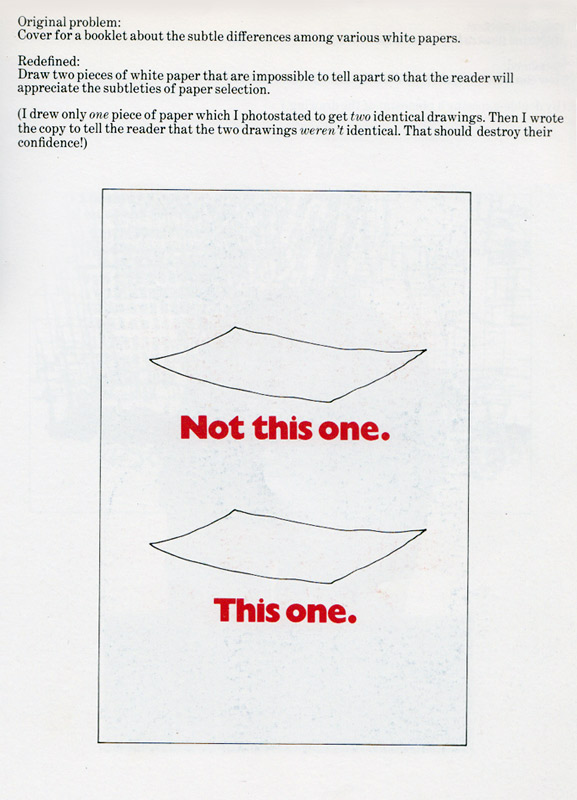
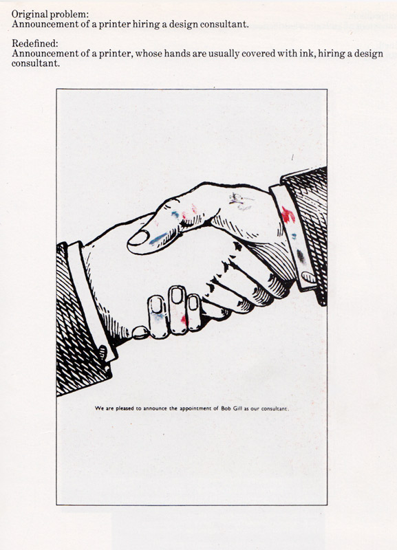
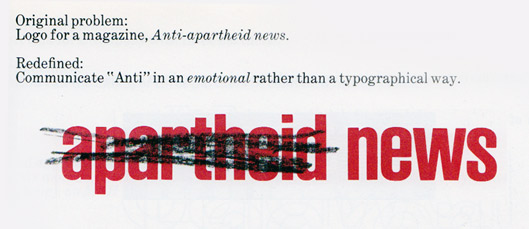
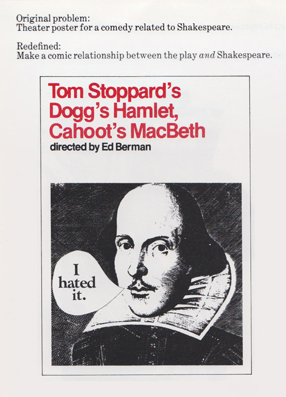
While a few images are scattered throughout this article to illustrate the (worthy of aspiration) genius of Bob Gill, I wanted to offer a little more.
Introducing each chapter are a few short paragraphs explaining the philosophy behind each collection that follows. These introductions show us varying lenses under which the original problems can be placed so that we might see something different when redefining them.
Obviously I can’t cover everything Gill does without running a blade over moral issues concerning plagiarism. Without going into great depth, I thought I would do what all of us do when we read such advice – put our own spin on it and apply it to concepts we already have. What follows are my interpretations of Gill’s ideas.
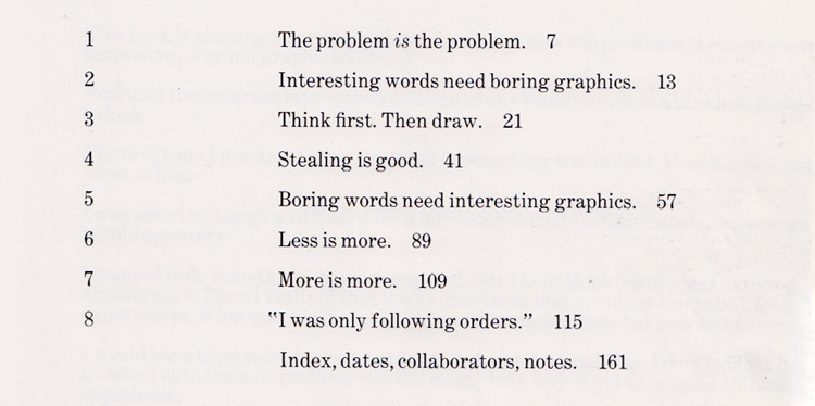
The problem is the problem.
Our creative expressions are the culmination of all those we’ve witnessed. Sometimes we rely on this too heavily rather than finding ideas within the client’s problem and content. We echo ideas of ideas of ideas of ideas.
To truly design something new we need to throw away our creative and stylistic laurel-resting ideals, forgetting about the solutions to other problems and instead focus on the one before us.
But what is often the case with problems is that they’re, well, problematic. A client will come to us with an idea they have and think all they need is an answer they’ve half-provided visualized.
Unfortunately it is common for the client to present us with the wrong problem to solve. They don’t phrase the question right. Perhaps they’re too close to it (forests, trees and all that), perhaps they’re not bright enough or they’re too smart, perhaps they don’t even have a problem.
So before we can find a beautiful, new, unique solution that’s buried in the problem we are facing, we might need to rewrite it so there is opportunity to to pull from it something interesting.

Interesting words need boring graphics.
A stupid designer grows intoxicated on their own greatness and self-worth.
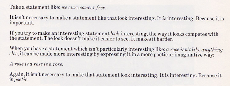
Gill gives an example I could not top so won’t try; “We cure cancer for free.”
There is one design solution for this. White background, big, black, heavy as a whale text, left aligned. Want to go out on a limb? Center it (but don’t).

Think first. Then draw.
Research, research, research, research, research.
Then think visually – draw and sketch, draw and sketch and write and draw and sketch and write and draw. Pages of thumbnails. Pages of notes. Pages of research. Pages and pages and pages written and drawn until your wrists ignite.
With all these marks, why not try different things? Use different pens and pencils and crayons and brushes and markers. Different colours, widths, textures, sizes. We don’t think monotonously, so why draw like we do?
Then, after it’s formed in your mind, and you’ve put those thoughts onto paper, boot up the Mac.
Jump into the digital too quickly and we will start to produce work that feels like it belongs to the digital world. We’ll do what we’re comfortable doing and seeing, what we’ve seen come from the box of light a million times. Even worse, we might just rely on the trickery digital tools of design often encourage.

Stealing is good.
Should you find yourself in the situation where you are using the artwork of another—be they a photographer, illustrator or typographer—it is your honorable duty to respect their work.
Much like the designer who should shut-up in the second point above, Interesting words need boring graphics, interesting artwork needs boring design.
If you’ve found imagery or a typeface that ignites a fire in your soul, then it demands of you to allow it to do so unto others. Just let it sit there with no distraction, waiting quietly for its prey.
If you’re going to steal the beauty of another image, then don’t drop it while hauling it into your van.

Boring words need interesting graphics.
Most people suck at writing copy for advertising and marketing. Including advertisers and marketers.
If you have to deal with the usual dribble, then chances are your design will need to pick up the weight – but again, the foolish designer will race ahead as giddy as a gerbil! Just because the words are boring does not mean that they should be hidden behind your design.
The boring words still need to be read, that’s why your design exists. With boring words, it is up to us to strike up the balance in which the design brings attention and lends interest to the dull words, while not getting in their way.

Less is more.
Much power can be pulled from a design when it quietly and gently pulls together two opposing elements and has them sing the same tune. Aim to say more with less.
I could have written more, but….

More is more.
A sentiment I first stumbled over in Paul Arden’s fantastic It’s not how good you are, it’s how good you want to be – if you’re going to make something big, make it REALLY big.
If you want the headings to be much bigger than the body copy, then make them 10 times bigger, if you want your website to be bright and colourful, make it overly bright and sickeningly colourful. If you want your photo to be funny, make sure it’s hilariously funny. Don’t settle for elegant typography, aim for royal-family wedding typography.
The point is that a little different isn’t often noticeable – things don’t often hit extremes in real life, but in the world where we are the makers, why not push things to the edge blow them the hell up?

“I was only following orders.”
If the job passed by your desk, it’s your fault it’s ugly. The client only makes suggestions, you have every right to tell them their suggestion isn’t a good one, explaining to them why and offering a suitable alternative.
“The client made me do it” doesn’t mean anything when the job is finished and in the hands of the public.
Change the original problem so what they hold isn’t embarrassing.

One of the most important books on design
While other books might be more valuable in many regards (Bringhurst’s The Elements of Typographic Style and Meggs’ History of Graphic Design for example), the unavoidable take-away Gill gives us stands alone:
Original and interesting solutions grown from the client’s problem are what make graphic design move from appropriate to good.
The body of a good idea won’t be completely obscured by the clothing of aesthetics that we drape over it. While the clothes may need to be appealing for the idea to be noticed in the first place, the body will still be beautiful even when the clothing becomes tacky as the sands of time are sprinkled over them. Good ideas last.
It’s evident with the work scattered throughout this article. I know there are some readers who would have closed this article upon realising the artwork is, most likely, older than they are. I understand why this would turn them off, even if I don’t think it’s a good attitude to have.
But if you spent a moment to see the beauty of the idea that is hidden below the (conceivably) tacky clothing, you’ll see the true value of the design. The benefit of which is more than just timeless design.
A good idea shines through stylistic preferences the audience may hold.
If the design you produce relies on visuals to appeal to the audience alone, then, by default, you are unappealing to a large proportion. But if a good idea, one born from the problem, is the body of your design, then people won’t need to rely on aesthetics to find interest and consider the design and message worth remembering.
While the edition of Forget all the rules about graphic design. Including the ones in this book. that we looked at today is no longer current, it can still be quite easily found and is absolutely worth the (very little) cost. The original hardcover (with a slightly different name) can be found on Amazon and AbeBooks, as well as the softcover version, also on Amazon and AbeBooks.
In 2006 it was re-released in a smaller format and has some updates done throughout (design and some of the pieces included) – Unspecial Effects for Graphic Designers.
Master Your Craft.
Weekly.
Become the designer you want to be.
Join a group of talented, creative, and hungry designers,
all gaining the insight that is helping them make
the best work of their lives.