It feels like I need to swallow.
It’s not quite a pain, but it’s a discomfort of sorts. Right in the bottom of my throat. Maybe closer to the top of my chest. It moves whenever I go to look for it.
My eyes warm around the edges. My brow softens.

I sigh. Not one of sadness, though not quite happiness. Contentment. That’s what it is, I think. I’m content with the fact that a simple piece of design has been able to evoke in me an instinctual reaction. That marks made by a hand, that an idea given shape, has been able to pull from me an emotional reaction, has been able to alter my brain chemistry, to make me feel my breath, is a wonderful gift.
There’s other design out there that alters my mood in different ways. Some excites me, making me want to leap from my chair and run until my lungs burn. They’re energising and exciting and inspiring. To run, of all things. But that was the goal of the designer.
There are other works out there that have me feel an excitement not had since a childhood Christmas.
Others are visual tricks. They’re little puzzles that make me happy when I solve them.
Some of the coolest are websites. Those that, upon loading up, are so rich with novelty that I can’t help but scroll down, click through, signup to a newsletter, buy their product, become a fan for life. All because their site is interesting.
This is what good design does. It moves people. It moves them emotionally and physically.
Both are spices in the dish. Too much of either and the meal is ruined.
Examples are easy to find. So easy that I can illustrate them with a few words:
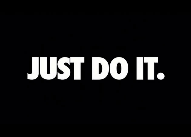
“BUY BUY BUY BUY BUY THIS PRODUCT!!!! GO TO THIS URL, CALL THIS NUMBER, TWEET THIS HASHTAG, OR PROVIDE SOME SMOKE SIGNALS AND WE’LL COME TO YOUR HOUSE!! SO YOU CAN BUY BUY BUY BUY BUY BUY!! WE’RE ON TWITTER, FACEBOOK, INSTAGRAM, GOOGLE+, WORDPRESS, SPOTIFY, YOUTUBE, LINKEDIN, VIMEO AND WE ALSO HAVE OUR OWN SOCIAL NETWORK! WE CAN HELP YOU BUY BUY BUY! LET US INTO YOUR LIFE!”
“You’re fat, ugly, and stupid. You will DIE. Find out how! We have the solution!”
Yuck.
Good Design Moves You Physically.
Good design makes you do something. The majority of our work has a call to action, something that evokes the audience to physically do something.
It can be as dramatic as leaving the house, or it could be as subtle as punching in a username and password.
This isn’t the flour of the cake’s we try to make. It isn’t the sugar, or the eggs, or the chocolate. It’s the goddamn tin. It’s has to support everything else that we do, it has to be the home for it, it’s the guidance.
Think of any product or site that you use, and think about what you use it for. Chances are, most sites are designed to help you get to this physical movement as quickly and easily as possible.
Instapaper? Click or tap on a topic and read.
Twitter? Type a message out quickly. Wait.
No.
It goes deeper than that, doesn’t it?
This is where empathy comes in.
Before the physical need to communicate is started, there needs to be a psychological component. A desire to have yourself heard or spoken to. Validation, that’s it.
That’s hardwired into us. The genius of Twitter is that it tapped into this wiring. But there’s also stage fright. It can be intimidating to say “look at me” when that’s all we really want for people. We want them to look at us, look at our work and our ideas and say “hey, that’s awesome!” (look, an emotional and physical response!).
They solved this. They made the path to communication so slippery that even the most timid of people are able to find comfort. 140 characters. There’s nothing scary in 140 characters, is there? And once it’s gone out so quickly, after being so easily written, we feel at ease. So we do it again. And again. Twenty-thousand times.
They bridged the physical action (easy to communicate, tap a button, tap some more buttons, tap another button) with an emotional one (the need to communicate, of seeing your idea come up in a stream amongst those who you follow, those who you admire).
Clever.
If you’re going to design a Twitter client you’d want to respect this. To get the user to move physically you’d want to make composing a tweet the easiest thing in the world. Without this nothing else in the app matters.
And publishing it? That needs to be rewarding, somehow. That’s a winner. Make it rewarding, and a little bit exciting.
Good Design Moves People Emotionally
Which brings us to the emotionally way in which good design can move people.
This is trickier in graphic design as it’s so easy to take advantage of people’s insecurities.
But when it’s done with empathy it can be extraordinary.
Good design makes people smile. It makes them excited. It makes them sad. It makes them nervous. It makes them enjoy a richness of novelty.
Once you’ve taken care of the physical response you’re hoping to elicit, then it’s time to worry about the emotional.
Simply by asking yourself “What do I want the audience to feel when they use this product?” whether it’s an app or a poster, you can tap into a rich vein of ideas.
I’m not sure if it’s natural or drilled into us, but mentioning an emotion leaves as awash with concepts.
Happy. What colour is happy? What shapes are happy? What words and typefaces are happy? What photos evoke happiness?
It’s kind of like the “don’t think of an elephant” trick, that always gets people to think of elephants.
Think about happy.
Or sad.
Or excited.
Our minds think of images for such things. Mostly photos, I’m guessing. Or video clips of experiences we’ve had, perhaps?
These are yours to cherry pick from, and please do so. Play a little game with them. The next time you’re at your desk working on something, ask yourself what the emotional response to this piece of work is going to be.
If it’s “nothing”, then you’re probably in trouble. Unless that’s the goal. Which is perfectly possible.
Except When It Doesn’t.
Sometimes design is meant to simply shut up.
Much like Beatrice Warde’s crystal goblet, it must simply disappear, allowing one to enjoy their wine without noticing the glass in which it swirls.
Those scummy examples I mentioned earlier in this article are ones in which the design is often used to dramatically dress up the pig of content that’s under the surface. Ugly, boring, stupid content.
But sometimes the content is so good it shouldn’t be hidden by anything. There shouldn’t be any tricks by the designer to evoke a physical or emotional reaction. The idea of the author, the original artist, simply needs to move from their mind to the mind of the audience member, with nothing standing in the middle of the road.
Sometimes this ideas are transferred with words. Sometimes it’s photos. Sometimes the best thing for you to do as a designer is to place the photo, then send your bill.
Your worth in this case is knowing that the photo is doing to do all the inspiration for emotion and physical movement. The lesser designer will slap words on everything, trying to evoke a reaction with their idea from their mind, rather than from the artist who has already done that for them.
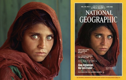
I love National Geographic, and of course the design can’t always be removed, but this illustrates how much more powerful the photo without design getting in the way.
Three Simple Questions.
Design is never this easy, of course. Context, content, rah rah rah. So many things matter, but thinking in these terms is a good starting point for most projects.
What do you want them to do?
How do you want them to feel?
Are you sure of either of those?
Master Your Craft.
Weekly.
Become the designer you want to be.
Join a group of talented, creative, and hungry designers,
all gaining the insight that is helping them make
the best work of their lives.