In part two of this four part series of analyzing the differences between movie posters—originals vs remakes—we have some great comparisons. This meal’s main ingredient is a fleshy base of horror/thriller, with a twist of romance, a dash of comedy and a sprinkle of absurdity. It will serve 13 couples.
This is a great batch because it showcases how far posters have come in the horror genre. From horrible beginnings of tacky facial expressions, it’s now possible to say that posters showcasing death, blood and gore are in fact beautiful. Delicate textures and soft browns & yellows with dashes of red, it’s easy to see that the designers behind these posters love what they do. Crafted with care, there is just something stunning about these pieces of macabre. And horror isn’t alone in growth. With the couple of examples below, you’ll notice that the posters for action films has improved greatly also even though their begging weren’t spawned from such beginnings of that of horror.
The other parts
Part I (A-G) • Part II (H-L) • Part III (M-R) • Part IV (S-Z)
The Hills Have Eyes (1977 & 2006)
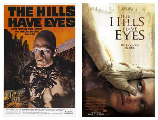
GLADIATORS, ARE YOU READY?! As almost always, the new adaption of this horror flick is far superior to it’s predecessor. Although, the type has me a little perplexed as it feels as if the H/i hasn’t been kerned properly. The girl in the shot looks more bored than scared, but the textures in the background, the dirty hand in a glove and the required text in the bottom left is so nicely done I hardly even noticed her vacancy.
The Hitcher (1986 & 2007)
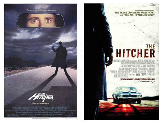
I love the simplicity of the 1986 version of The Hitcher’s poster, and the logo makes me smirk in it’s originality when compared to the 2007 version. But everything else is almost laughable about this original. It does feel right for the time, but hasn’t aged well. Not to mention the colours, texture and shot of the car in the 2007 version make me swoon. Somehow the designer was able to make the required squished-to-hell text work in a way that makes it obvious the poster was designed with it in mind, not at the last moment when it had to be shoved in somewhere.
House On Haunted Hill (1959 & 1999)
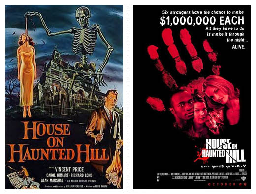
The poster for the 1959 version of House On Haunted Hill wins the ‘Badass of this post’ award. A skeleton hanging a women, some guy with unexplainable hair carrying around a head, and fantastic type makes up the winner. The 1999 version feels like it was designed with a marketing rep sitting behind the designer. Not that the four (I count four, not counting the credits text) fonts aren’t enough, but the paragraph of text at the top is a little too much. Which is a shame, because if the text at the top and faces in the hand weren’t there, this would be a fantastically intriguing poster.
Insomnia (1997 & 2002)

Not only is the 2002 version of this Norwegian remake better than the original, but I feel that it’s a good poster in its self, not just comparatively speaking. It gets around the idea of having the casts faces blown up by shrouding them in the dark of night, which serves as a nice contrast to the film (set entirely in day) but, obviously, compliments the dark nature of the story. The touch of glowing daylight in the top corner grabs your eye, while the faces guide you to the title. The actors names aren’t too obvious and it all just works so well together.
The Island Of Dr. Moreau (1977 & 1996)

Make the faces bigger.. no bigger.. a little more.. yeah, way bigger, it’s Marlon Brando and Val Kilmer for God’s sake, make them huge! What do you mean the original had a really cool illustration of a human turning into a darkened wolf? Who cares about that, no one goes to the movies to see stories, they go to see actors.. make the faces bigger! Bigger!!
The Italian Job (1969 & 2003)

On the left we have a sexy shot, no discernible faces, simple and restrained design with the bad guy drinking tea while holding a massive gun. Awesome. On the left we have actors displayed in sizes based on their pay-scale. That aside, I really like the 2003 version. The dark colours with the strong streak of yellow which is echoed throughout the film (road markings, lines of traffic, the paint job of the cars) is a fantastic combination and it’s a rare instance where a gradient for a background has been pulled off, but the character in the background has a shadow that just doesn’t feel right and looks too illustrated.
(The Day Of) The Jackel (1973 & 1997)
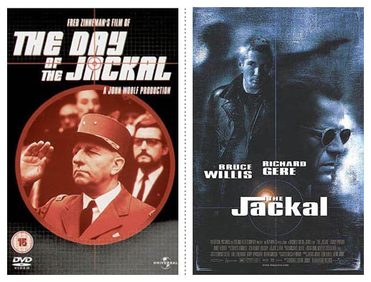
Even though the 1997 version of The Jackal is only loosely based on that of it’s 1973 original, it’s kind of nice to see a similar font being used. The original looks far too much like the cover for an Atari game than a movie poster (or in this case DVD cover). The subdued colours and gritty texture of the newer version works so well for this movie. So well, it stops you from noticing the lens flare behind the title.
Les Visiteurs / Just Visiting (1993 & 2001)

Same director, same story idea. The original was set in France, while the newer version was set in the United States. On first viewing, the newer version seems tacky and obvious. But then you move past the standard good-looking leading-lady pose and realise it’s not all bad. That being said, the artwork of the original is a little more eye catching as it’s just plain bizarre.
King Kong (1933 & 2005)
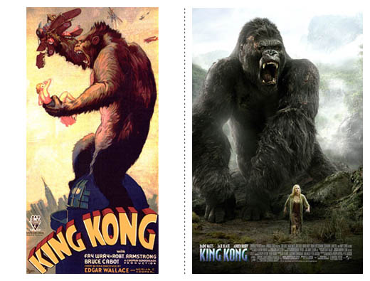
Oh baby, two great posters. Both show that all involved were smart enough to make Kong the strongest part of the poster. Both have the beast standing above the text, not below it where it might diminish his stature—you almost feel as if he could stretch out to twice the size.
Both of these posters have things to love about them. The 1933 version shows Kong as the kick-ass bad guy who is going to be able to tear the city a new one. Not to mention the bizarely out of scale lady and plane (it would suggest the blonde in his left hand is almost the size of the plane in his right), the on-top-of-the-city pose is fantastic, giving way for stunning background colours and not to mention the iconic title. We are shown the raw strength and animalistic nature of the big guy. The 2005 version shows fantastic restraint, not filling the space with taglines that make no sense or a montage of feathered images. Kong doesn’t look so dangerous, as it looks more like he’s protecting his lady-friend. The soft glow is a great addition, as is the fact that neither Kong nor lady are posed in an overly artificial way (staring right at the camera or side on).
Il Mare / The Lake House (2000 & 2006)

The original works so nicely. The sunset behind the lovers grab your attention, and looking at them, man with out stretched arm gingerly grasping the woman’s, they both look so disarmed and in love with one another. Six years later, and you aren’t sure if the two characters are in love or if Keanu Reeves is sick and holding a gun to Sandra Bullock’s back to get to a blood bank. Though the imagery is a not so subtle reference to what unravels towards the end of the story, the layout is quite nice, with only the actor’s names feeling out of place.
L’Ultimo Bacio / The Last Kiss (2001 & 2006)
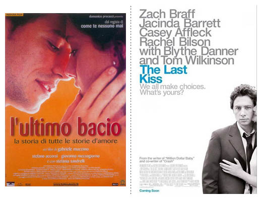
The original isn’t really much. It’s neither here nor there and is rather generic. The 2006 version has a few strong points. The large type is beautiful, and the grey/blue colour scheme works very well. Who wouldn’t be drawn straight to that island of blue in a sea of white and grey? But… maybe the type is a little big? The text is fighting with the image for attention, so your eyes dart all of the place on first glance. Overall, it’d work far better without the image, but the image is just great and raises a few questions, which leads the audience to viewing the poster for another second or two and it staying in their heads longer. While Zack Braff kind of looks the way he always looks, the barely in the shot girl on his side works so well in creating intrigue.
The Little Shop Of Horrors (1960 & 1986)
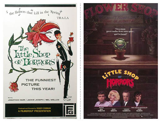
The 1960 version is all kinds of great. The delicate illustrations contrast against the monstrous plant about to eat our bobble-headed friend makes me want to go along to see this movie. It looks fun, quirky and different. Although Steve Martin’s come-hither look does ignite the heart.
The Longest Yard (1974 & 2005)

Again, we have the ‘shown on a scale based on pay-cheque’ technique in use with the 2005 remake. But it is far ahead of the curve when compared to the original, even with it’s tag line, which seems to be used on pretty much every fourth movie poster in history (‘If you can’t (blank), get even’).
The original looks more like an ad for a chest-merkin found in a men’s magazine. The remake isn’t all bad. The number-plate treatment of the type works well as a reference for the location of the film (a jail … alright, so it might not be the most original idea in the world), and the red/yellow in the top is quite lovely and serves as a nice contrast to the blue of the jumpers. Budding actors take note: get the agent these guys have. How else did they manage to get almost every supporting actor onto the poster? Oh, and I just noticed these second tag line about getting even.. two in the one poster, whoo!
Mood
Texture lends a piece of work some tangibility, making something look handled and not cared for – something to be dealt with quickly, holding no real value and is worthy of nothing more than being discarded, much like the victims in the films they are representing. If something is safe and warm, it isn’t often going to be dirty and scratched—when was the last time you fell asleep comfortably in a disgusting place?—so soon as you look at the texture-heavy posters, you are given a feeling of unease. The colours aren’t bright to invoke happiness or excitement; they are dirty yellows and whites with a small selection of washed out colours representative of filth and grime.
Of course, texture isn’t the only way we can set a mood easily. While texture might be able to set a mood quickly, colour can have a stronger impression. The Il Mare/The Lake House & L’Ultimo Bacio/The Last Kiss are great examples of how a lack of colour can invoke a lot more than saturated images can. It catches your eye because something is missing, not because something is added and brings you in because of it. And when mixed with a splash of colour, the unsaturated can can work even harder (The Last Kiss). Alternately, when it’s half-half, it isn’t as strong and can sometimes come off tacky (The Lake House).
Then there is the complete opposite. The saturated, the bright and the sometimes nausiating. The Longest Yard and Just Visiting remakes are great examples of this. You aren’t going to expect either of these films to be serious or contain a whole lot of depth because the colours are shallow in their vibrant superficiality. They get your attention quickly, but you aren’t going to want to see them on your wall, screaming at you day after day. No, these saturated colours are the candy of this post. They are great to look at, get your attention and make you want to go to see these films. But watch too many of these sugar-coated flicks and you’ll start to feel a little hollow inside and crave something with a little more substance.
Part I (A-G) • Part II (H-L) • Part III (M-R) • Part IV (S-Z)
REFERENCES & LINKS
Speakup: Dark and Fleshy: The Color of Top Grossing Movies
A great article on the colour scheme of the higest grossing films, lovingly put together by Armin Vit at Speak Up.
Characters on the Silver Screen – July 2008
A great article at the Fontshop blog about the fonts used in a few movie posters from the last few months.
Wikipedia – List of film remakes
This is where I found all the information needed for the film remakes.
Master Your Craft.
Weekly.
Become the designer you want to be.
Join a group of talented, creative, and hungry designers,
all gaining the insight that is helping them make
the best work of their lives.