George Orwell’s masterpiece, Nineteen Eighty-Four, is a piece of literary work that few are ignorant of. Yet after a bit of time looking at different covers designed since its first edition, I began to think that there weren’t many that felt like true reflections of the original.
George Orwell’s masterpiece, Nineteen Eighty-Four, is a piece of literary work that few are ignorant of.
A chilling story of a world at war where all information, culture and, to a terrifyingly easy extent, ideas are controlled by the Thought Police from their Ministry of Love—it’s a lot worse than it sounds—under the law of a strict ruler – Big Brother and his totalitarian regime. We focus on Winston, a man of no importance in this alternate world of 1984, whose purpose is to alter records as to better reflect the current politcal mood of the party.
When the designer includes a subtle reference
or link it’s always a delight
While the covers of books don’t have to represent exact moments or ideas contained within the pages they cover (there’s a saying about it, I believe), when the designer includes a subtle reference or link it’s always a delight. When the cover makes more and more sense the deeper your understanding of the story becomes, it begins to become an inside joke between you and the block of paper in front of you.
This doesn’t really happen with many, if any at all, of the covers of this classic novel. There seems to be something lacking for most of the covers designer for Nineteen Eighty-Four since it’s original writing, which is surprising given its popularity and position within literary history.
I thought I’d look at more of these covers. To see if it was as bland as I thought it to be.
I was quite surprised when I realised that most of the covers fell into the ‘oh, it’s the visual of the blurb’ category.
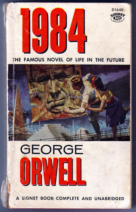
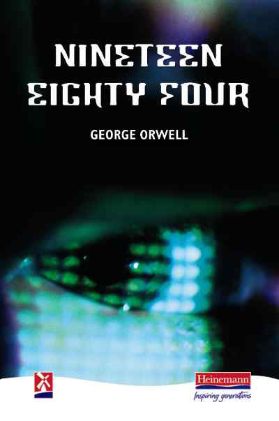
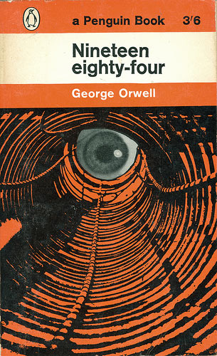
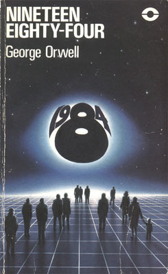
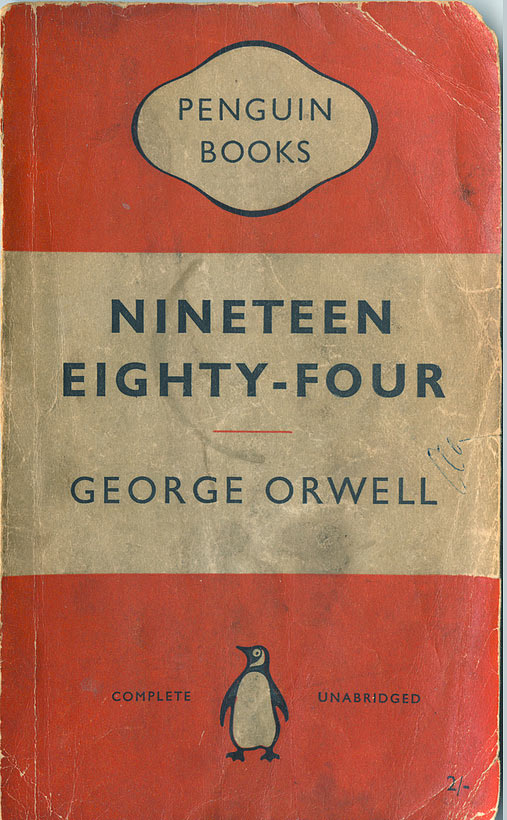


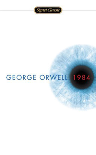

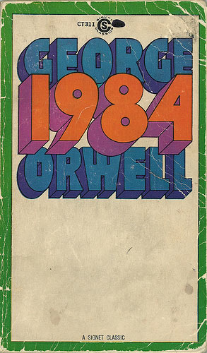


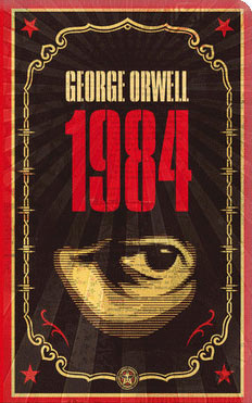
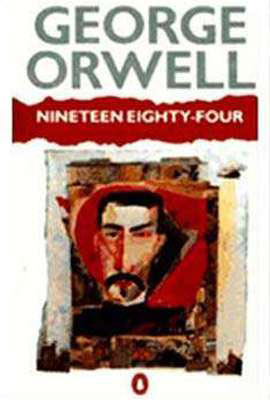


There are some that are quite good, one or two that are quite beautiful (Shepard Fairey‘s recent swing at it being the leader of the pack), but few borrow imagery from the pages they wrap. None that felt like a true reflection.
I thought I’d give it a crack and explore a concept from the story.
I wasn’t trying to design something that I thought would sell the book better than any other cover designed. In fact, where I ultimately ended up would probably sell the least amount of books as only those who have read the story would understand the reference – and more importantly, it’s not a reference they would go hunting for on the shelves.
No, I just wanted to try something that felt a little more fitting.
A story told from within
So I began to think of information and how it is contained within the story. I wondered how this book would be understood and seen and thought of within the world of Nineteen Eighty-Four. As if it was a book written about it from within.
The story ends with a murder (of sorts) and before this, the leader of this world is not painted in the most flattering of hues. Yet, in the world of Big Brother and of continual change to information so all praises Big Brother and his decisions, stories are spun.
This is what our protagonist Winston does with information. Should Big Brother and his government change its political stance on an issue, then all information, past and present, is changed to appear as if Big Brother had always thought the same way. The bad guys are only bad until they are allies, then they have always been so.
So the words are changed to erase that which should not have happened and forget all who were involved. So I began to wonder, what if this were to happen to Nineteen Eighty-Four—what if it was changed to hold Big Brother in a more favorable light?
Erasing the story-teller
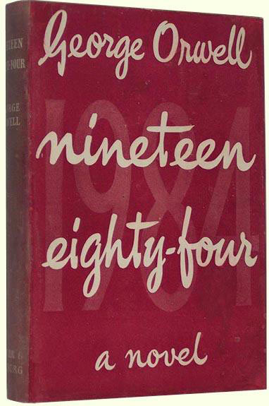
I imagined it being a hard-cover book, one not particularly designed, but rather simple – this isn’t a time to think of page harmony and hierarchy.
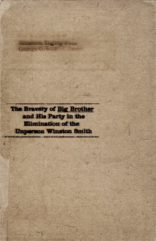
Being a hardcover book, it wouldn’t be easy to remove a pressed in name – it would require some scratching and some scrubbing on behalf of the changer of words against the fabric and ink.
This is what I did with the original title.
A deep impression would always remain, and some remnants of ink would still be visible. It wouldn’t be clean nor perfect – there would always be a reference to what the book was.
It would not look good for Big Brother should someone tell a story of how evil and awful and disgusting he is. Therefore the title must also be changed to erase the story from peoples memories.

Correcting History
Prepare for a spoiler – the last moments of the book, Winston’s life effectively ends (there’s a murder but not a death).
But who would a courageous, strong, brave, intelligent and noble leader have murdered? Those who aren’t to be known, of course! Those who become known as an unperson. Those who are evil and wrong and are to be removed from history, lest the good name of Big Brother be besmirched! Ahem.
Let’s say that someone decided to make this a story of how Winston wasn’t the good guy, but the bad. And he was stopped, as bad guys often are, by the good guy.
Now let’s talk technicalities. Nineteen Eighty-Four takes place, or at least from the point of view of Winston, from what was known as England. Keep this in mind for a moment, please.
For a new title to be impressed upon our cloth covered, hard cover book, you would need type of metal. Something strong, that could make an impression. Yet the book is already stitched and there isn’t the money (it is war time, after all) to rebind.
Now imagine this man who is changing all our words running around England. Looking for metal type. He would need something pre-1939, before the start of the second World War.
He could easily find Clarendon.
Clarendon was originally designed around 1845 by an Englishman and felt a resurgence in popularity in the 1920s. There would be a fair amount available, one would think. Originally designed to be representative of the strength and intelligence and might of the British Empire, it seems rather fitting to use such a face for a government that prides its self on not much more than such characteristics.
So we have our font in the form of metal to give our book its new title. And we have our problem – it cannot be run through a press. It would have to be done by hand.
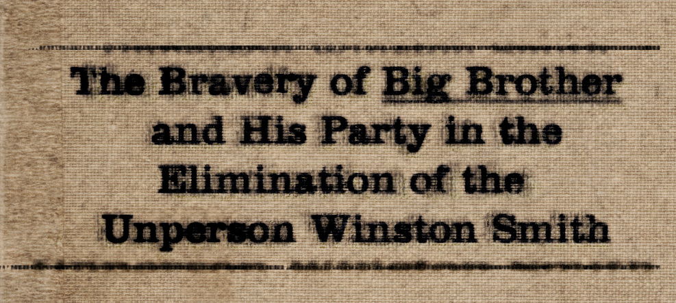
The problem in our case was that whoever pressed the letters in, whoever inked them up and set them, didn’t do so with the same amount of finesse that a press and typesetter might. Too much ink was put on the letters, far too much, nor is the impression clear – it’s as if they’ve had more than one go at it. And if one looks closely, clear signs of bleeding are apparent.
That which is hard to ignore, is the fact that it’s ugly. Horribly ugly. It’s centered text to the left, with no thought of kerning or, even though an attempt has been made, to have the lines of text balanced. Perfect for a world where such detail in the arts is ignored and, in a sense, repulsed by those with political muscle.
But there it is, our new cover. A cover as if it were made by those in the novel, under such circumstances. A book which was spun and changed to tells the story how those in charge want it to be. A leader wasn’t defied—a villain was stopped.
Does it do a better job than those shown here at selling this classic? No, not really. Is it a little more interesting and play on the ideas contained within the book? I hope so.
Master Your Craft.
Weekly.
Become the designer you want to be.
Join a group of talented, creative, and hungry designers,
all gaining the insight that is helping them make
the best work of their lives.