Pixar is a billion dollar company because it knows how to tell a story.
They know how important it is and that without a strong story at the core, all the technical wizardry and aesthetic mastery of their films would be overly sweet.
Story telling is often as important in graphic design as it is in animation and film making, even if it isn’t as obvious — we use grids, type, colour and imagery to help bring stories to life.
When there is a lack of a story—of an idea—there is nothing but average design to be found. Why? Because there’s a lack of a point of interest — there’s nothing for the audience to grab onto.
So let’s learn from the mistakes and glories of others, comparing two story tellers who act on the same stage—Pixar and Dreamworks, of course—and the stories told through the branding of their films.
I’m talkin’ logos, baby.
Toy Story
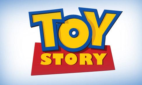
Pixar
Playful and fun — a great way to start!
This logo is a winner because it’s appropriate without being condescending.
The primary colour pallet aims it perfectly at its audience and nothing says “gimmie” like red and yellow. The type size, the chunkiness of it, as well as the playful way it’s laid out, make this cute in the right way and screams, well, “Toy”.
It’s also nice to see a logo which has depth (hinting at the 3D of the animation) without going straight to embossed trickery.
A Bug’s Life
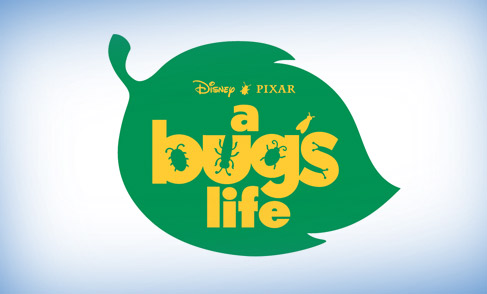
Pixar
Another nice and flat logo from Pixar. It’s lovely to see a beveled look isn’t what they go for just because their films are CGI.
The bugs eating away at the letters are cute and the little one between Disney & Pixar is a great touch.
The typeface is appropriately playful and has an exaggeration to it that suggests that we’re going to be shown little things really big (I’m looking at the i, f and e mostly), but it’ll be a gentle ride.
The slight warmth of the yellow is nice little ray of sunshine that gently touches down on the bug covered leaf.
All this adds up to a little reflection of the film — it has its footing in it.
Antz
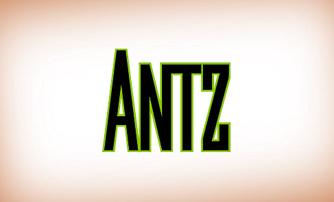
Dreamworks
I’m sorry, what?
Oh, the Z is on the end, instead of an S. Edgy! Though it was the eighties early nineties mid-nineties late nineties, so it wasn’t totally off base, right?
What I want to find in all of these logos is a reflection of the greater story. And I’m afraid I just can’t see it this one. A shame.
Monsters, Inc
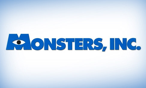
Pixar
Blue, bold and capitals — perfect for a major corporation.
The blue hints at one of the major characters while the eye turns this, what could be ordinary, logo into something quirky and is another character reflection. It’s a little touch that hints at what’s to come in the movie. Lovely.
Again, it hints at the story without being obvious or dumbing it down, just what Pixar are getting better and better at as we work through these logos.
Shrek
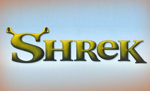
Dreamworks
Beveled text isn’t often something I can be excited about but there is something in this one that makes it passable — the texture.
Don’t you want to run your fingers over the bumpy, dried out skin of this logo?
This one works for me. The font suggests a seriousness air to it, if it were flat and unaltered. But the e is out-of-place, much like Shrek himself, and the ears are so damn cute it hurts.
The dropping of the k is a little bothersome, but hey, what would you expect?
Finding Nemo
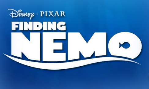
Pixar
Oh, ho ho! This is the first logo in which they go from good to great for Pixar.
This 3D, animated, with extreme depth, which is aimed at kids movie has a logo that is none of the above. They’re getting very good at this, aren’t they?
Nemo is pushed along by the wave at the baseline, sliding over and sinking the text, rather than bouncing it (the cheap-trick alternative; see Shark Tale). The appropriate and small-fish-in-a-big-ocean O works as a reflection of the story and gives me a smile.
Worth special mention is the E. Perfectly drawn so the bottom arm is about the same thickness as the top one but still has the curve of the wave to it.
I love that the name of our little fish is the strongest thing, serving as another reflection of the big personality and heart of the title character.
The Incredibles
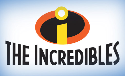
Pixar
This one just screams comic book, doesn’t it?
The I is a great reference to the S of Superman and the X of X-Men badges. It’s simple, memorable and looks fantastic on the chest of a hero.
And the title itself? Its bigger-than-life comic book styling of a slightly art deco inspired typeface serves as a nice echo of the design of the housing, clothing and technology of this film. Reflect, reflect, reflect! The story of this film is all over this logo.
The juxtaposition of the type sensibilities and style decades-old, brought together with characters and technology that whispers futuristic? Oh, how I love its mixing of old and new with exceptional class.
Shark Tale
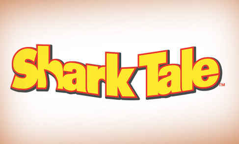
Dreamworks
So we have this idea for an animated movie that’s under the water and … what do you mean ‘Nemo’?
This is the wave that I’m so glad the Finding Nemo logo avoided.
The red outline on abused and oddly tracked yellow type, being shoved from the background in a solid drop shadow is trying far too hard and succeeding at exactly blip.
Though the shark fin in the h does give me a slight smirk, I just wish it wasn’t so oddly shaped.
Madagascar
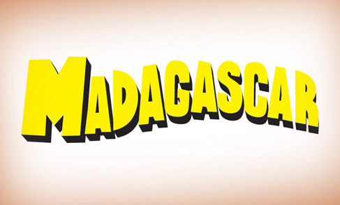
Dreamworks
A cheesy postcard type treatment, this one could work for exactly that reason.
Could work, but doesn’t.
The idea isn’t fleshed out enough and the application of it was never consistent enough to make the suggestion clear enough. It just looks like a poorly drawn word, in which the R is slowly floating away.
Cars

Pixar
Here it finally is — 3D, embossed text. It was bound to happen eventually and … and it’s been pulled off.
But how are they able to have such a nice looking logo using normally tacky methods?
To put it simply — it doesn’t look like 3D type. It looks like a chrome covered car ornament.
It’s not a 3D logo that looks like an ornament, it’s a realistic looking ornament that’s perfectly appropriate and works as a logo, and happens to be totally rendered.
It looks as if it should be on the back of a car in the film and in reality. It looks perfect and is perfectly appropriate. And you have to love the typeface used!
Over The Hedge
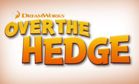
Dreamworks
If it weren’t for this character poster, I think I’d be more of a wicked commentator.
Alright, so the typeface is pretty fun and suits the whacky characters, sure.
And … in a Shakespearean stroke of symbolic genius, the beveled, drop-shadow-wearing, gradient covered over the is literally jumping over the hedge. Ha!
Flushed Away
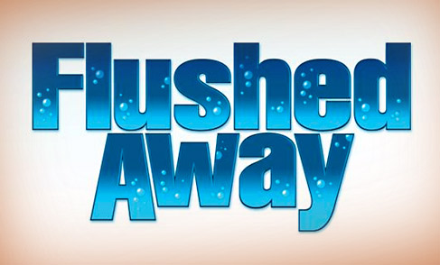
Dreamworks
HAH! BUBBLES!
Ratatouille
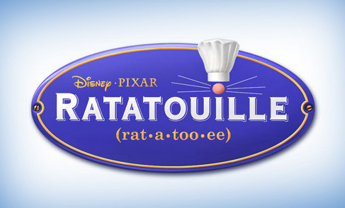
Pixar
On first viewing, this might not be great. But it grew on me — now I can’t help but adore it.
The nose of a rat sneaks in above the I, trying to find a place where it isn’t welcome. And with it comes, unabashedly, a chef’s hat that sits outside the ring of normality and the expected. Sounds like the story, doesn’t it?
The type and colour pallet has an appropriate freshness to it that I embarrassingly can’t explain other than “yeah, feels French.”
But what I really love about this one is the attention to detail — the screws aren’t perfect, nor are the whiskers — neither pair are symmetrical and it’s ridiculously charming because of it, much like a rat in a kitchen.
Bee Movie
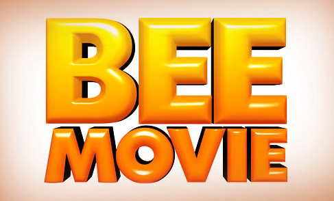
Dreamworks
http://www.photoshopstar.com/text/recreate-the-bee-movie-text-effect/.
The budget was $150 MILLION.
Wall•E
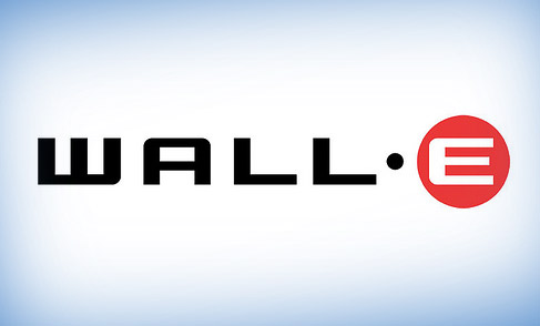
Pixar
It is oddly the heartless and cold shapes of this logo that makes it even easier to love. Especially after watching the film about the little robot that could.
Wall•E was to be a soulless machine, made for one drab, ugly, boring task its entire life.
What better shapes could work for the logo of such a machine? Sharp edges, no charm, strong footed and a red circle, a reminder of a machines optical sensor [Ed: Hasta la vista, baby.]
The bravery of commitment is what I like about this one. A lesser designer would have made the E a different, lively font. Maybe a scribble or scratch or something that shows some sort of soul hidden inside.
But the heart of the character was so evident every time it was shown that anything along those lines would almost be numbingly useless.
Kung Fu Panda
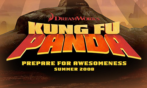
Dreamworks
Of the Dreamworks cattle, this is my favorite. There is just something about Panda shadowing down form the Kung Fu that I like. The shape of it intrigues me as it echos traditional Chinese architecture with its curved roofs.
The typeface actually works well — which is great, as it could of easily have been the kind of ‘Asian’ looking typeface that is oddly offensive.
Though it is beveled, red and yellow and looks to have a drop shadow, it all works. Normally such traits on paper are ones that’ll cause this to be another write off. But no, not this time.
But I have to mention one very important thing — it doesn’t really reflect anything in the story, at all. It’s just aesthetically pleasing … good for now, bad for later.
I should mention that I think this one is actually a good poster that gives me a giggle, from the talented BLT & Associates. (IMP link.) Aaaand, I can’t help but mention the opening credits, some of the finest and most bad-ass I can think of for an animated film.
Up
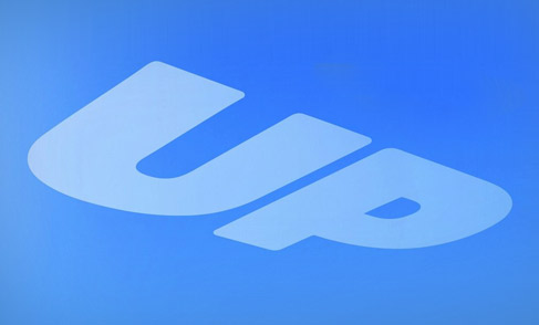
Pixar
Perfect.
It’s written in the sky. Not on it or over it or under it, but in it.
These two simple letters are part of the fabric of the heavens and the gentle gradient and soft edges give a lightness that feels as if it should be floating off the beautiful posters it appears on.
This is such a sweet logo because of it. It’s strong and heavy but is floating away, gently, as the wind pushes it to a far-flung destination … I don’t think it needs to be said that this is a great reflection of story.
Monsters vs. Aliens
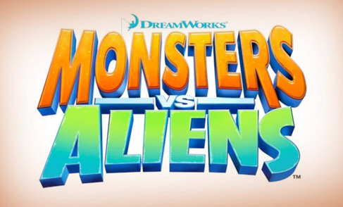
Dreamworks
What a lovely way to finish off – with a nice and gooby mash of text, with what look like free fonts with a monster amount of Photoshop tutorials applied.
This could have been far cooler — maybe some comic book style text? Or something that would look at home in sci-fi stories of the thirties and forties? But no, we have … this.
A Waste of the Talented
I’m not a branding or logo guy.
Don’t get me wrong, I adore it, but don’t really take part. Though I do pay it a lot of attention, adoring graphic design and creative ideas as I do.
And that’s where all this has come from — shifting through the type and imagery for that hidden creative idea. For the central story.
Dreamworks do good work. Hell, their logos aren’t exactly ugly, either. They’re generally ok — aesthetically pleasing too, even if it is often superficial. But that’s it — they’re pretty, but dumb. They don’t feel as if they are representative of the film and generally feel over stylized with whatever Photoshop trickery was at hand.
Perhaps it’s about an audience I just don’t fall into? Perhaps I’m being a little too picky about some of this, and if so, please tell me. But I can’t find the stories in the logos of Dreamworks’s films in any way that the ones of Pixar are brought through.
The most interesting thing about all this is that it’s almost as if it’s part of a plan.
The films that have the cheaper looking logos and flat poster designs are also the ones the critics and audiences didn’t think much of. Is it possible that all Dreamworks is trying to do is fill a gap in the market for average CGI films? I’d hope not. It’d be a waste of wildly talented creatives. But the signs are there, in the unoriginal, lack-of-thought logos that we have above.
The lesson to be learned here is that when there’s a story to tell (and there almost always is), then make sure it’s told with conviction and heart and funny voices, not just spoken about or alluded to and thought appropiate when it’s not.
Master Your Craft.
Weekly.
Become the designer you want to be.
Join a group of talented, creative, and hungry designers,
all gaining the insight that is helping them make
the best work of their lives.