Paula Scher, Herbert Matter & Swatch: Was it Plagiarism or Parody?

Paula Scher, Herbert Matter & Swatch: Was it Plagiarism or Parody? artworks

After the flames of modernism became mere embers, the design community started to turn to something with more warmth.

People were after something comfortable — a song buried in memory.

So designers of the eighties began looking back to move forward.

Digging through the archives and history books, designers searched for visual languages with more romance wrapped in their tones than what the clean lines and bold type of modernism offered.

Philip B. Meggs, Meggs’ History of Graphic Design, 4th edn., pg 481.Should a designer sit down and find novelty in a historical style, they wouldn’t set out to copy any exact piece. They would learn the language it spoke and use its “vocabulary of forms and form relationships, reinventing and combining them in unexpected ways.”

Looking Back with Paula Scher

By the mid-eighties, Paula Scher had become known as a designer producing original and clever work that sometimes spoke with the tongue of the past, emulating style and feel in interesting and new ways.

Doing this, Scher and her business partner Terry Koppel put together a promotional booklet entitled Great Beginnings.

Compiling the opening paragraphs of well-known novels, the booklet served as a great introduction to how one can employ design styles long gone in fitting and interesting ways.

Each spread was designed with nothing but type in a way that was suited to the times in which each novel was originally written. It was gorgeous.

Swatch Shopped for Style (and Got Brilliance Half-Price)

After flicking through the duo’s promotional piece, the marketing director of Swatch brought Koppel & Scher on board to help promote the Swiss watch company.

It comes as no surprise that they were asked to develop a campaign that was reminiscent of American 1950s advertising.

“All through the eighties clients seemed to believe
they were buying style, not thinking.”
~

Paula Scher — Make It Bigger, pg 68

After delving into magazine advertising from thirty years prior, the pair found a habit developing in the old ads — the products changed lives! Not only did soap make you cleaner, but it made you look younger and find happiness! Oven mitts keeping your hands from burning? They also make your meals taste better too! They had their catch.

It was a catch that was funny and memorable — a good one to wrap the contemporary and hip watch maker in.

The juxtaposition between the cool time pieces and the tacky photography and cringe-worthy tag-lines made sure that the ads were memorable and effective. The ads were clever, funny and cheeky, perfectly fitting within Scher’s body of work.

They were a hit.

Hello Herbert, So Nice to See You Again

Swatch found its home in the Swiss International Business Building, where upon the walls hung the work of Swiss design legend, Herbert Matter.

Herbert Matter (1907—1984) brought photography to the table of The International Style in a way that was fresh and interesting.

Matter was only 25 when he developed this now legendary campaign. Deep etching and contrasting photos, typography and colour (while keeping this modernly minimal), Matter developed a series of powerful and beautiful posters for the Swiss National Tourist Office.

While this was part of the same series, it seems as though the one below is the one most referenced.

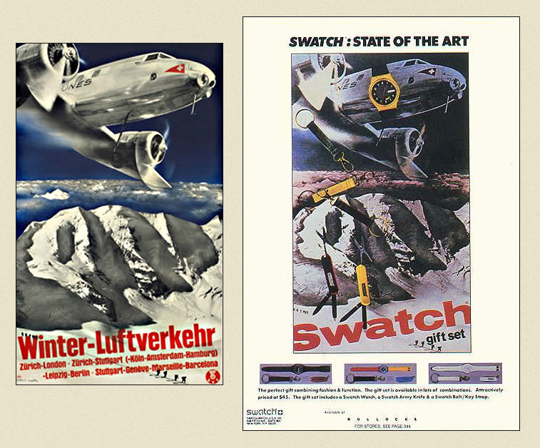
Fifty years later, Scher held admiration for the pieces and decided “they were all simply crying out for a Swatch Watch.”

From singing the swan-song of the Swiss alps to voicing the marketing campaign of Swatch.

It was an utter joke. And that was her point.

The poster that got everyone thinking.
Herbert Matter’s original on the left, Scher’s on the right.

She got in contact with AIGA and Matter’s estate to seek permission and ensure that everything would be above-board.

The poster had to have some elements recreated — the lady in the ski hat was reshot at a different angle, with the title changed (and made bigger, then bigger still by the marketing department) and the arm dropped in.

It was credited to Koppel & Scher with Herbert Matter.

But Was it Parody or Plagiarism?

It went from magazine spreads to posters in shop windows, then into design magazines and annuals.

So naturally, when Scher spoke at an AIGA conference in Boston, she shared the piece with the audience.

It was greeted with laughter.

It isn’t that they all understood the joke (though many probably did), it was that earlier at the conference, Tom Wolfe gave a speech about what he called “the big closet” of design history that many creatives dip into to in search of ideas to “recycle.”

He showed the Matter/Scher Swatch posters as an example.

Then Tibor Came Along

“Designers abuse history when they use it as a shortcut,
a way of giving instant legitimacy to their work …
historical reference and outright copying have been
cheap and dependable substitutes for a lack of ideas.”
~

Tibor Kalman — Good History/Bad History

Expanding upon Wolfe’s ideas, Tibor Kalman believed in using design history in a genuine way.

To use it to understand how designers of the past thought about their problems and how they arrived at their solutions. It is not the study of pretty pictures that was the result of such thoughts that we should focus on — it is ideas and social context that is of importance — what pushed the ideas into reality. It’s what Scher had done so masterfully earlier in her career and was now doing it with less grace but with tongue firmly in cheek.

But generally, that wasn’t being done as designers weren’t doing it with Scher’s wit. Instead, the practice of pinching a style from history for nothing but superficiality had emerged. Designers were pushing aside context and looking at things through the narrowing view of retrospect and nostalgia.

What was once considered modern design that might have been ahead of its time, innovative and even boundary pushing, is now seen as quaint. Cute. Safe and familiar. But rather than employing the mentality of thinking ahead, innovation and discovery, many were just saying “oh yes, this is lovely, this will do. Ahhh, how pretty a memory!”

The resulting work is often pretty but dumb.

Tibor’s words drove people to ask questions (and subsequently answer them). Libraries of essays and discussions were written by students, lecturers and practitioners about the Swatch poster and others like it — is it really just a joke, a bit of parody?

Or is it simply plagiarism?

Do share with us, what are your thoughts?

We recreate what we are inspired by.

But the Swatch poster grabs and chokes the original through time and puts a plastic watch on it. It isn’t subtle by any means—it’s too obvious to be a mere reference.

Unlike the previous campaign, Matter’s original pieces weren’t departure points for Scher. The work of Matter became the work of Scher. But she intended for them to look exactly the same — that was her point, aiming it to be a bit of a joke for the company, for designers and those of the audience who would recognize her intentions.

So does Paula Scher get away with it because she is Paula Scher? Because of her reputation, because she was one of many doing it? Because it’s dramatically blatant? Because it’s a joke?

It raises an interesting question — what role does design history play for us today? Is it for mere interest? Is it something to bounce off? Something to recreate? Emulate? Ignore?

Personally, I get that it was a joke of sorts. Though, perhaps, not a funny one, but I’m not one for whom context plays any role – I was in diapers when Scher’s campaigns run.

But it is your opinion I think will be more interesting than mine. So please, do tell me, what do you think? Parody or plagiarism? What role does yesterday have today?

REFERENCES & LINKS

Good History/Bad History by Tibor Kalman
There is something enigmatically drawing about Kalman’s writing and this piece is no different. After reading it, you realise how important our history is and the benefits one can have from understanding the details, not just the pictures.

Make It Bigger by Paula Scher
In 2004, Paula put together much of her work and actually wrote about it all! A nice monograph as it is more than just pretty pictures, names and dates — she goes into detail about her process and thoughts on many projects. A must for your collection.

Looking Closer: Critical Writings on Graphic Design
The first in a great series that bring together essays, ideas and thoughts on graphic design. In this issue a reprint of the Kalman Good History/Bad History article is included.

Meggs’ History of Graphic Design
Oh I’m sure you have a copy! Why wouldn’t you? This link is just so you can … uh … give it to a friend, right? This is a pinnacle piece and one of the most important design books available. Buy it and I’ll buy you a cookie and we can laugh at those who don’t have their own copies!

Blogerino
I found the Great Beginnings shots here. I must say, one of the biggest rewards I get from researching online is stumbling over sites like this one — interesting and clever.

Comments

11 pieces of brilliance put forth by the audience

inspirationBit
7th of September, 2010 • www
A lovely hedera

Welcome back, Alex, with yet another thought-provoking post.
Great write up.

I think this case bears some similarities with famous singers performing cover songs: it all depends on how old the original was and whether the majority still remembers who was the original performer of that song.

Similarly here, if not for this post, many people (including myself) wouldn’t know that Paula Scher’s Swatch poster is almost identical to Herbert Matter’s from 50 years earlier. I would simply praise Scher’s talent for her tasteful modern design with a vintage appeal.

Then what if 30 years later Swatch hires another designer to create a new promotional piece, and that designer (especially one with less fame & experience than Scher) decides that it would be funny to copy both Matter and Scher and produces a slightly altered version of their posters. Would it still be accepted as a blatant joke?

Alexander Ross Charchar
7th of September, 2010 • www
A loverly hedera

Thanks Vivien :)

Haha, I like the copy of a copy idea and what it might mean in reference to the original(s).

The comparison to music is a good one – for an artist to cover a song, they generally need to get approval from anyone who either owns the song or wrote the original. In this case, that’s exactly what Scher did, and much like a musician, she never said “this is my own” but rather “this is a cover”

While doing my research I was quite surprised about how passionately people talked about this case. I think Scher did absolutely nothing wrong because she was deliberately and blatantly copying a design for the sake of copying the design – that was the joke. If she had claimed it as her own, that’d be a major issue. But she slapped a plastic watch on it in this Dada like fashion and so it becomes its own little joke.

Now, if someone else came along and did it yet again, then I think it’d be fantastically funny (depending on context of course) as it’s amplifies the absurdity of it all. Though for it to be really worth while, it’d have to be done by someone of the same stature as Matter and Scher and, well, there are hardly any of those around :)

Thanks for a great comment :)

Stuart Thursby
8th of September, 2010 • www
A lovely hedera

Another outstanding post, Alex.

Personally, I prefer seeing things like this than blatantly copying a style and doing a terrible job of emulating it. It’s not so much that it was Paula Scher herself that renders these “joke” works legitimate, it’s the fact that they were well designed. A copy, yes, but any hack can take a copy of a classic poster and butcher it.

There’s a fine line between being inspired by a style or era (ie Constructivism) vs. paying an homage to it. It’s when an homage ends up poorly designed, in poor taste or completely out of context that bugs me.

John Dilworth
8th of September, 2010 • www
A lovely hedera

Yes.

It is parody, and it is plagiarism. The former often requires the latter.

Is it OK to do plagiarize for parody (or tribute)?

It depends.

I think it was OK in this instance, the client probably even showed her client the source material. I also think she’s likely sick of seeing this made into an argument (In her own words here: p 98 of her book, Make it Bigger)

It may not be OK in other instances, where the owners of the plagiarized content may not be happy with the appropriated use, or a client may not be happy with the possible risks of being sued.

John

BrandsArchive
8th of September, 2010 • www
A lovely hedera

I think she was the right person to make this “joke”. Coming from anybody else, this one would have been misinterpreted.

And can only hope that 30 years later another designer will take this “joke” one step further. That would be nice…

Alexander Ross Charchar
8th of September, 2010 • www
A loverly hedera

Stuart Thursby
Thanks Stuart!

I agree about an homage being done poorly being annoying, especially when a lot of the finer detail is lost and it’s more like a stylistic set of clothes being thrown on top of an idea. It ends up being an attempt to force a feel/style onto a piece of work rather than that feel/style naturally coming from it.

John Dilworth
Hi John

I’d tend to slightly disagree – I think the difference between a parody and plagiarism is one is a light hearted echo of the original, while the other is blatant stealing.

I have no doubt she’s sick of seeing this argument coming up, especially so long after it happened – but that’s a big reason why I was interested in the topic. I’m a younger designer and much of my audience is too, having only been in the industry for less than ten years. So in this instance, I’m not saying “ha ha, look at what Paula Scher did, isn’t it silly?!”, instead I’m aiming for “This is how an excellent designer used history in a variety of ways, what can we take from it?”

This was all fresh to me and I thought it was an interesting topic to bring up, especially as it seems common place for a lot of webdesign to just be a copy of a copy of a copy of stylistic musings. History is becoming a common topic around the web too, so I wouldn’t be surprised to see more style stealing from the history bin :)

Brandsarchive
I think there’s a little truth in that, absolutely – being who she is made a big difference. But I’ve seen student designers do the exact same thing in the last few years and it was charming as an idea worth exploring. I think it’s about context and transparency in your intention.

Thanks for stopping by!

Kelly Hobkirk
9th of September, 2010 • www
A lovely hedera

Thanks for this thought-provoking post, Alex.

Sadly, plagiarism is an accepted standard in graphic design. Big agencies steal copyrighted work from smaller firms who can’t afford to litigate. Designers “borrow” concepts that wind up looking like outright copies.

Shepard Fairey is famous for “reclaiming” old works and lending his trademark look to a reworked design. He fully admits that’s what he is doing. Paula Scher’s Swatch work appears to do pretty much the same thing. In both designers’ works, the old works have arguably been improved upon, with more sophisticated production techniques and the application of a more modern aesthetic.

Sometimes “new” works are bad, blatant copies. Mike Doherty, president at Cole & Weber, emailed me in 2007 asking permission to use one of my hand-painted illustrations and a label design I’d originally done for a client, so he could private label some wine for use in promoting a boutique shop he co-owned. I was willing to provide use permission provided the works stayed identical to the original. Mr. Doherty had the impertinence to cross out some of the terms of the agreement, sign that and send it back, then proceeded using my copyrighted art as he pleased. I was stunned at both his audacity and at the very poor quality of the redesigned label. (I was also lacking the $30k to sue for copyright infringement.) Graphic Artists Guild told me this happens all the time.

I believe that when new works are created from old “inspirations,” if the work is done in parody of very old works, or with direct permission and due credit, these types of updates can advance the design dialog and are therefore worthy of consideration as good or even great design. In cases where it’s just an obvious copy (with no advancement), well, that has to be considered plagiarism.

Alexander Ross Charchar
10th of September, 2010 • www
A loverly hedera

Kelly Hobkirk
I’ll start by saying I’m sorry to hear about your experience with the wine label. That’s a really shitty thing to do and, unfortunately, I’ve heard of similar happening before.

The advancement idea is an interesting one. Part of the joke behind the Swatch campaign was that it was a wink to posters that were apparently well known at the time. I kind of like the idea that nobody in the audience really knew of the originals and this served as an introduction to Matter and his work.

For 99% of the audience, they wouldn’t care – it would just be an old style design with modern watches thrown on top and is interesting for it. But that other 1% would be a little more interested and dig further and I think that’s where the advancement in understanding of history is born. Which, I think, is incredibly important if you’re a designer.

Kelly Hobkirk
10th of September, 2010 • www
A lovely hedera

Alexander Charchar
I quite like that the Swatch campaign brought attention to Herbert Matter’s work. I began to associate his name with his works only a few years ago (and also found Max Huber around the same time). Ironically, I enjoyed Paula Scher’s work many years earlier.

Your post got me to crack open her book, ‘Make it bigger,’ where I see that she talks about developing the spoof and crediting Matter. It’s a good book, by the way.

Alexander Ross Charchar
21st of September, 2010 • www
A loverly hedera

Kelly Hobkirk
I guess that’s the side effect of the ‘joke’, isn’t it? While the initial idea was to reference something designers might recognise, the flip side of it is designers who didn’t recognise it ended up digging a little deeper and learning about Matter – not a bad thing by any definition!

I adore Make It Bigger – it’s got some very honest moments in it that are often lacking in design monographs, which make it worth the cost alone.

Esmalte
9th of March, 2012 • www
A lovely hedera

Great post! Im surely sharing this with my girlfriends! Had fun reading it indeed.

Shall you delight, entertain & enlighten
us with your own thoughts?

By what name
are you known?

By what route shall an email
touch your thoughts?

And where is the website
that your playground lies?

With what name do you express
140 at a time with twitter?

Will you lend me your
thoughts with a comment?


May I please remember
these details?

thank-you dearly

Shall I send message to notify
you of new thoughts?

Hidden! Hidden! Hidden! Hidden! Hidden!
Hidden!Hidden!