Few moments in history altered the course of human development like this single one.
What came with this first book was a massive leap in technology, and what’s more, accessible information that brought with it a struggle for knowledge, with the powers-that-be on one side and the common man on the other.
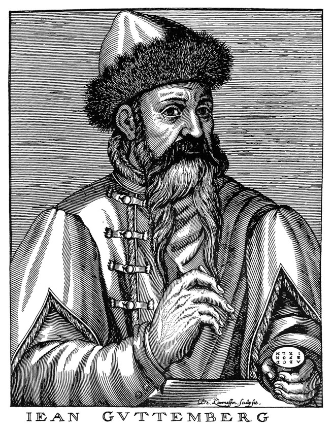
The moment of which I speak is the development of the printing press and movable type, which were brought together by Johannes Gutenberg to develop the 42-line Bible.
The 42-Line Bible is more than a book. It is a symbol for human thought. It is the result of hard, tireless work one undergoes when they understand their work to be important. Or they want to make some serious cash.
Gutenberg’s idea lead to the Renascence, the Scientific Revolution and the separation of Church and state as ideas flowed freely and it wasn’t only the monasteries, universities and wealthy who had access to books and knowledge.
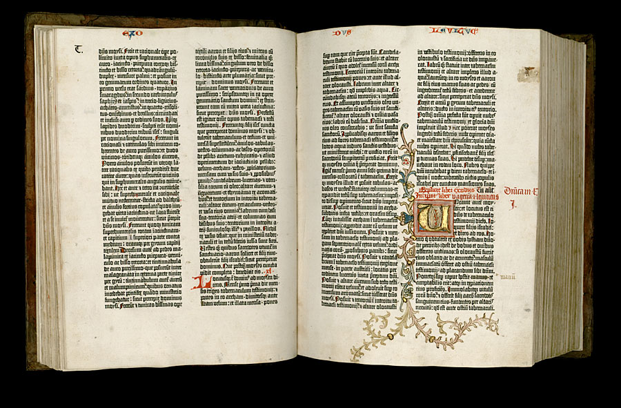
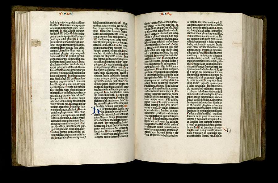
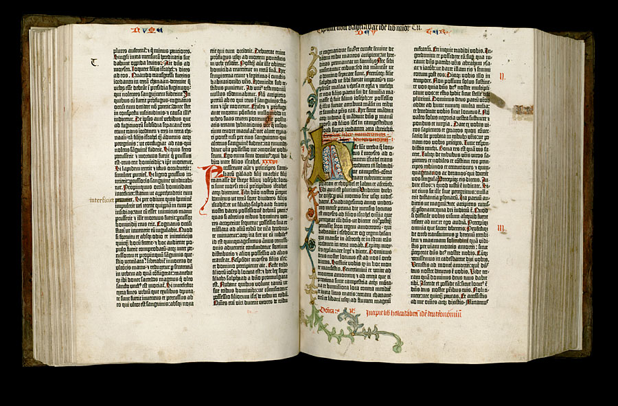
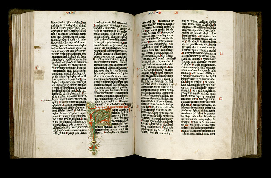
The Book
The Beautiful Book
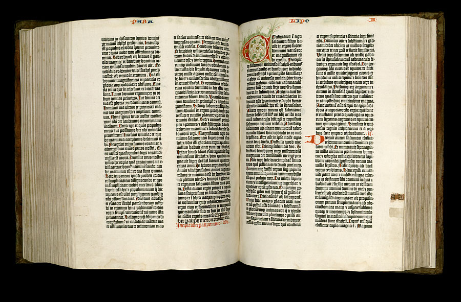
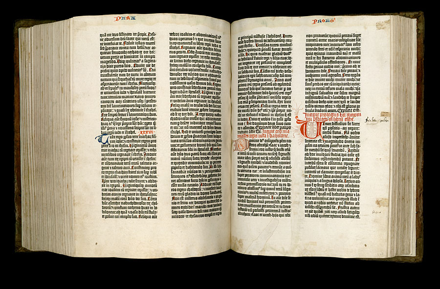
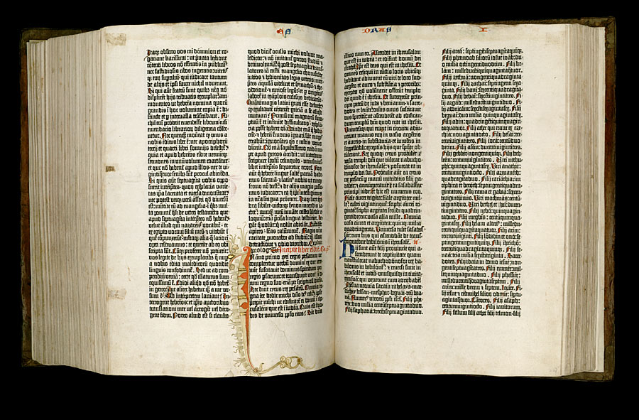
The Gutenberg Bible is the outcome of an orchestral combination of technologies and ideas that came together to produce the first book to be printed with movable, metal type, around 1455. It essentially introduced the printing press as it was to be known for hundreds of years to follow.
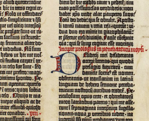
Prior to the printing press, books were written by hand from a team of scribes, who were unable to keep a consistent visual tone, were prone to mistakes and were damningly slow. A single book was a process that could take months or years, rather than days or weeks.
This all changed with Gutenberg and his run of 180 Bibles.
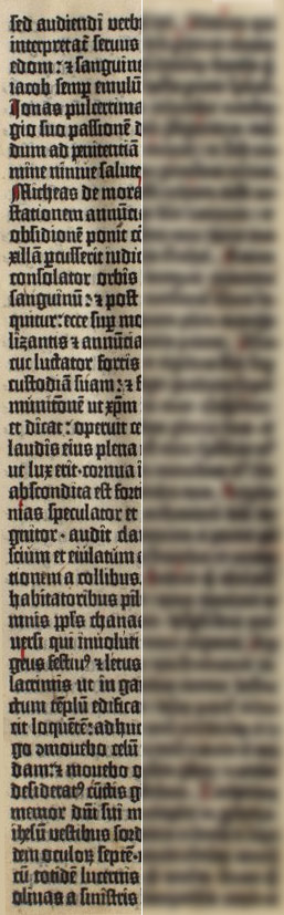
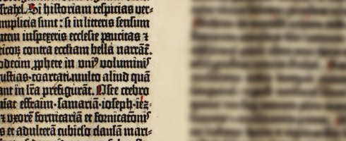
This was new territory never dared ventured by anyone before — the pages of these books numbered over 1,200 at a size of 307 x 445 mm with a consistent beauty, produced at a relatively remarkable speed.
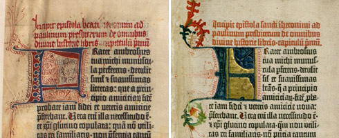
Visually, the goal was to reflect the beautiful scripts being produced at the hands of scribes of the time, without having to actually write a word, but use exchangeable metal letters. Also found through-out are illustrious drop caps and the opening and closing of sections being done manually by experienced hands, generating an enticing mix of mechanical accuracy and flowing calligraphy.
The Technology
While the book is a piece of art in itself, it is the technology that was developed so the book could be produced where the true beauty lies.
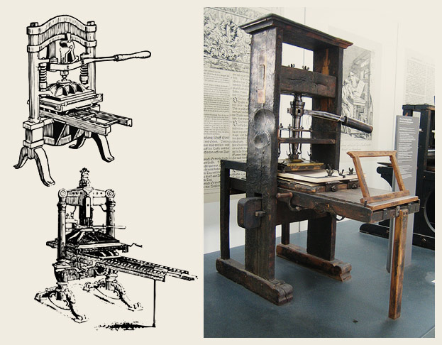
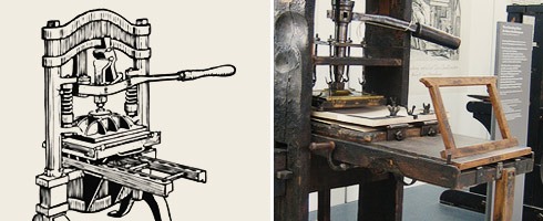
The Press
Little is known of the press Gutenberg designed. It is surmised that much of his inspiration came from his childhood in one of the world’s busiest wine regions.
Wine presses were large, sturdy pieces of machinery that would lower a plate with great pressure through the turning of a very large screw, which, in effect, is exactly what Gutenberg’s press did.
Below the plate—or platen—was a sliding bench which would hold the inked metal type, with a sheet of paper held in place on the surface. The bench slid into position below the platen, the screw was turned, the platen lowered—giving pressure to the paper against the type evenly and quickly. Then the screw was turned in the opposite direction, raising the platen, then the bench was pulled back, paper removed and the whole process repeated continuously.
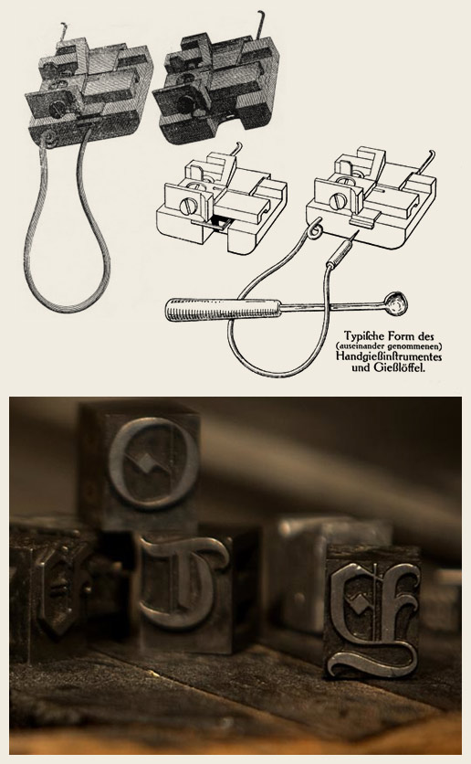
The Type
If one were to boil this whole process down, it is the system developed to produce the metal type that would prove to be the most innovative. Many of the processes used to print these books generally existed in one form or another, but the metal type is a stroke of genius as nothing like it had existed before.
The way in which these letters were made is a fantastic historical moment. Every variant of each letter was carved and etched from steel at the rate of one, or perhaps two, a day. Let’s consider these the masters.
Each master was then hammered into a strip of brass, leaving behind a perfect impression from which our final letter would eventually find its shape. The strip of brass was slid into a small, two part mold, that would close tightly, leaving a long open cavity with the indented brass at the base.
“… an estimated fifty thousand characters needed to be on hand”
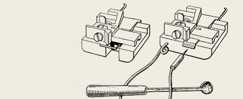
Into this flowed a boiling mixture of various metals that would cool and solidify into the shape of the letter at the base, with a long square shape of a body, all in a matter of a moment.
The mold could then be opened almost as soon as the liquid had been poured and from it could be pulled a single letter cast in metal, ready to be put aside as the mold was reassembled and more liquid-metal poured.
On average, a single page would hold 2,600 characters, so such a quick process was needed to cast the type. With four to six presses being used at once, each with two lock-ups of type on the sliding base, with likely another one or two each being produced at the same time, an estimate of fifty thousand characters needing to be on hand at any one time seems like a conservative number and is thought to be the amount that was the in shop at the time.
The Ink
The ink used by scribes and artists at the time was mostly water based. Sufficient for the wood-block printers as it would be soaked up by the wood, with little excess remaining. But with metal came difficulties — without a porous base into which it could be absorbed, the watery ink would drop onto the paper or become unmanageable pools within the depths of the letters.If the ink were water based, the definitions of the letters would be completely lost as the paper would absorb the ink and bleed.
A much thicker ink was developed from boiled linseed oil and soot, which was dolloped onto a large surface, onto which a large leather ball was rolled to smooth and even it.
Once the ink was smoothed and coated the ball, it was then transferred to the type by rubbing the ball onto the metal letters in a semi-rolling motion, while being held by a handle at the top end.
The Pages
The books were printed on two types of stock. The more lavish of which was vellum, a material produced from smoothing calfskin. It is estimated that a staggering 5,000 animals would have to give their hide for the thirty editions that were to use such materials.
Only a small portion were printed on such luxurious materials as the cost of producing them was far greater than almost anyone would be able to afford. The majority of the more expensive of the 180 books found homes in Universities and large Churches, who were comfortably capable of affording such extravagance.
The remainder of the books were printed onto hand-made paper imported from Italy. Gutenberg chose to import his paper from Piedmont, Northern Italy as it had developed a reputation to be the European center of fine paper making.
The paper was made from linen cloth, rather than wood pulp—which came into popular and continued use in the 19th century and is what we’re accustomed with today. The cloth-based paper was strong and could handle the pressures of the press and the passing through many hands.
And from all this came a book
The process became a production line, starting with the compositors who took the type from their homes of organized boxes, put them into a forme, which was loaded onto the tray. The type was inked with a leather ball, dressed with a piece of paper, pushed into position, impressed from the large platen then moved back out of the way, the paper removed, type inked, paper replaced and it all repeated.

This whole process took at least ten—or perhaps twenty—years to come to fruition. Needless to say much work went into these books. The process was refined as research and experimentation was done by Gutenberg and those in his employ, with the end being that the technology he gave to the world didn’t undertake any major changes for at least another 350 years.
I cannot say for certain that I find this book beautiful because of the process that backs it, or for the educational implications it had. Nor is it because of the design and type used throughout. It is simply an immensely important notch on our historical belt, no matter why one adores it.
I can say that it moves me, for whatever reason.
Gallery


Harry Ransom Center at the University of Texas’ Bible
And industries were started …
The impact that Gutenberg’s 42-line Bible has is fairly evident. The education of the common person became far richer as ideas pertaining to Government, Humanity, Science and Mathematics were brought back from antiquity while new ideas could be spread like never before.
Most, if not all, of those involved in the working of the press’ under Gutenberg’s employment went on to open their own print-houses, some as far away as Italy and France. With many investors seeing how quickly and cheaply these books could be produced, there was no short supply of pockets from which the dollars could be taken.
“What happened to Mr. Gutenberg?
Unfortunately his story takes a tragic turn”
But what of the main player in this story? What happened to Mr. Gutenberg? Unfortunately his story takes a tragic turn. With not enough money to finance his project, he turned to investors. One of whom came to the end of their patience at, literally, the last days of production and closed the shop of Gutenberg, disallowing him entry and access to his equipment. He didn’t oversee the end of his project.
Gutenberg’s assistant became a business partner with the man whom Gutenberg owed a small fortune, finishing the books and selling them, creating a continued flow of financial support for himself, rather than his previous master.
Gutenberg never went on to great riches as he continued his work as a printer, and never met the quality or praise of his lost masterpiece.
Gutenberg wasn’t an artist in the traditional sense. Perhaps he may be better considered an entrepreneurial engineer who served as a conductor of ideas. A conductor to whom a great deal is owed.
Whatever we may consider him to be, without his creative thought and determination, the world in which we live would be a very different place.
REFERENCES & LINKS
The British Library
The British Library has a handy resource on the Gutenberg Bible and in particular the two copies they have in their collection.
The Gutenberg Bible at the Ransom Center
Another mini-site for a copy of the Bible, this time from the Harry Ransom Center at the Universiy of Texas.
Type Foundry
Type Foundry is a blog I stumbled over while doing research for this article and was floored by the quality and depth of the writing. A fantastic blog all about typography and where I found the Type Mold imagery.
Flickr Resources
Aplumb‘s photo of a press similar to Gutenberg’s, used above.
Master Your Craft.
Weekly.
Become the designer you want to be.
Join a group of talented, creative, and hungry designers,
all gaining the insight that is helping them make
the best work of their lives.