Every now then, as you stumble through design history, you trip over and fall on your ass.
When you look closer at what caused you to stumble, you realise it’s a rather a big rock, one that you should have seen coming. Perhaps it was a big moment when things changed in our industry, in society, in theory and you’d simply been ignorant to it until that moment that it got caught under your foot.
More often than not it’s a person. When we first start studying we hear the names Josef Muller-Brockmann or Paul Rand and when we see more of their work, or read some of their words, we wonder how we didn’t know of them sooner. We could learn of them on our third day of study and argue that we should have heard of them on our first.
For me, the latest person whose name caused me to happily hit the dirt is Reid Miles, an amazing modernist designer who designed over 500 LP covers for Blue Note Records through the 1950’s and 60’s.
Blue Note Records
Blue Note Records was known for their selection of artists, whom they treated with a surprising amount of respect, rather than imposing upon them their own ideals about how their work should sound. They would go as far as to pay the artists for their rehearsal time, as well as their recording time, something which other independent music labels wouldn’t do. The benefits of this was improved sounds, relaxed artists and a comfort from all those involved that translated well onto vinyl.
And while the majority of the music they released was aimed at a wide audience, they would also work with lesser known and slightly eccentric jazz musicians. It’s almost an abstract thought, but the company wasn’t overly concerned with making money with these records as they want to simply write about new developments into the history pages of jazz.
This creative freedom is one worth noting, as it is perhaps this experimental, let the artist be an artist, kind of mentality that extended to their covers and to the ideas Miles had for them.
The Personification Printification of Jazz
When you look at the work of Miles, you can’t help but feel as if you’re looking at Jazz realised.
When he first joined Blue Note, he worked as an assistant to John Hermansader, the then creative director of the company. John’s work was quite lovely in its own right, but lacked a certain punch that Miles would go on to deliver. Initially Miles just wanted to keep up and continue the stylistic tradition that Hermansader had started, but in the end he elevated it to staggering heights.
His covers “sound like [they know] what lay in store for the listener“, Felix Cromey, Blue Note: The Album Cover Art which cannot be argued. Even to those who have no idea about—or hardly heard—jazz, the covers just look the way jazz covers should.

Perhaps its the typography? Or the photography? Or maybe it’s the colour? I think of jazz as an explosion of soulful sounds, which are peppered with extreme emotion. The covers that Miles designed have much in common with this idea.
Stunning black and white photography is the life blood for most of the covers, and a splash of colour hits as an explosion of excitement or lust or cool as the typography is always in the right spot.
They scream modernism in a way that few can compete against, often treating the typography as visual elements that can be broken apart, stacked upon one another in a playful way, blown up or shrunk down and brought together with the photography in a way that seems gravitational. The layouts are often evasively perfect as they look as if to lay any of them out even slightly differently would be to lay them out wrong.
Chicken, meet egg. This is the genius of Miles. While I wonder if his covers looked like jazz, or whether we’ve come to think of jazz to look like his covers, one thing is for sure — he seems to have truly understood the spirit of the sound and embodied it perfectly on these 12″x12″ cardboard homes.
Though, he wasn’t a fan.
While he would design over 500 album covers for the Jazz cornerstone, and receive (sometimes multiple) copies of each, he wasn’t a fan. He would instead unload them off to friends or trade them in for classical instead. He wasn’t a jazz fan.
In this article about Blue Note and Miles from Computerarts.co.uk, an intriguing idea from Experimental Jetset is presented; “it is interesting to see that a designer who really managed to capture the essence of his time, was also, in a way, disconnected from that very essence … it is perhaps ‘distance’ not engagement that makes the designer.”
As much beauty and modernist inspiration that we can take from Miles’ work, perhaps the biggest lesson he has in store for us is objectivity. He shows that to properly execute, it may be best for us to put romantic notions we hold for our clients—or our messages—aside. It’s further proof that we should use a language that is native to our client and their audience, not try to reinterpret it as we see fit — even if that means developing one we might not be especially interested in, as long as it’s understandable.
He also shows us one of the biggest—funnest?—gifts that the modernists gave us was an idea of how to convey a single message or idea in a powerful and simple way. The design just carries the message, rather than attempt to be the message.
Step Aside, Sir
His designs have virtually nothing to them, don’t they? They’re typical “my kid could do that” kind of layouts. We all know better than this, but this is a fine example of how knowing which screw to turn is how we can charge what we charge.
He was smart enough to know when to allow the fantastic photography of collaborator, and Blue Note Record co-founder, Francis Wolff to shine through. He didn’t try to be too smart Wolff’s images, letting them to do the talking, whether the discussions it would hold were with the audience or the rest of the design.
And then those splashes of colour! Oh! How lovely! Emotional colour at its best. A dab here, a tint there. The way in which he used colour is a great example of good design. Much like the photography and the typography, he knew when to turn the volume down to 3 and then when to push it up to eleven. The duotone photos work powerfully and benefit from strong contrasts in the photo as well as down-played type that, when the colour was rich, is often quite poor in size.
His keen eye would ensure that the typography, colour and imagery are all considered and benefit because of it. When the title is loud, the photography is turned down. When the typography wants to take center-stage, the photography would allow it, often with the colour playing the role as the three-piece backing band.
But the thing that gets me the most excited is his typography. After looking at enough of his covers you can begin to know which Blue Note covers are his and which were done by other designers. The typography is always so neatly stacked, with letters vertically aligning playfully, yet delicately, and always have a visual flow that gently guides the eye.
And there are also the little quirks to be found — sometimes the type is balanced on the tip of a finger, separated by a cigarette in hand or hanging from a saxophone. It’s these little visual quips that add a level of charm that do nothing but benefit. It shows the design is relaxed enough that it doesn’t need to scream to be smart.
Looking at these works you can feel the respect that Miles instilled in each of them. There’s no arguing of elements. No misdirection for the eye to be tricked (and tired) by.
Bop Hum Hum Tsssssk Tsk Tsk Bup!
If you have a moment, I’d very seriously suggest watching this short video.
It works well to literally illustrate to the motion of the typography.
While the idea of his covers being animated wouldn’t have occurred to Miles while he was producing them, it does show the inherit sense of movement and vitality that he managed to give his typography. The ways in which the type bobs and slides and grooves just feels right. As if they’re itching to break out from their covers and dance to the music they’re announcing.
But let’s not forget the other elements. The imagery and geometric elements just slide into place as if they’re sliding down the string of a bass, just waiting for their moment to twang.
It’s design that is tied perfectly (through intention or learned) to an era.
The International Typographic Style was finding its stride in the United States having recently been brought from Europe through various trade publications just as Reid Miles was starting his employment at Blue Note. It was a wonderful marriage of moments.
The newness of this style of design makes his covers even more enticing — there’s a daring to them. The audience wasn’t just happy to associate a clean design to their music that they so loved. This kind of design was new to them, not something appropriated in an effort to find an air of dignity or class. But they ate it up and made it theirs, all while Reid Miles gave jazz a new visual language that still sounds like the cat’s meow.
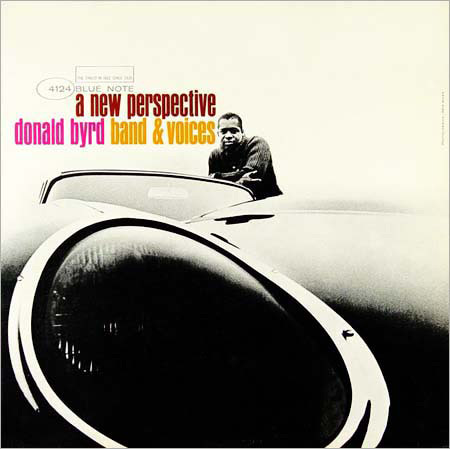
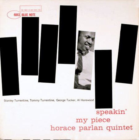
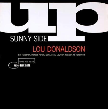
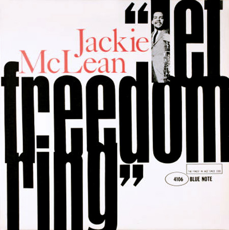
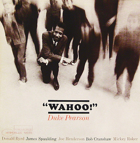
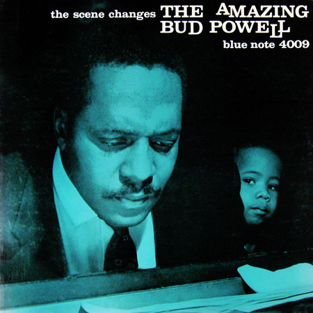
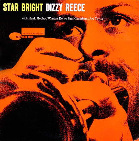
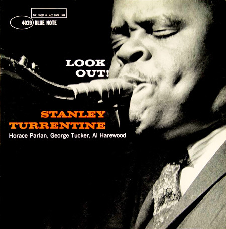
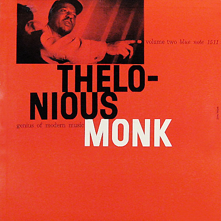
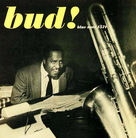
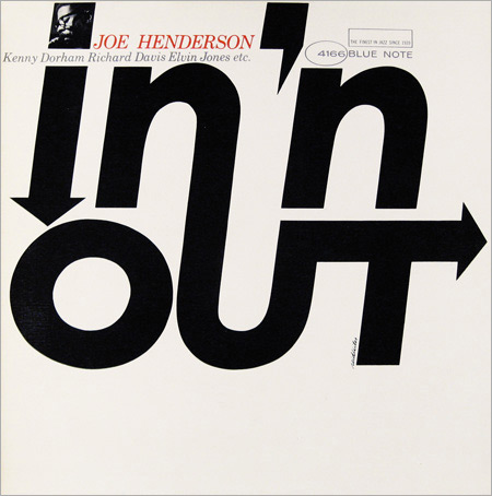
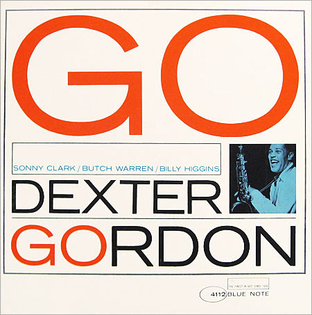
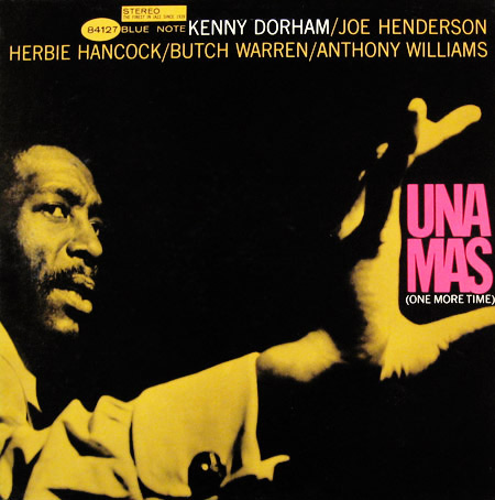
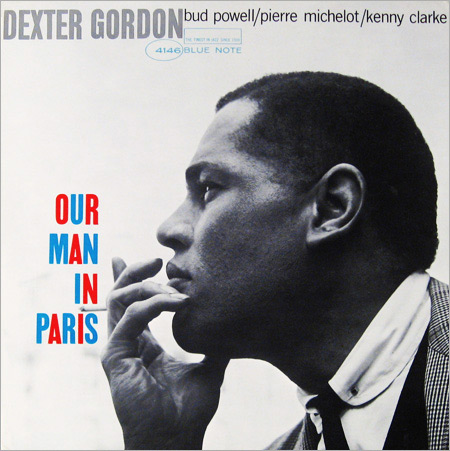
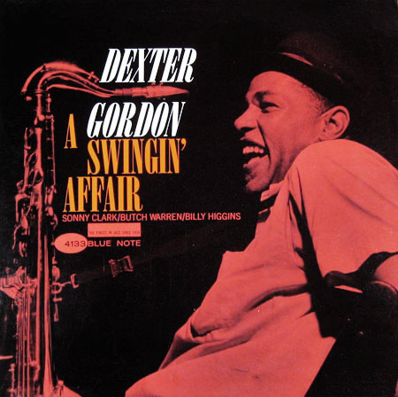
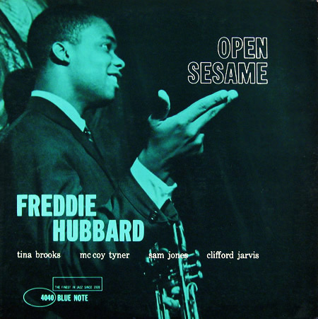
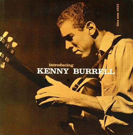
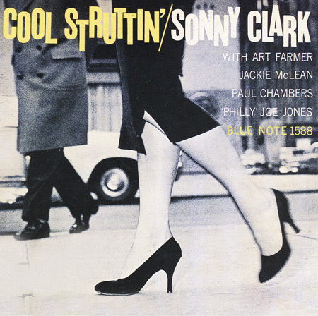
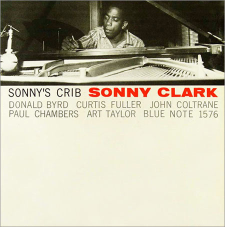
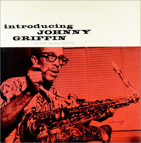
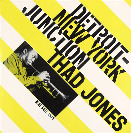
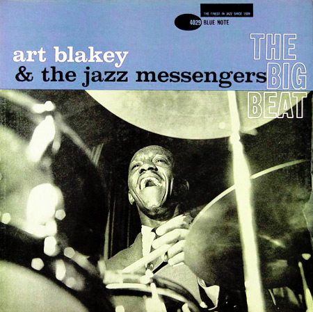
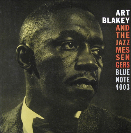
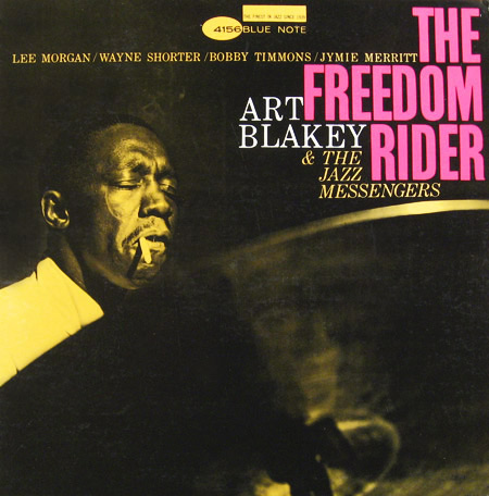
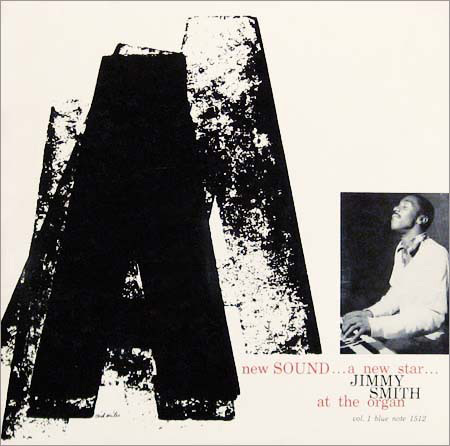
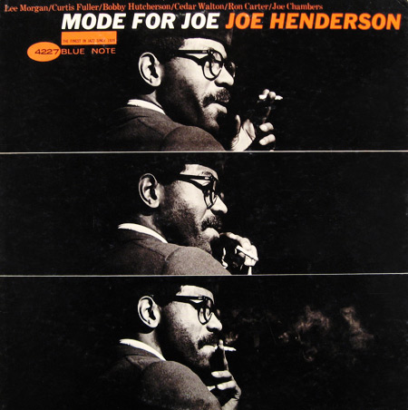
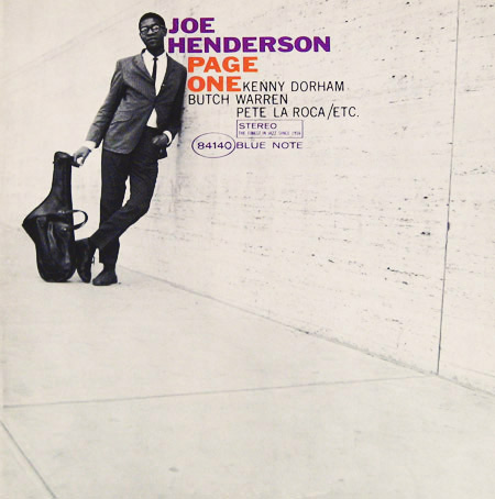
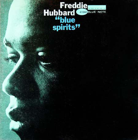
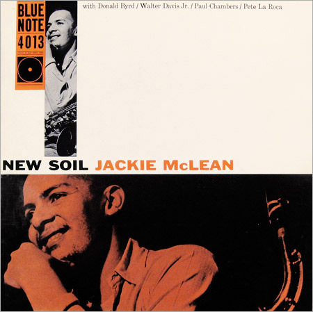
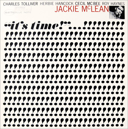
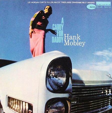
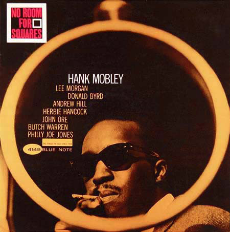
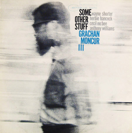
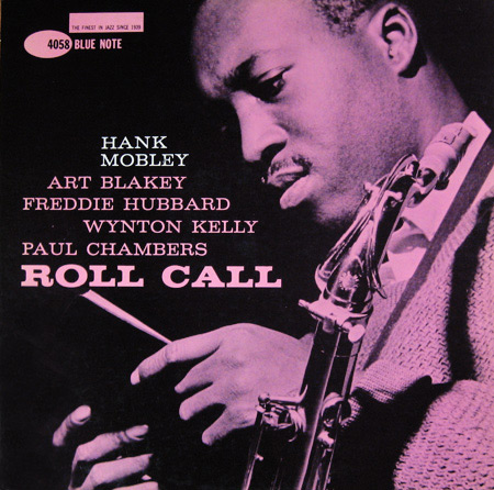
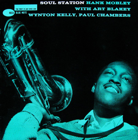
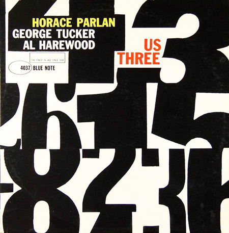
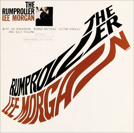
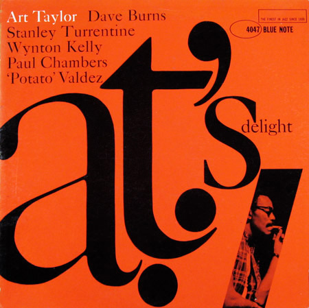
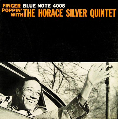
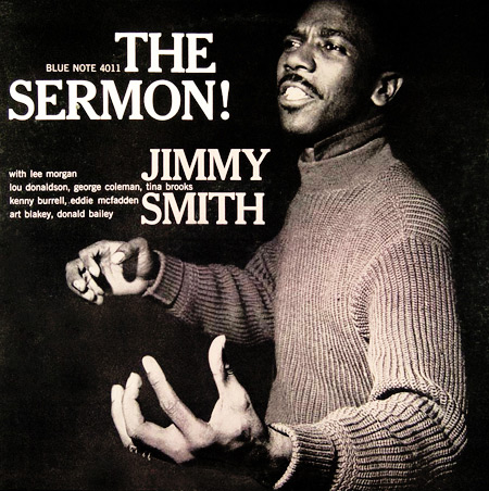
Gallery


REFERENCES & LINKS
Reid Miles — Hard Format
A nice collection of Reid Miles’ covers from the addictive Hard Format.
The Blue Note Masterpieces of Reid Miles — This Modern House
A fairly comprehensive collection of the Blue Note 4000 series, where Miles really spread his wings and did some of his best work.
Vintage Vanguard
Woah. That’s all I can say about this massively impressive collection of jazz covers, with several pages showing off (all?) the Blue Note records.
Thinking Miles Ahead: The Art of Reid Miles — dvisible magazine
A great introductory article to Blue Note & Reid Miles — one of the articles from which I began to learn of this wonderful marriage!
Blue Note 4000 series — Birka Jazz
Another goodie from which I learned much about Blue Note and Miles.
Blue Note: Album Cover Art on Amazon.com
I don’t think anything could beat seeing these beauties in the 12×12″ originals, but maybe this will get you close? And in the interest of honesty — I haven’t actually handled this book myself, but the reviews on Amazon are encouraging!
Master Your Craft.
Weekly.
Become the designer you want to be.
Join a group of talented, creative, and hungry designers,
all gaining the insight that is helping them make
the best work of their lives.