Jan Tschichold left an impression upon the world of graphic design and typography that few could compete against. From strongly advocating the beauty of sans serif fonts and clean, organised design 20 years before it took off, to strengthening the design of Penguin books to turn them into the something special that they are. Jan Tschichold spent a life learning and exploring and left us with much to do the same.
Early Life & Education
Jan Tschichold took his first gulp of air on the second of April, 1902 in Leipzig, Germany, when his parents Maria and Franz welcomed him into the world.
Sign-writer by trade, Franz gave his son an introduction to the world of lettering – although not seeing it as his future, Tschichold learned the ins-and-outs of sign writing while assisting his father.

His aspirations of becoming an artist were deflated when his parents thought otherwise. Not wanting their son to be an unfruitful artist, the family concluded that becoming an illustration teacher was a worthwhile option—it provided a creative outlet and a steady income. Tschichold as teacher began when he was 14 years of age and lasted a mere three years.
The wheels of calligraphy and script began to turn in the mind of Tschichold two years prior to the start of his teaching post. It was the 1914 World’s Fair for Books & Graphics that left an impression.
An interest in calligraphy formed, fueled by his personal studies of the books Tschichold poured himself into – especially those which covered calligraphy, ornamental script and writing.
At the age of 17, Tschichold threw his back against his life as a teacher and began his typographic studies. While he studied a range of creative endeavors, such as engraving, wood cutting and bookbinding, it seems as if his time of study didn’t involve a great deal of education. Simply, he knew it all.
Because of his personal studies and passion, there wasn’t much he didn’t have a strong understanding of.
The staff at the academy must have seen Tschichold as a contemporary rather than a student. His professor left him to his own devices, while the director of the academy saw a spark in the young man and, in 1921, had him begin to give classes in script writing.
There wasn’t much he didn’t have a strong understanding of
Over the following years his passion and influences grew greatly.
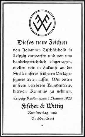
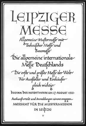
Up until 1923, Tschichold wasn’t developing clean, geometric san serif rich design. In fact, it was quite the opposite. He was mightily impressed by one of the first fonts of Rudolf Koch – Maximillian Grotesk. A very German black letter. He also made it a habit to collect the works of masters of script, such as Pierre Simon Fournier and would use his calligraphic skills on ads for which he was commissioned.
It was a time of unevenness in the world of the printed word. Fonts were chosen almost at random, with little-to-no regard for the text. There was virtually no roman weighted fonts in use – an inheritance of the gothic.

Then came the Bauhaus
Considering his work up to this point, the explosive impression left upon Tschichold when he visited a Bauhaus exhibition in 1924 must have been a sight to see.
Here is this young, gifted man who had been influenced and passionate about black letter and scripts, now looking at letters with straight edges, made of simple shapes with no flare. The inquisitive smirk that moved his lips must have been joyously fixed for some time.
In response to the sloppiness of the layouts of his time, Tschichold would become something else altogether. As if it happened over night, his layouts began to have such rigorous structure and composition, filled with white space, straight lines and thick rules.
The inquisitive smirk that moved his lips
must have been joyously fixed for some time
He so loved this new way of presenting information, or perhaps hated how it was being done by most at the time, that he became vocal with such magnitude about it.
If it wasn’t set in a sans, if it was laid symmetrically and looked a kin to the work that was the norm, the work that Tschichold himself had set only a few months prior, then it was heinous crime. He explored ideal ways of laying out a page, using the shape and size of the page for a basis on which the margins would be established.
While the influence of Tschichold and those that shared his beliefs wouldn’t be seen for a number of years, his name was becoming known in the circles of design and typography. Some loved and shared his views, others hated them. But they all knew of him.


The New Typography, Nazis and Switzerland
For close to a decade, Tschichold continued to work in his new, adored, mind-set. At the request of Paul Renner, he took a teaching post at the School of Applied Arts in Frankfurt, at which he taught two of his somewhat opposing (in style, at the time) passions: typography and calligraphy.
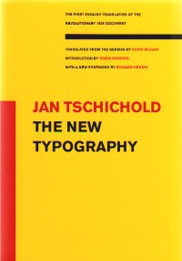
1928 saw the publication of perhaps his most influential work, The New Typography. Still published, and translated to English, it was a masterpiece of modern graphic design and with its fresh and regimental guidelines of layout, treasured by many.
The Nazi party wasn’t thrilled with
this cheerleader of ‘un-German’ design
Through this, his views and stance in the creative community of 1933 Germany, it doesn’t come as a surprise that the Nazi party wasn’t thrilled with this cheerleader of ‘un-German’ design. Soon after coming into power, they raided his home and upon the discovery of materials they deemed improper, temporarily imprisoned him.
He was later helped through the kindness of a police officer whom was able to help him secure a passport, therefore a passage out of Germany. Tschichold and his family relocated to Switzerland, twenty years before the International Typographic Style would begin.
And what happened to those designers, typographers and printers who gleefully held copies of his books? It’s a safe assumption that the Nazis held them in suspicious eyes, as they did Tschichold – all copies of Tschichold’s books, which loudly chanted his opposition to the type of design that the Nazi’s considered ideal, were seized. They most likely ended up in the mountains of burning books common of the time, done so for the protection of the German people.A great testimony to the power of design, through the fearful destruction of it.
He was easily able to acquire work in Switzerland – his reputation and previous teaching post ensured that. But with the war raging on, work—especially interesting and exciting and different work—was in short demand.
Perhaps this is what drove him to satisfy his creative urges in ways other than his day-to-day work? During this time, he authored several more books, including the highly anticipated (of which 1,000 were sold before it went to print), Typographic Design in 1935.
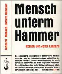
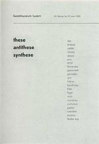
Toward the end of the 30’s, he began to loosen his grip on the principals the Bauhaus had impressed upon him nearly 15 years prior. The two covers below show the transition fantastically. On the left (1938), is a piece of work that, compositionally, is fitting to the Tschichold of the recent past at this point, yet is is typographically more classic than modern. On the right (1941), the modernness is stripped completely.


Penguin
In 1946 he relocated to London at the invitation of Allen Lane of Penguin Books. The three years that followed influenced the design of books for many years to come.
At the time Penguin was far from unsuccessful – their now infamous business plan clearly worked. It was their design that was lacking.
The biggest task for Tschichold was to establish a set of rules to be used across all books to be published by Penguin. A four page guide was given to all those concerned and covered all things from margins to italics, from punctuation to footnotes, all of which would be housed in a new grid system. This was the base on which Tschichold was to develop the character of each book. It had to be perfect.
It had to be perfect
Those who had to now work under Tschichold weren’t happy about it. A German was coming into their offices, their studios and factories, to tell them that what they were doing was wrong. That what they had been doing was ugly.
After a year of ignored changes to proofs, of trying to make the books more readable, consistent and beautiful, he broke through. His requests and ideals of layout where be listened to and obeyed.
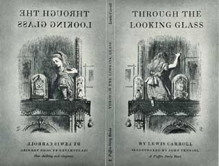
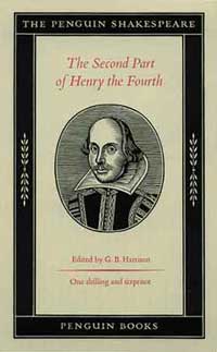
He then went on to rework the covers. Starting in 1948, through different weights of Gill San, a hierarchy was better established. The tone of those infamous orange strips was changed and strict rules for the tracking of text established.
A second revision included the introduction of the rules between title and author, the Penguin logo was redrawn and all fonts were made smaller.
The third revision, done a year after the first, saw the fonts reduced again. And while sustaining the golden ratio, the overall size of the book were scaled down.
Tschichold’s three years at Penguin was nothing short of prolific, resulting in 500 book redesigns. He left at the end of 1949—his design assistant resigning the same day—recommended his successor and wrote out another influential and important chapter in his life and in the history of graphic design.


A life well earned
Returning to Switzerland, Tschichold continued the life the craftsman deserved. He wrote, worked, gave talks around the world and won awards and recognition.
His most prolific book was released in 1962—Arbitrary Measurement Relations of the Book Page—and was widely translated and has since undergone eighteen editions. Also released was a 30 year retrospective of his work entitled, Master Book of Typefaces.
… To become an instant addition to
the annals of classic typographic design
And after many years of development, the beautiful and elegant Sabon was released. A font inspired by a Claude Garamond font specimen sheet that would go on to become an instant addition to the annals of classic typographic design.
Yet, all must come to end. And so it was, that in the August of 1974, Jan Tschichold drew his last whisper of breath and bid the world adieu.


REFERENCES & LINKS
Linotype Feature
Almost all of the images I used through out were found in the fantastic feature Linotype ran for Tschichold’s 100th birthday. It’s also where the majority of my research was found.
Tschichold at Penguin PDF
Richard Doubleday wrote a fantastic piece which focused on Tschichold’s time at Penguin and the influence he had.
The Brilliance of Typographer Jan Tschichold
A well written retrospective of Jan Tschichold written by Richard Hollis at the Guardian
Jan Tschichold: Master Typographer: His Life, Work and Legacy
An amazing book on the life and work of Jan Tschichold released only last year.
Master Your Craft.
Weekly.
Become the designer you want to be.
Join a group of talented, creative, and hungry designers,
all gaining the insight that is helping them make
the best work of their lives.